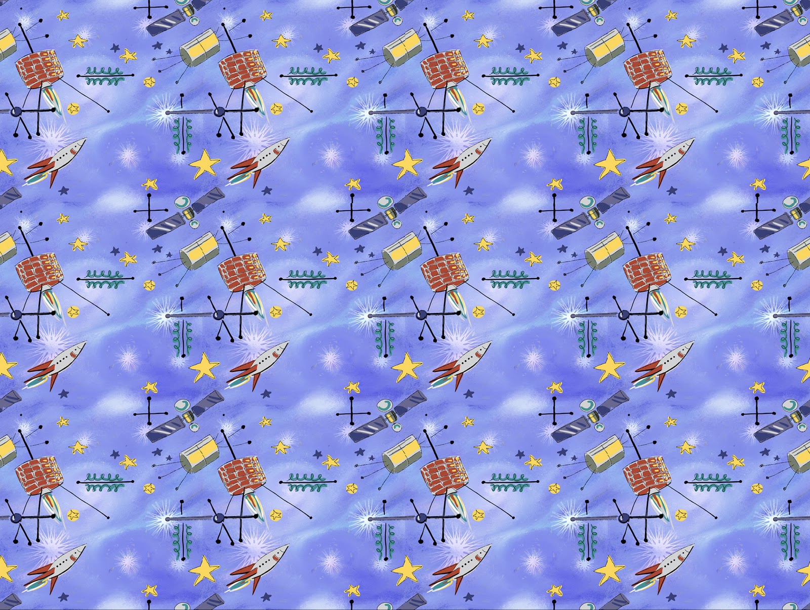
Last week's word, 'Paisley' left lots of room for interpretation and a chance to explore pattern and color. This week, the word challenge was 'Satellite,' and I have to admit that I wasn't too excited when I opened my email and discovered it was the choice for the week. Nevertheless, I decided to go for it. At first, I bounced back and forth between two ideas - an outer space scene filled with satellites, and a more metaphorical scene depicting a beautiful flower being orbited by insects that circled the flower like little satellites. I think my second idea certainly has potential for a fun and colorful illustration, but I guess I just wasn't energized enough to pursue it (I think I will file that idea away though), so I went with my first, more obvious idea - a depiction of satellites in outer space. Since I've been working a lot with patterns lately, I decided to see what I could do with an outer space themed pattern.


I did a few sketches of satellites in my sketchbook and then went to my computer where I started trying to come up with an appropriate outer space background. I tried lots of variations and had a difficult time coming up with something that I was happy with. I started off with a very dark color scheme which I gradually developed into something much lighter.

I started adding some additional colors that I had planned to develop into gas clouds or nebulas, but they just never seemed to look right. I was getting frustrated fast.

Next I tried to see what would happen if I put the image through a posterize filter.

After that I began to blend the colors, and to lighten them.
Then I decided to duplicate the layer a couple of times. I tried some different layer blending modes, gave the whole thing a more overall blue color and then added some star-like growth patterns. By this time, I was definitely getting closer to the image I had in my mind.

After lightening it even more, I finally had something I was happy with.

Here is the image after I started to do some freehand sketching of my satellites over the finished background. Before starting to draw I had turned on the 'Define Pattern' mode so that anytime a line went off the edge, it would reappear on the opposite side of the drawing and would thus line up properly when tiled. This of course, slowed down my pen a lot, which was frustrating. As you may notice, I originally had an extra satellite in the image, but I decided to take it out after doing a test of how the pattern looked when tiled. The extra satellite, since it was a vertical object, tended to create a vertical stripe when the image was repeated so I decided to remove it.

Here is the final painted image after I removed the extra satellite. You can see what the image looks like tiled as a pattern at the top of this post.
Thanks for reading this, I hope you found it interesting.


 Besides not liking the sky's color and the arrangement of the stars and meteors, I was unhappy with the sky's oval shape. For comparison, you can see the original version on the left. In addition to repainting the sky, you might notice that I made some other changes as well. I decided to go with just one shooting star, I added a hint of the milky way in the sky, I added a cat in the background and I added additional shadows to the ground and figures. Those additional shadows that I created with Corel Painter's tinting brush, made a huge difference. In the original image, the characters and the grassy hill look like they are being lit by bright sunlight. Adding a blue tint to the lower areas of the image unified the foreground with the sky and made the whole image appear more night-like.