Showing posts with label children. Show all posts

Tuesday, July 23, 2013

Illustration Friday - Robot

My original, finished robot pattern
It's been a while since I've submitted anything for the Illustration Friday weekly challenge, but when I saw that this week's challenge was "Robot," I couldn't resist.  Coincidentally, I was working on an update of a robot pattern that I had originally designed for my Spoonflower shop. My aim was to create a fabric design with some kid-friendly, retro-looking robots.

My original pattern featured 5 different robots (plus one that was repeated within the basic repeat module). Below, is the sketch for their original design. To the right, is the finished color pattern showing how it repeats. To the finished version, I added some textures in Photoshop to help give the image the feel of vintage cloth.

If you scroll down to the bottom, you can see my updated version that uses the original robots, plus a couple of new ones.


The original sketch for my robot pattern

A test, using the sketch, to see how the pattern lined up when repeated

For the updated version, I added two more robots, and lots of little gears to fill in blank spaces. I also changed the color scheme.

My recent updated robot pattern where I added two new robots and lots of gears

A sheet showing how the new pattern repeats

Thursday, June 06, 2013

Dream Friends

Dream FriendsDream Friends by You Byun
My rating: 3 of 5 stars

In "Dream Friends," artist You Byun’s debut picture book, a lonely girl named Melody has a special friend. As you may have guessed from the book’s title, the catch to their friendship is that Melody and her friend can only meet in her dreams. It’s an idea filled with promise and Byun has beautifully captured a child’s surreal dream world in her muted pastel colored paintings. With their slightly over-sized, bean-shaped heads, the character design in “Dream Friends” reminded me of the children in the animated film “My Neighbor Totoro,” (Melody's large dream friend, is also not unlike Totoro). The story itself is very simple and half of the book consists of scenes of Melody romping with her Dream Friend in their dream world. I do wish there was more development of Melody's character, but seeing that this book is meant for very young children, it's understandable that story and character development are secondary to the lovely illustrations. Even though the story may seem simple, the book does deliver a heartfelt message. In the end Melody learns that by taking inspiration from her dreams, she can find happiness, magic and friendship in her waking life. I suppose it's a lesson even grown-ups can learn from.

Below are two of the dream vignettes featured in You Byun's picture book, "Dream Friends."


View all my reviews

Monday, April 30, 2012

What Makes You Jump?

"Jump" was this week's 'Illustration Friday' word and I had quite a bit of fun coming up with ideas.  Since I couldn't decide which idea I liked the best (and since I was also looking for a way to procrastinate working on another project), I actually ended up doing three interpretations.

My first idea was to see if I could make the word itself into things that seemed to be jumping. My first sketch was with letters shaped like people, but I couldn't get that idea to work, so I tried it with animals. The "J" duck, the "U" fish and the "M" dog came easily but I had a hard time coming up with something for the "P." First, I tried a Giraffe, but, even with it's long neck, it wouldn't cooperate.  When I thought about the elephant and it's trunk, I knew I had my solution.

My next idea was inspired by my dog.  Fortunately she doesn't have fleas, but she does scratch herself once in a while, which gave me the idea for this drawing. Fleas are powerful jumpers.  I think I read somewhere, that a flea's jumping ability, if it were translated to a human equivalent would be like a man jumping over a building.  I actually did two versions of this drawing.  In my first one, I sketched the dog very quickly and though I liked its face, the body seemed too rigid and stiff. I was going to go with it anyway until at breakfast this morning my dog began scratching and I could see all of the problems with my original pose.  So, I tackled it again.  I've put the two of them side by side so that you can see the difference.  The one on the left is my first attempt.  On the right is my final version.  You can see I decided to add some more fleas. I also changed their size and the color of their trajectory lines.

I hadn't planned to do a third interpretation but this idea came to me this afternoon and it seemed too great to pass up. I did it fairly quickly, in just under an hour, using Painter 12's 'real' watercolor brushes. I think anyone who's gone to see a good scary movie can identify with what it's like to almost jump out of your seat when an unexpected scare is sprung on the audience. I wanted this illustration to have a spontaneous and 'alive' look to it, so I didn't do much in the way of cleaning up the watercolor.  I used 4 or 5 layers and painted in the dark blue gray first.  I like the way it sort of pooled into dark spots behind the figures, almost as if the light from the movie they're watching is casting a shadow behind them.


Wednesday, April 11, 2012

Illustration Friday - Vocal

My first thought for the word 'Vocal,' which is this week's "Illustration Friday" challenge was of someone singing or yelling.  When I sat down to start sketching I began to draw a little boy.  During my lunch break, just prior to beginning this drawing, I had watched an early episode of "The Andy Griffith Show," and my drawing ended up looking like Opie Taylor as played by a very young Ron Howard. When I realized I was turning him into Opie, I googled the character and came up with a reference photo of Opie singing (or maybe he's yelling, though I don't recall too many episodes where Opie yelled). Anyway, I used the photo as a guide for the mouth, but as you can see I made some changes. I gave my boy, a gap in his teeth and I decided to have his eyes open.  I also turned his head slightly.


Below are a couple of early pencil sketches.  As I worked on the image, I decided the composition needed something else so I added a dog, which I based on a photo of my own dog, Poppy. The pencil sketches, as well as the finished illustration were done using Painter 12.


First sketch
Sketch after some clean up and shading

Friday, January 20, 2012

Barbara Cooney in Black and White

In a career that spanned six decades, artist Barbara Cooney (1917-2000) illustrated over one hundred children's books. She twice received the Caldecott award for best picture book, in 1957 for "Chanticleer and the Fox," and in 1979 for "Ox-Cart Man," by Donald Hall.  I first became aware of her books while I was working in a bookstore in Washington state. I think the first one that I read was "Miss Rumphius," her 1982 American Book Award winning story of a woman who sets out to make the world a more beautiful place by planting lupines everywhere. Cooney considered this book to be a part of what she called her trilogy, which also contained "Island Boy" (1988) and "Hattie and the Wild Waves" (1990).  In the book "Children's Books and Their Creators," edited by Anita Silvey,  Cooney is quoted as saying that the books in this trilogy "come as close to any autobiography as I will ever get."

Miss Rumphius and her later books were created in color using acrylic paint and Prismacolor pencils, but some of her earlier works were done in black and white.  On a recent trip to our public library's children's classics section, I discovered one of her earlier books, a 1949 compilation of stories and poems compiled by the Child Association of America, called "Read Me Another Story." This book is filled with charming scratchboard illustrations that give us a glimpse into Cooney's style from the first decade of her illustration career.

Here is how Cooney described the beginnings of her career: "In the beginning I worked in black and white, that being the most economical for the publisher. I yearned for color. 'But,' said my editor, 'you have no color sense.' Still yearning for color, I accepted the discouraging pronouncement. Eventually a little color was allowed - sometimes two colors, sometimes three. But each color had to be painted on a separate sheet of paper. These were called 'overlays.' One art director hoped to convince me that working with these separations was 'the purest form of illustration.' But I found it tedious."

Looking at these beautiful black and white illustrations from "Read Me Another Story," I don't think that the addition of color would add anything to their charm.


Thursday, December 15, 2011

Illustration Friday - Separated

I've been very busy getting ready for one more holiday craft fair so I only had time to do a quick sketch for this week's word which is 'Separated.' I'm not sure what made me think of this idea, other than that I know how painful it can be to be separated from an animal that you love.

At one point in the development of this sketch, I had the mother looking very mean and perturbed by her child's behavior. But I decided to go back to a more worried looking mom.  You can see the sketch of the mean mom below.

Tuesday, September 27, 2011

How to Be Ferocious - Illustration Friday - Ferocious

For this week's 'Illustration Friday' challenge, which is the word "Ferocious," I stuck with the first idea that popped into my head, which was little children acting like ferocious beasts. I started off by doing some digital sketches using the 2B pencil brush in Painter 12. Originally I thought I would do a whole series of sketches, but I ended up just doing two which I then painted using Painter 12's new watercolor brushes (which I really like by the way).


I started out with a sketch of a child wearing a headband with attached animal ears.  A long, cloth belt tied around the waist makes a tail. He/She (at this point the sex hadn't been decided) is trying to scare a kitten. 


I then did another sketch, adding a boy in a similar pose but facing the opposite direction. 


As I began to refine the sketches, the first child turned into a little girl in her pajamas. She is imitating the lion that is depicted on her pajama top. The little boy is trying to frighten a puppy. As I refined him, I gave him pajamas with a dinosaur on the top and put him in slippers that looked like alligator heads. 


After finishing and cleaning up the sketches, I began painting them using Painter 12's new watercolor brushes. For painting the figures I used the Digital Watercolor 'New Simple Water' brush and the 'Coarse Mop Brush.' For the blue background, I used one of my favorites of the new brushes that come with Painter 12 - the Real Watercolor 'Fractal Wash' brush. This brush acts and looks like a real wet wash, and the speed at which it paints is greatly improved over previous versions. It's a great brush for adding a wet looking, fuzzy background.

At this point, I also added in another sketch of the first little girl, showing her sneaking up on the kitten. I liked the idea of showing a sequence, but it wasn't going to work with the image of the little boy and the dog, so I decided to split the illustration into two illustrations.  The boy and the dog now became a separate image.


Tuesday, September 20, 2011

Illustration Friday - Mesmerizing


I had several ideas for this week's 'Illustration Friday,' which this week is the word "mesmerizing." The idea I ended up using came to me while I was sitting in an auto-shop waiting room, waiting to get my oil changed and my tires rotated. There was a big screen TV in the room that was set to a channel playing old sitcoms. I had brought a book to read, but I had a hard time concentrating on it. The giant TV, which was showing an old episode of 'Bewitched,' was so mesmerizing that I found my eyes constantly drifting away from my book to look at the screen. Since there was no one else in the room, I finally got up and turned the sound down, which helped a little as far as concentrating on my book went.

So, from that experience I came up with the idea of a waiting room filled with children. All of the children in the room, with the exception of one little girl, find the TV to be mesmerizing. The child who is not watching the TV, is mesmerized by her book and would rather read.  This is my first image that I started and finished using the new Painter 12 upgrade (I did take a side trip into Photoshop to add some filters, but more about that in a minute).

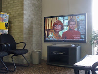
Since it's small enough to fit in my pocket, I almost always carry my camera with me.  For this illustration I consulted a reference photo that I took while in the auto-shop waiting room (see photo at right). From there, I made a digital sketch. I knew I wanted to have the little girl and her book off to one side of the image, so I started by arranging the chairs and figures. After the initial sketch, I did another one where I refined the figures and darkened the lines.

Once I was happy with the sketch, I started doing some coloring. On a separate layer, I filled the canvas with a soft yellow color to give the image some overall warmth. Then, using the Digital Watercolor 'New Simple Water' brush, I began to color in the background and shapes. You can see my progress in the images below (Click on any image to see it larger).

As I worked, I created lots of layers so that I would have the flexibility of changing the opacity of different objects and adding special filters to some areas.  When everything was colored, I saved the image as a Photoshop file and then opened the image in Photoshop CS4.  In Photoshop, I used a third-party filter called Mister Retro (made by Permanent Press) to add some speckled texture to the various layers of color. The second to the last image in the progression (see below), shows the image with all of the coloring finished in Painter, prior to adding the filters. The last image in the progression shows a screen shot of the finished image, re-opened in Painter, after the Mister Retro photoshop filters had been applied. In this image, you can see all of the layers I created while working. I reopened the image in Painter in order to add some shadows on the little girl and under the chairs. I created the shadows on their own layer and painted them using Painter's Smart Strokes 'Textured Chalk' brush.

Thursday, May 26, 2011

Illustration Friday - Soaked

The word for this week's 'Illustration Friday' challenge is "Soaked," an appropriate word for this week considering the number of storms that have passed through where I live. This is a piece that I actually did a few weeks ago as an experiment in using Corel Painter's Liquid Ink and Watercolor brushes. The idea came from something I witnessed on one of the many daily dog walks that I take with my dog, Poppy. One day, after a spring shower, we were out walking and saw a young boy and girl out playing with their umbrellas in the puddle-filled streets. Since it was warm out, they were in shorts and didn't seem to mind getting a little soaked. That afternoon, I created this illustration based on my memory of those two kids playing in the rain.

I started this illustration with a simple digital sketch, using Painter's Colored Pencil brush.


After sketching in the children, I began inking them in and adding some ink splatters to the background.

I continued to add layers of ink and watercolor washes.


Here I've added an overall wash of color to tone down the stark white background that was showing through.

You can see that by this stage, I've changed the color of the ink I used to outline the children. I started off with a brown ink and here I've changed it to black. I also decided to give the umbrellas a white ink outline.

The finished image. For the final step, I softened some of the watercolor edges and lightly erased some areas to give a better feeling of light reflecting off of the puddles.

Thursday, November 25, 2010

Illustration Friday - Sneaky

First off, Happy Thanksgiving everyone! I hope you are all having fabulous feasts and getting stuffed. Now on to this week's blog:

I'm going to be a vendor at a local craft and gift show in a few weeks and I've been trying to come up with Holiday card designs that I can print on my inkjet printer.  I've been so busy getting stuff ready that I had decided I would skip 'Illustration Friday' this week, but then I began thinking of ways that I could combine a Christmas image with this week's word which is "Sneaky." What child hasn't thought of sneaking out of bed to spy on Santa putting out presents?  If caught, I'm sure their parents would tell them that they were being sneaky.  I tried to make my illustration look like it could have come off of a magazine cover from the 1950s or early 1960s.  I was going for a graphic look, with a minimal color palette.  I created the shapes in Adobe Illustrator, saved the layered file as a photoshop file, then opened it in Corel Painter where I added some line work.  I then saved the file again as a photoshop file and finally opened it in Photoshop where I ran it through a Mister Retro Permanent Press filter to give it the look of an old image that's gone through a printing press.  I then did a variation of it where I further restricted the color palette and added some text.

At the bottom, you can see my original digital pencil sketch, that I drew in Corel Painter.