Showing posts with label Illustration Friday. Show all posts

Monday, August 26, 2013

Illustration Friday - Rescue


Final image
This week's 'Illustration Friday' challenge is the word "Rescue," and I am submitting a piece that I actually created three years ago. It was a piece I did for fun, my attempt at creating an image that looked like it might have come from a Little Golden Book.

I always loved the Richard Scarry books and his illustrations showing towns populated entirely by animals. In my illustration, an elephant is being rescued by a squad of dalmatian firemen.

Before I began painting (the final image was created in Painter 11), I created a few thumbnail pen and ink sketches in one of my sketchbooks.

You can see in the first rough sketch that I originally had quite a different look for the dog climbing the ladder. I didn't like his snout, so I changed it to a more boxy shape.


Once I was happy with my character designs, I created a cleaned up sketch. From there, I began filling in blocks of color, using Painter 11's chalk and pastel brushes.
Cleaned up sketch created in Painter 11

Starting to fill in areas of color


For the final stepped, I gave the elephant a warmer tone and some reflected light from the flames. This helped her to stand out more from the gray building. 


Sunday, March 10, 2013

Illustration Friday - "Yesterday"


Click illustration to see it larger
As someone who has a hard time of letting go of his past, I’ve often associated the word “yesterday” with a feeling of nostalgia. I especially get nostalgic for my childhood, a time when I was closer to my sister and lived in a home where I felt safe and secure. I didn’t come from a perfect family, we definitely had our dysfunctional problems but I won’t go into those problems here. Despite our dysfunctions, I felt cared for and loved by my parents and even when I was younger, I think I knew they were spoiling my brother, sister and me.  

I was sick a lot as a child and because of this I missed a lot of school. My bedroom became my refuge and safe haven. I was a shy and inhibited child, afraid of much of the real world and my room, with all of its books and toys, became the only place where I felt safe and secure. I remember thinking that I would be perfectly happy to spend the rest of my life in my room. 

For this week’s Illustration Friday challenge, I’ve drawn an affectionate portrait of the way I remember my room.  It represents ‘yesterday’ to me because I often feel as if my childhood in that room took place only yesterday. I find it hard to believe that it’s been over 40 years since I could legally be considered a child. It really does seem like yesterday that I was curled up on my childhood bed and reading the Oz and Narnia books.

I’ve tried to include a number of things that were actually in my room at one time or another. I always had a lot of stuffed animals and dolls on my bed, a few of which I’ve shown in the drawing, including a Raggedy Ann doll, a plush green snake, a large dalmatian, several bunny rabbits and a teddy bear.  Above the bed, sitting on the headboard is a large papier mache cheetah that I made when I was 11 or 12.  On my walls I had thumb-tacked several posters, including a reproduction of a 1920s poster for  “The Thief of Bagdad,” starring Douglas Fairbanks (shown on the wall behind the cheetah). I remember I also had a poster showing a ruined castle in Ireland (you can see a portion of it on the right edge of my illustration).  The floor was made up of linoleum tiles in various shades of speckled browns and tans.  For awhile I had a large, oval braided rug that took up most of the floor space.  At the base of my bed I remember having a decorative green cardboard box that had a flowered lid. There were often newspapers stacked on this box because for a while I used to cut out and save the ads for my favorite movies.  The curtains on my window were beige and patterned with green, blue and tan representations of colonial shop labels and broadsheets. My room faced our backyard and from my window I could look out on to our backyard with its oval swimming pool and the brown mountain that rose up a block away from our property.

Even after I moved away from home in the late 1970s, my parents continued to live in this house so I often returned for visits.  Some time in the mid to late 1980s disaster struck my room in the form of a busted water heater which was in a service porch behind my bed. When the water heater broke, it flooded my bedroom, damaging many of my record albums and anything else I had stored on the floor. The linoleum was also damaged and had to be replaced. After this disaster, many of my things were put in storage and moved to other parts of the house. From that time on, my room never felt the same again. It no longer looked, or felt, like the room I had grown up in. 

I created the illustration using Painter 12's "Real" watercolor brushes and a customized "Pen" brush.

Monday, December 17, 2012

Illustration Friday - Snow

We've been having a mild fall here in Indiana, no snow so far and there's none forecast for the near future. We do have a lot of cardinals around and when I saw this week's Illustration Friday challenge, which is the word "Snow," I thought of how pretty a red cardinal looks against a snowy backdrop. I created my image as a quick watercolor sketch in Painter 12. I started off with a digital pencil sketch (see below) and added the watercolor on a separate layer.

After coloring the bird, I used one of Painter's Bleach Splatter brushes to make some spots on the bird's feathers (see detail below). After that I used Painter's Real Watercolor Scratch brush to draw some snowflakes over some of the bleach spots (detail below). I decided to leave the background white to further enhance the feeling of a bird on a snowy day.


digital pencil sketch

detail of the bleach spots created with the Bleach Splatter Brush

Snowflakes drawn with Painter's Real Watercolor Scratch Brush


Monday, October 01, 2012

Illustration Friday - Book


I haven't submitted anything for 'Illustration Friday' in quite a while, but when I saw this week's topic was the word "Book," I couldn't resist participating. Over a ten year period, I worked at two different independent bookstores and during that time one of the things I was responsible for was editing the newsletters for both stores. Because I'm also an artist, I created a lot of book-related spot illustrations, especially for the children's newsletter that I created. I don't remember if this image was for the newsletter or not, but I did use it for a while on my business card. It started off as a black and white pen and ink sketch which I then turned into a color illustration in Adobe Illustrator.  I then took that image, exported it as a tiff file and opened it in Photoshop where I applied some Mister Retro filters to give it the look of an old, scuffed print image.


Wednesday, July 18, 2012

Illustration Friday - Lost

I've been very lax about posting to this blog.  Lately, I've become addicted to tumblr and have two blogs there where I post sketches and other items of interest with minimal writing attached (vincentdesjardinsdraws and Jumbled Planet).

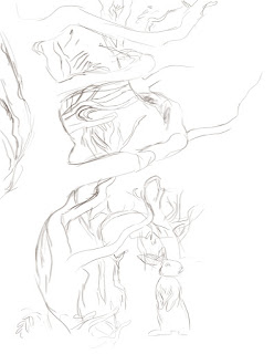
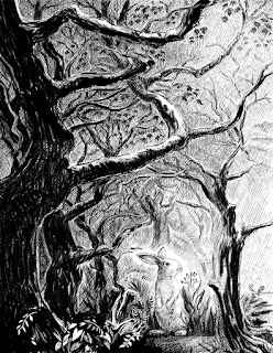
But, today I wanted to post and talk about the image I submitted for this week's "Illustration Friday," challenge which is the word 'Lost.'  I was originally inspired to create this illustration by a photo of a spooky, moss covered forest (you can see the original image, below left).  I created the final image in Painter, but before I began, I opened the photo in Photoshop and created a threshold layer so that I could better see the lights and darks in the image. I then used this as a visual reference to create the darkest shapes in my image.


From there, I began sketching in Painter 12.  Originally I had thought to do this as a digital oil or gouache painting, but then I thought it might be more dramatic to do it as a black and white digital pen and ink drawing.  From the very start, I knew I had wanted to have a rabbit in the image.  I like rabbits and I thought it might provide some tension to show an innocent looking little rabbit lost in this rather imposting and dramatic looking forest.
Beginnings of digital pencil sketch

In the above image, I've begun to map the darkest areas
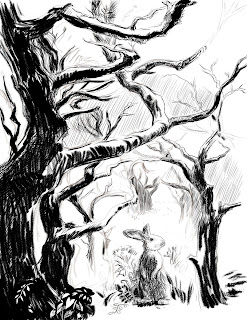
After I had blocked in the darkest trees, I added additional layers to fill in the background shading.  By having the cross-hatched background shading on a different layer, I could erase areas of it without damaging the main shapes.  This came in very handy when I decided to add some shafts of sunlight to the image. As I continued to work, I began to deviate from the original photo and started adding branches and leaves where I thought the image could use some texture and visual interest.
Here, I'm filling in the background with lots of cross hatching.
As I darkened the background, I decided to add some rays of sunlight, to help guide the viewer's eye toward the rabbit.

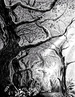
Finally, after finishing the image in black and white, I decided it might be fun to do a colored version.  Since I had created the black and white image on several layers it was easy to add another layer underneath to create the color.  All I did was flatten the black and white layers to a single layer and changed the resulting layer to a 'multiply' blending mode, which allowed the color to show through in the white areas.


Above is the finished piece and below, you can see what the watercolor layer looks like without the pen and ink layer.


Sunday, May 13, 2012

Illustration Friday - Kernel

The 'Illustration Friday' word for this week is "Kernel."  A corn kernel is the first thing I thought of, the second thing was popcorn. I abandoned the popcorn idea and instead drew a little mouse clutching a kernel of corn. I know people who cringe at the thought of rodents and I know they are a big problem for farmers when they get into their stored grain, but I decided to put those thoughts out of my mind and concentrate on creating a cute little mouse. I created this image using Painter 12.  I started out with a digital pencil sketch and then colored it with Painter's 'real watercolor' brushes.  I'm pretty happy with the way it turned out.

Monday, April 30, 2012

What Makes You Jump?

"Jump" was this week's 'Illustration Friday' word and I had quite a bit of fun coming up with ideas.  Since I couldn't decide which idea I liked the best (and since I was also looking for a way to procrastinate working on another project), I actually ended up doing three interpretations.

My first idea was to see if I could make the word itself into things that seemed to be jumping. My first sketch was with letters shaped like people, but I couldn't get that idea to work, so I tried it with animals. The "J" duck, the "U" fish and the "M" dog came easily but I had a hard time coming up with something for the "P." First, I tried a Giraffe, but, even with it's long neck, it wouldn't cooperate.  When I thought about the elephant and it's trunk, I knew I had my solution.

My next idea was inspired by my dog.  Fortunately she doesn't have fleas, but she does scratch herself once in a while, which gave me the idea for this drawing. Fleas are powerful jumpers.  I think I read somewhere, that a flea's jumping ability, if it were translated to a human equivalent would be like a man jumping over a building.  I actually did two versions of this drawing.  In my first one, I sketched the dog very quickly and though I liked its face, the body seemed too rigid and stiff. I was going to go with it anyway until at breakfast this morning my dog began scratching and I could see all of the problems with my original pose.  So, I tackled it again.  I've put the two of them side by side so that you can see the difference.  The one on the left is my first attempt.  On the right is my final version.  You can see I decided to add some more fleas. I also changed their size and the color of their trajectory lines.

I hadn't planned to do a third interpretation but this idea came to me this afternoon and it seemed too great to pass up. I did it fairly quickly, in just under an hour, using Painter 12's 'real' watercolor brushes. I think anyone who's gone to see a good scary movie can identify with what it's like to almost jump out of your seat when an unexpected scare is sprung on the audience. I wanted this illustration to have a spontaneous and 'alive' look to it, so I didn't do much in the way of cleaning up the watercolor.  I used 4 or 5 layers and painted in the dark blue gray first.  I like the way it sort of pooled into dark spots behind the figures, almost as if the light from the movie they're watching is casting a shadow behind them.


Tuesday, April 24, 2012

Illustration Friday - Heights

Giraffes see the world from great heights, which is why I chose it as my subject for this week's 'Illustration Friday' challenge which this week is the word "Heights."

I've been playing around lately with Painter 12's watercolor brushes. I've also been using some brushes that I downloaded from Skip Allen's Painter tutorial blog. Whenever I get a chance I try and do a quick illustration where I experiment with the various brushes. This week's 'Illustration Friday' illustration is the result of one of those experiments.
I started this illustration by painting in a background and then creating a new layer where I drew a pencil sketch of the giraffe (see below). I wanted the giraffe to appear to be stretching up into the sky, the tallest thing around, but in my original sketch, he seemed kind of lonely.  Not only that, but the image seemed rather boring.


I decided I wanted to have something at the giraffe's eye level, so on another layer I sketched in a flying bird.  To emphasize the giraffe's height, I decided to have him towering over some shrubs. To paint the giraffe's body, I created another layer and, using one of the soft chalk brushes, filled in the body's shape in a light tan. Above that layer, I placed a new watercolor layer where I painted his spots.  On yet another layer, I used some sketchy pen brushes to draw in his eyes and also to add a few lines to his face and legs.


Next, on a separate layer, I played around with adding another tree.  But when I added the large tree, suddenly the giraffe didn't seem so tall, so I got rid of it. I also ended up changing the foliage underneath the giraffe. It originally looked too dark and thick, so I thinned it out a bit and lightened the color.
As you can see in the final image (see below), I ended up flipping the bird horizontally over to the right side of the giraffe. 


Saturday, April 14, 2012

Illustration Friday - Puzzled

Another Friday has come and gone and with it, another 'Illustration Friday' challenge. This week the word is "Puzzled." For some reason, this word made me think of that scene in Disney's "Dumbo," where the little elephant wakes up after his accidental drinking binge and discovers that he is up in a tree.  Of course he's puzzled by this, how in the world did he get himself up a tree? Of course the audience knows that he flew up into the tree with his gigantic wing-ears.  Anyway, my dog is obsessed over squirrels and I know she would do anything if she could get up in a tree to catch one.  I know I would certainly be puzzled if I went out into our yard and found her sitting up in a tree.  So that's where I got my inspiration for this week's word.

Lately, I've been doing some experimenting with Painter 12's real watercolor brushes which is what I ended up using to create the finished artwork. By the way, you can click on the image to see it larger. I did several sketches before I finally got the dog and the little boy the way I imagined them.  My progression of sketches is below.


Wednesday, April 11, 2012

Illustration Friday - Vocal

My first thought for the word 'Vocal,' which is this week's "Illustration Friday" challenge was of someone singing or yelling.  When I sat down to start sketching I began to draw a little boy.  During my lunch break, just prior to beginning this drawing, I had watched an early episode of "The Andy Griffith Show," and my drawing ended up looking like Opie Taylor as played by a very young Ron Howard. When I realized I was turning him into Opie, I googled the character and came up with a reference photo of Opie singing (or maybe he's yelling, though I don't recall too many episodes where Opie yelled). Anyway, I used the photo as a guide for the mouth, but as you can see I made some changes. I gave my boy, a gap in his teeth and I decided to have his eyes open.  I also turned his head slightly.


Below are a couple of early pencil sketches.  As I worked on the image, I decided the composition needed something else so I added a dog, which I based on a photo of my own dog, Poppy. The pencil sketches, as well as the finished illustration were done using Painter 12.


First sketch
Sketch after some clean up and shading

Saturday, March 31, 2012

Are there places you'd like to return to?

The first version, painted in Corel Painter 11.
The word for this week's 'Illustration Friday' challenge is "Return." I've been thinking a lot lately about a place where I use to live. It was an old farm house in Washington state that was situated across the road from a meadow on the edge of a small forest. It was a place where I use to walk my dogs every day. I moved away from there 5 years ago when the relationship I was in fell apart and I've never felt as homesick for a place as I have for that house, meadow and forest. Lately I've begun to dream about it. For the past couple of months, I've had a dream almost every week that I have returned to that location. The house has since been sold and someone else now calls it home. I will probably never go back there, I think it would break my heart to go back and see someone else living in a place that I once felt was mine. But it did inspire me to create this image of an old woman returning to a favorite spot. Maybe it's a spot that she's never left, but returns to every day on walks with her dog.

I painted this illustration in Corel Painter 11 and then played around with it a bit, creating a new version by tweaking it in Photoshop using a Mister Retro filter to give it a sort of aged graphic feel. I then imported that version into Illustrator where, using the 'Trace' feature, I turned it into a vector image which simplified the shapes.  I saved that image as a tif file and then reopened it in Photoshop where I adjusted the colors.

The 2nd version, using the Mister Retro filter in Photoshop which added halftone dots.

The vector image version created in Illustrator and then adjusted in Photoshop.

Thursday, December 15, 2011

Illustration Friday - Separated

I've been very busy getting ready for one more holiday craft fair so I only had time to do a quick sketch for this week's word which is 'Separated.' I'm not sure what made me think of this idea, other than that I know how painful it can be to be separated from an animal that you love.

At one point in the development of this sketch, I had the mother looking very mean and perturbed by her child's behavior. But I decided to go back to a more worried looking mom.  You can see the sketch of the mean mom below.

Wednesday, November 23, 2011

Illustration Friday - Vanity

It seems like ages since I've posted anything new in this blog. It's been a busy month, getting ready for several craft shows, designing and making new things, running my Etsy shop and working on an entry for Tomie dePaola's SCBWI contest have taken up most of my time.

This week's word for the 'Illustration Friday,' challenge is "Vanity." I really had hoped to create something new to illustrate the word, but once again I feel pressed for time, so, I dug up an illustration I did for 'Instinct' magazine's health column back in 2005. I believe the article that accompanied the illustration was about men's hair loss and products on the market that claim to slow it down.

As someone who is bald himself, I can understand the desire to try out hair loss remedies. If there was a magic pill that was 100% effective and worked without side effects to give me back all the hair I had as a youth, I'd certainly take it. Why? Because I guess I'm vain. Isn't that why most people use beauty products, wrinkle removers and similar concoctions that claim to make a person look young again, because of vanity? Everyone wants to look their best, so there's nothing wrong with a little vanity. If nobody cared about how they looked, it certainly wouldn't be pleasant to go out for an evening on the town. No one enjoys looking at a bunch of slobs when they go out for a nice dinner. Now that I've been bald for almost half my life, I've learned to accept the fact that I'll never see myself with a full head of hair again. That doesn't mean I don't miss my hair, it just means I'm not going to throw away my life savings trying to pursue dreams of a youthful appearance. Besides being bald has its advantages, I don't ever have to worry about waking up with 'bed head' hair.

I managed to find the original sketch I submitted to the art director and one of the initial stages of the painting. You can see both of those below. Most of the painting was done in Corel Painter and the textures and lighting effects were then added in Photoshop.
the digital watercolor sketch I sent to the art director for approval
An early stage of the painting before the shading was blended and before the textures were added.