
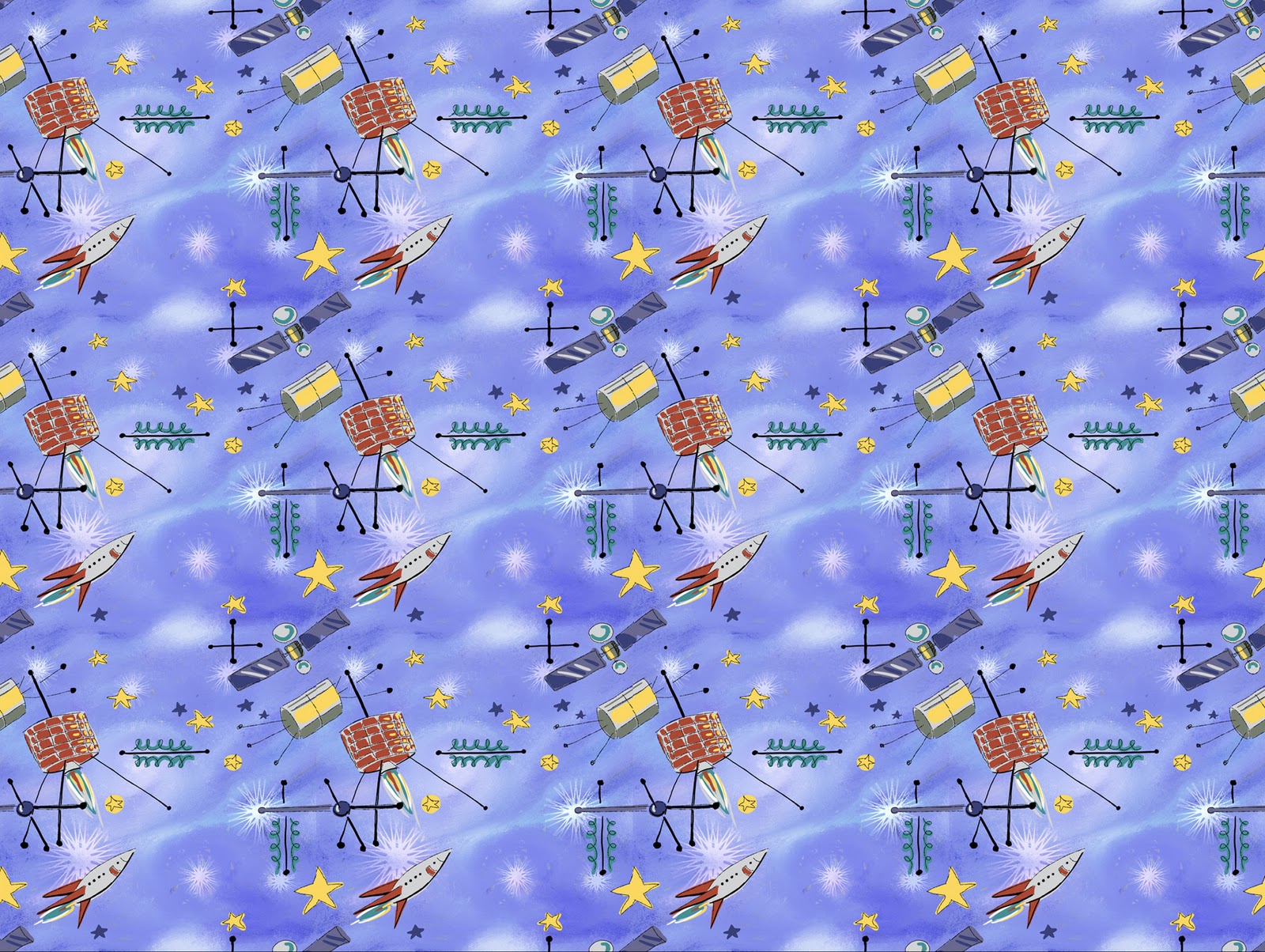

 I did a few sketches of satellites in my sketchbook and then went to my computer where I started trying to come up with an appropriate outer space background. I tried lots of variations and had a difficult time coming up with something that I was happy with. I started off with a very dark color scheme which I gradually developed into something much lighter.
I started adding some additional colors that I had planned to develop into gas clouds or nebulas, but they just never seemed to look right. I was getting frustrated fast.
 Next I tried to see what would happen if I put the image through a posterize filter.
  After that I began to blend the colors, and to lighten them.
 After lightening it even more, I finally had something I was happy with.
 Here is the image after I started to do some freehand sketching of my satellites over the finished background. Before starting to draw I had turned on the 'Define Pattern' mode so that anytime a line went off the edge, it would reappear on the opposite side of the drawing and would thus line up properly when tiled. This of course, slowed down my pen a lot, which was frustrating. As you may notice, I originally had an extra satellite in the image, but I decided to take it out after doing a test of how the pattern looked when tiled. The extra satellite, since it was a vertical object, tended to create a vertical stripe when the image was repeated so I decided to remove it.
 Here is the final painted image after I removed the extra satellite. You can see what the image looks like tiled as a pattern at the top of this post.
 Thanks for reading this, I hope you found it interesting.


 ," and getting excited by all of the unusual gadgets, machines and visions of what we used to think the future would look like, I decided to take the challenge in a whole other direction. My idea was to create a faux vintage magazine cover, a cover similar in style to those that use to grace "Popular Science" or "Science and Mechanics," in the days when they had great painted cover illustrations that depicted the wonders of the future. So to tie this in with the cocoon challenge, I decided to have the cover illustration of my faux magazine be a human cocoon device for hibernating during long interplanetary space voyages. I decided I would have a father showing off this device to his son to prepare him for their own voyage into outer space.
