Showing posts with label illustration. Show all posts

Friday, July 31, 2015

Evolution of an illustration

The final image, showing Henry
Bergh jumping through the skylight.
For the past three months I've been working on a non-fiction children's book that will be released next Spring. I am very excited about this project, not only because of the fascinating subject matter (more on that in a second) but because it is my first assignment with a major publisher (Houghton Mifflin Harcourt). The book is titled "Mercy, The Incredible True Story of Henry Bergh, Founder of the ASPCA," by Nancy Furstinger.

April of 2016 will mark the 150th anniversary of the founding of the ASPCA and being an animal lover, I'm very excited that the book I am illustrating will be released in conjunction with the ASPCA's anniversary celebrations.

For this posting I am going to let my readers in on the process of how I went about creating one of the illustrations for "Mercy." In the book's introduction, author Nancy Furstinger relates a suspenseful incident involving ASPCA founder Henry Bergh and his attempt to put a stop to a dog fight. The scene describes him waiting on the rooftop of a building where a fight was about to take place. He and another officer are watching the activities of the dog owners through a skylight. Just before the men release their dogs, Henry leaps through the skylight. I won't tell you how the scene ends, you'll have to read the book to find out, but in this post, I'll show you how I came up with the illustration that will accompany this scene in the book.

Reference books from the library
The action for this scene takes place in 1866. So, before beginning any sketching, I researched the time period. Henry Bergh was born in 1813 and died in 1888, his life spanning much of the nineteenth century. To begin my research, I checked out a number of books from the library, including books on fashions of the period and references for both human and animal anatomy. Much of my research though was done online. For this particular illustration I needed an image of a man jumping down through an open skylight. One of my favorite online sources for visual reference material is Getty images, which is actually a stock photography site for purchasing the rights to hi-res images for use in publications. But it's also a great source for reference images to aid in your drawings. The previews that come up when you do a search will be at screen resolution and have a watermark across them, but since they are to be used only for drawing reference, they are extremely useful for finding people in various poses, styles of dress, etc.


The leaping man in this image became my reference
for Henry Bergh jumping through the skylight
To start on this illustration I entered a number of search terms, things like 'man jumping,' 'man jumping down,' 'man leaping,' etc.  I not only used Getty images, but I did "Google" searches as well, using the same search terms. Once I started finding some possibly useful images, I downloaded them in to a folder on my computer. Using Adobe Bridge, I was then able to organize and look at thumbnails of all of my downloaded images. While using Getty images, I discovered some wonderful late nineteenth century illustrations from a periodical titled 'Le Petit Journal.' These illustrations were loaded with action and great period details and provided useful reference in several of my illustrations including this one.


An early attempt at a layout using
cut and pasted reference material

Once I had enough images, I did a rough layout by cutting and pasting some of my reference figures into a sort of collage. These collages were my early attempts at getting the illustration to match how, in my imagination, I felt the scene should look.  I played with several poses from various images and if things didn't look like how I imagined them, I would start over from scratch.  This scene on the left is my first attempt at a layout.

If I were an expert at drawing anatomy and perspective from scratch, I might have opted to just sketch out my idea. But since I had already downloaded the reference images, I found it was quicker to do a rough cut-and-paste job of my reference materials. That way I could move the elements around, scale them, flip them, etc. until I achieved a layout I was happy with.

Below are some examples of how my collage layout changed to reflect my evolving idea of how I wanted the scene to look.  Once I had the main figures positioned where I wanted them, I began to draw. I drew the dogs freehand, without much in the way of reference. I also made up whatever figures and elements were missing from my collage. The sketch shown at the bottom below displays the final layout, although I did make some changes to the dogs before I began to ink and color the illustration. I did all of my coloring and painting in Corel Painter 12, primarily using the digital watercolor brushes.

a second attempt where I've changed
some of the reference elements
The scene is starting to come together
 although the foreground is too
crowded, with no room to show the dogs.

Here I have begun to sketch out the scene based
on my cut and pasted collage. Some elements,
like the dogs, and some of the faces in the crowd,
I made up without much in the way
of any reference.


Tuesday, May 13, 2014

Mistress Masham's Repose


Mistress Masham's ReposeMistress Masham's Repose by T.H. White
My rating: 4 of 5 stars

Maria is shown the tiny livestock
illustration by Fritz Eichenberg
The premise of Mistress Masham’s Repose is a clever one - the travels of Lemuel Gulliver described in Jonathan Swift’s “Gulliver’s Travels” actually took place and some Lilliputians, captured on a later expedition, have escaped and have been hiding out and living in exile on a rundown English estate.  For over a century, they have managed to avoid detection by living inside of a garden folly. Their secret comes close to being exposed when they are discovered by Maria, a young girl living on her ancestor’s estate. For me, the best parts of the book were in White’s descriptions of how the tiny Lilliputians are forced to cope in a land of gigantic threats. The writing is often somewhat dense, but filled with humor and White shines in describing the foibles of his characters. The character of Maria is not always likable but White uses her to show how a little power can corrupt even a person with the best of intentions. As is often the case, the villains of the story are often the most interesting characters and White has created a devious pair in the characters of Maria’s governess, Miss Brown and Mr. Hater, a greedy Vicar. There is a lot of suspense created when these two conniving schemers discover the existence of the Lilliputians and plot ways to make a fortune off of them. They even discuss murdering Maria if it should become necessary to achieve their gains. White fills the book with doses of English humor (which may go over the heads of some younger readers) and frequently goes off on rather esoteric tangents, which I felt slowed down the narrative. If it weren’t for these esoteric and wordy asides, I probably would have given this book 5 stars. All in all, it’s an enjoyable read, especially if you’re in the mood for a story rooted in a classic of English literature. If you can, make sure and find an edition that contains the fantastic illustrations by Fritz Eichenberg. His amazing pen and ink work perfectly captures the humor and drama in White's story.

All illustrations are by Fritz Eichenberg and were scanned from a 1946 copy of Mistress Masham's Repose by T.H. White, published by G.P. Putnam's Sons.

The book has recently been reprinted by The New York Review Children's Collection.


Click on the illustrations to see them larger.

Miss Brown and Mr. Hater poke a captured Lilliput

Miss Brown discovers the People in Maria's room
The Professor and the People try to figure out
a way to release Maria from the dungeon


Some of the dangers faced by a
person who is only six inches tall.


View all my reviews

Sunday, December 29, 2013

My Favorite Picture Book of 2013

Mr. Tiger Goes WildMr. Tiger Goes Wild by Peter Brown
My rating: 5 of 5 stars

I first became aware of author/illustrator Peter Brown with his lovely picture book from 2009, “The Curious Garden.” I’ve followed his output ever since and with his latest book, “Mr. Tiger Goes Wild,” he has become one of my favorite author/illustrators. Using minimal text in combination with his wonderfully mid-century style illustrations, Brown manages to tell a surprisingly complex tale of bucking the norm and being true to oneself. Mr. Tiger lives in a society of animals that dress in human clothes, walk upright and are rigidly formal in their polite behavior. But for Mr. Tiger, always being prim and proper is a boring way to live. One day, he has a wild idea - he decides to walk on all fours! Right away he feels better, but when he decides to shed his clothes and run wild, his friends lose their patience and ask him to take his wild behavior to the wilderness. Without spoiling the ending, I will say that I found the resolution of this fun tale to be a delightful surprise.
illustration by Peter Brown from "Mr. Tiger Goes Wild"

The double-page spread where Mr. Tiger decides to shed his clothes is ingenious in its design and simplicity. A large public fountain forms the center of the two-page design (see last image at bottom). On the left page we see Mr. Tiger diving into one side of the fountain fully clothed. On the right page, we see Mr. Tiger emerging from the other side of the fountain but this time, without his clothes. Then we notice his clothes floating on the water. Turning the page, we see Mr. Tiger, standing on all fours, without a stitch of clothing to hide his magnificent striped coat. There is no text, words are unnecessary. His stance and the smile on his face tell us everything we need to know - Mr. Tiger has at last discovered his own true nature.

In this beautifully designed and humorous book, Brown presents the reader with a thought-provoking array of concepts - the stagnation of conformity, the joy in being different, respect for the rights of others, and making compromises. I highly recommend this book, definitely my favorite picture book of 2013!


detail from Peter Brown's "Mr. Tiger Goes Wild."


Double-page spread from "Mr. Tiger Goes Wild."


View all my reviews

Monday, October 07, 2013

Doodler Doodling by Rita Golden Gelman
My rating: 5 of 5 stars

Rita Golden Gelman has taken a simple concept - a daydreaming girl doodling on her notebook paper during class, and turned it into a fun, tongue-twisting page-turner filled with great word play and escalating situations. The author is helped by Paul O. Zelinksy’s wonderfully zany illustrations. Zelinksy is one of the most versatile illustrators working today. His illustrations for this book are nothing like the Flemish style renaissance paintings he created for Rapunzel. Here he combines loose watercolor and ink drawings to create dazzling doodles that come to life as the girl’s daydreams get out of control. The story and illustrations climax with a double-page fold-out. This is a fun book that would make a wonderful read-aloud and the pictures are so much fun that kids will want to study them over and over again to see how they relate to the playful text.


View all my reviews

Friday, June 21, 2013

Open This Little BookOpen This Little Book by Jesse Klausmeier
My rating: 5 of 5 stars

What Jesse Klausmeier’s “Open This Little Book,”  lacks in plot, it makes up for in cleverness and creativity. This is one of those books that is so clever in its concept that I found myself thinking, “I wish I had thought of that.” Klausmeier and artist Suzy Lee have come up with a book that makes the page turn an exciting event and have so smartly integrated it into the book’s concept that this is one book (like a pop-up book) I can’t imagine ever working on a Kindle. Part of the genius of this book is the change in page/paper size as the book unfolds. The title page itself is smaller than the page that comes before it and each page after that gets physically smaller until you get to the middle of the book where the pages start getting larger again. Now this may not seem like a stroke of genius to you, but the author and artist have brilliantly combined this size-changing concept with a simple series of events that will teach kids about size relationships, colors, animals, patterns and the joys of reading. One thing that I didn’t even notice on my first read was that the color palette changes as the story goes along. Each turn of the page adds another new color until the reader gets to the final illustration where the reader is rewarded with a beautiful illustration that uses the entire rainbow spectrum of color that we’ve been slowly introduced to. Suzy Lee’s illustrations, which in a few places remind me of William Steig, are charming and the last illustration in the book is so delightful, it gets my vote for best children’s book illustration of the year! This is a really clever and fun book.


View all my reviews

Sunday, June 09, 2013

Brave Girl: Clara and the Shirtwaist Makers' Strike of 1909Brave Girl: Clara and the Shirtwaist Makers' Strike of 1909 by Michelle Markel
My rating: 4 of 5 stars

This non-fiction picture book by Michelle Markel is a fascinating and important look at an era of America’s history that saw the rise of the labor movement and life-saving changes in worker’s conditions. Told through the eyes of young Clara Lemlich, a recent immigrant who finds work in the garment industry, this is a story of one young girl’s struggle to make a difference in the world. With her father unable to find work, it’s up to Clara to help support the family. When she gets a job stitching blouses in a garment factory, her eyes are opened to the unsafe and unfair working conditions that women (and men) of the day were forced to endure. For example: if you pricked you’re finger and bled on the cloth, you were fired; if you were a few minutes late you lost half a day’s pay; the doors were locked and every night the workers were searched to make sure they hadn't stolen anything; three hundred girls had to share two toilets. Disgusted by these unfair practices, Clara urges the other girls to fight for their rights. This is a book about standing up for what you believe in, not backing down and showing the courage of your convictions. These are lessons that shouldn’t be forgotten and are as important today as they were one hundred years ago when this story takes place. The story is beautifully complimented by Melissa Sweet’s mixed media illustrations that combine watercolor and gouache with collaged and stitched pieces of cloth and torn paper.


One of Melissa Sweet's mixed media illustrations


View all my reviews

Thursday, April 04, 2013

The Matchbox Diary

The Matchbox Diary by Paul Fleischman
My rating: 5 of 5 stars

If you’re a collector or even if your just someone who occasionally saves a memento from a cherished event, you’ll love Paul Fleischman’s “The Matchbox Diary.” The book opens with a colorful illustration by Bagram Ibatoulline, a double page spread depicting a sunny room, filled with antiques. An old man is inviting his great-granddaughter to choose something from the room so that he can tell her a story about it. What she chooses is a cigar box filled with small matchboxes, each one containing a saved memento. The first one that the child opens contains an olive pit and with that, her great-grandfather begins his tale of his boyhood life in Italy and how his family journeyed to America. As a young boy, the old man’s collection began when he was inspired to keep a diary. But, since he didn’t know how to read or write, he began saving objects connected to a memory. As he shares the contents of each matchbox, the old man’s story unfolds. A matchbox containing a bottle-cap is linked to the first time he made a trip to Naples and had a drink from a glass bottle, a matchbox filled with sunflower seed shells is a reminder of the long voyage from Italy to New York. Each of these memories is accompanied by one of Bagram Ibatoulline’s magnificent illustrations. On one side of the page we see the matchbox with its contents that trigger the old man’s memories. On the other side of the page is a beautifully rendered scene that shows us the event connected to the memento.

Detail of an illustration by Bagram Ibatoulline
from "The Matchbox Diary"
Prior to this book, I knew Ibatoulline’s work from his splendid 2003 collaboration with Paul Fleischman, “The Animal Hedge.” Ibatoulline’s illustrations in that book were inspired by 18th and 19th century American folk art. The illustrations in “The Matchbox Diary,” are the complete opposite in style. The illustrations in this book are done using acrylic gouache in a photo-realistic style, similar in a way to some of Allen Say’s books, such as “Grandfather’s Journey.” Ibatoulline’s illustrations in this book are marvelously detailed, the kind of illustrations that will reward you with repeat viewings. The renderings of the matchboxes are so carefully done, that you can almost feel the worn edges and the crumbling cardboard. The detail in the sepia-toned flashback scenes really help bring the past alive. This is a wonderful book, not only for introducing the concept of a diary to a young child but also perfect for exploring memories and in explaining the immigrant’s experience.

Detail of an illustration by Bagram Ibatoulline
from "The Matchbox Diary"

Detail of an illustration by Bagram Ibatoulline
from "The Matchbox Diary"

Monday, December 17, 2012

Illustration Friday - Snow

We've been having a mild fall here in Indiana, no snow so far and there's none forecast for the near future. We do have a lot of cardinals around and when I saw this week's Illustration Friday challenge, which is the word "Snow," I thought of how pretty a red cardinal looks against a snowy backdrop. I created my image as a quick watercolor sketch in Painter 12. I started off with a digital pencil sketch (see below) and added the watercolor on a separate layer.

After coloring the bird, I used one of Painter's Bleach Splatter brushes to make some spots on the bird's feathers (see detail below). After that I used Painter's Real Watercolor Scratch brush to draw some snowflakes over some of the bleach spots (detail below). I decided to leave the background white to further enhance the feeling of a bird on a snowy day.


digital pencil sketch

detail of the bleach spots created with the Bleach Splatter Brush

Snowflakes drawn with Painter's Real Watercolor Scratch Brush


Saturday, December 15, 2012

Evolution of an Illustration

I was recently commissioned by FarFaria to illustrate Clement Moore's classic Christmas poem, "Twas the Night Before Christmas."  FarFaria is an app for the iPad and their stories are published for that device (to be honest, I'm not sure if they can be read on other tablet devices or not).  This version I created for them is due to be released on December 24th.  Here is a sneak preview of the evolution of one of the images I created for the story.

Storyboard panels for pages 9-12
Designing for the iPad can be a bit of a challenge.  Unlike a traditional picture book where you have the ability to have an illustration cross over the page gutter (the division in the middle of the book where the pages are joined) to cover two pages, an illustration for the iPad is limited to the size of one screen at a time. For FarFaria's app the main part of the illustration needs to fit within an area approximately 6 x 7 inches (the text will cover the lower portion of the illustration, so any important information needs to be in the aforementioned dimensions above the text).


For this job, the art director requested that I create the illustrations in a specific style. He cited an older illustration of mine from my website that he liked and asked me to create the story in that style. The first step in creating the illustrations was to draw storyboards, one sketch for each page of text. I created these as digital pencil sketches, four to a page. Once these had been approved, I enlarged the sketches to the appropriate size and refined them. For this blog I will be showing the evolution of page 12. All of the art was created in Painter version 12.


Above is the enlarged story board sketch that I used for my digital inking
On a new layer above the sketch, I have begun inking the final line work.


Above is the final inked line art

On separate layers, using digital watercolor brushes, I have begun to color the image


The next step is to start adding shadows

The final image with some darker shadows


Thursday, November 08, 2012

A Bus Called Heaven

A Bus Called HeavenA Bus Called Heaven by Bob Graham
My rating: 5 of 5 stars

Stella lives in the city. When an abandoned bus with a sign taped to it reading “Heaven” appears one morning in front of Stella’s house, people in the neighborhood seem to change. For once, they stop and talk to one another. Stella, who usually has her thumb in her mouth, changes as well. She sees potential in the old bus and before you know it, she has inspired her community to clean it up and turn it into a neighborhood club house where all are welcome. Everyone brings something to donate to their new community center - one little girl brings her goldfish, a little boy donates his comic books, Stella contributes her table soccer game, other people bring chairs, rugs and baked goods. One little girl loans her dog for people who just need to sit and pat something. This is a really sweet and delightful story of how a diverse neighborhood of people are able to work together for the betterment of their community. Author/Illustrator Bob Graham shows people of all ages, colors and creeds uniting to create a shared space where children can play (and fight), babies can crawl, people can laugh, granddads can scratch dogs, couples can meet, and families can show their vacation pictures. But this bit of heaven does face a crisis. When a junkyard man shows up with an order to remove the illegal vehicle, the community must figure out how to save it. I don't think it's a spoiler to say that Stella saves the day (and the bus!). The illustrations in this book are delightful - double paged spreads and pages with multiple illustrations are crammed with details. Cars and trucks, people of all shapes and sizes, dogs, birds, cityscapes, ships, and factories, houses and junkyards fill the pages and demand repeated viewings. A wonderful book about inclusion and working together to create a community.

View all my reviews

Wednesday, October 31, 2012

Creepy Carrots!Creepy Carrots! by Aaron Reynolds
My rating: 4 of 5 stars

What’s a poor rabbit to do when the carrots he loves to munch on begin stalking him? Jasper Rabbit is faced with that question when he begins to suspect the delicious carrots from Crackenhopper Field are following him around, spying on him as he brushes his teeth and watching him while he’s in bed. Author Aaron Reynolds and illustrator Peter Brown have created a child-friendly homage to a classic ‘Twilight Zone’ scenario in this funny picture book that is perfect for any young child looking to be scared, but not too scared. Illustrator Peter Brown, using a monochromatic palette of warm grays and carroty orange, captures the shadowy look of an old horror movie. Even the edges of the frame are rounded to suggest a story unfolding on an old television screen. Jasper Rabbit’s paranoia is cleverly conveyed in Brown’s illustrations where the artist shows us what Jasper sees (creepy carrots everywhere) and what others see (everyday orange objects like flower pots or pop bottles). Because no one else can see the creepy carrots, Jasper realizes that he must turn to his own resourcefulness to outwit them. Kids may not look at a carrot in the same way after finishing this funny, slightly spooky tale. This would be the perfect read-aloud for Halloween or any night when a scary tale is called for.


View all my reviews

Monday, October 01, 2012

Illustration Friday - Book


I haven't submitted anything for 'Illustration Friday' in quite a while, but when I saw this week's topic was the word "Book," I couldn't resist participating. Over a ten year period, I worked at two different independent bookstores and during that time one of the things I was responsible for was editing the newsletters for both stores. Because I'm also an artist, I created a lot of book-related spot illustrations, especially for the children's newsletter that I created. I don't remember if this image was for the newsletter or not, but I did use it for a while on my business card. It started off as a black and white pen and ink sketch which I then turned into a color illustration in Adobe Illustrator.  I then took that image, exported it as a tiff file and opened it in Photoshop where I applied some Mister Retro filters to give it the look of an old, scuffed print image.


Wednesday, July 18, 2012

Illustration Friday - Lost

I've been very lax about posting to this blog.  Lately, I've become addicted to tumblr and have two blogs there where I post sketches and other items of interest with minimal writing attached (vincentdesjardinsdraws and Jumbled Planet).

But, today I wanted to post and talk about the image I submitted for this week's "Illustration Friday," challenge which is the word 'Lost.'  I was originally inspired to create this illustration by a photo of a spooky, moss covered forest (you can see the original image, below left).  I created the final image in Painter, but before I began, I opened the photo in Photoshop and created a threshold layer so that I could better see the lights and darks in the image. I then used this as a visual reference to create the darkest shapes in my image.


From there, I began sketching in Painter 12.  Originally I had thought to do this as a digital oil or gouache painting, but then I thought it might be more dramatic to do it as a black and white digital pen and ink drawing.  From the very start, I knew I had wanted to have a rabbit in the image.  I like rabbits and I thought it might provide some tension to show an innocent looking little rabbit lost in this rather imposting and dramatic looking forest.
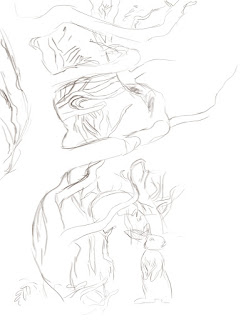
Beginnings of digital pencil sketch

In the above image, I've begun to map the darkest areas
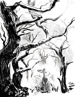
After I had blocked in the darkest trees, I added additional layers to fill in the background shading.  By having the cross-hatched background shading on a different layer, I could erase areas of it without damaging the main shapes.  This came in very handy when I decided to add some shafts of sunlight to the image. As I continued to work, I began to deviate from the original photo and started adding branches and leaves where I thought the image could use some texture and visual interest.
Here, I'm filling in the background with lots of cross hatching.
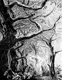
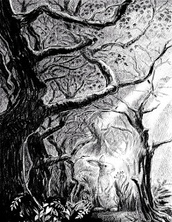
As I darkened the background, I decided to add some rays of sunlight, to help guide the viewer's eye toward the rabbit.

Finally, after finishing the image in black and white, I decided it might be fun to do a colored version.  Since I had created the black and white image on several layers it was easy to add another layer underneath to create the color.  All I did was flatten the black and white layers to a single layer and changed the resulting layer to a 'multiply' blending mode, which allowed the color to show through in the white areas.


Above is the finished piece and below, you can see what the watercolor layer looks like without the pen and ink layer.