Showing posts with label Painter software. Show all posts

Monday, August 26, 2013

Illustration Friday - Rescue


Final image
This week's 'Illustration Friday' challenge is the word "Rescue," and I am submitting a piece that I actually created three years ago. It was a piece I did for fun, my attempt at creating an image that looked like it might have come from a Little Golden Book.

I always loved the Richard Scarry books and his illustrations showing towns populated entirely by animals. In my illustration, an elephant is being rescued by a squad of dalmatian firemen.

Before I began painting (the final image was created in Painter 11), I created a few thumbnail pen and ink sketches in one of my sketchbooks.

You can see in the first rough sketch that I originally had quite a different look for the dog climbing the ladder. I didn't like his snout, so I changed it to a more boxy shape.


Once I was happy with my character designs, I created a cleaned up sketch. From there, I began filling in blocks of color, using Painter 11's chalk and pastel brushes.
Cleaned up sketch created in Painter 11

Starting to fill in areas of color


For the final stepped, I gave the elephant a warmer tone and some reflected light from the flames. This helped her to stand out more from the gray building. 


Monday, December 17, 2012

Illustration Friday - Snow

We've been having a mild fall here in Indiana, no snow so far and there's none forecast for the near future. We do have a lot of cardinals around and when I saw this week's Illustration Friday challenge, which is the word "Snow," I thought of how pretty a red cardinal looks against a snowy backdrop. I created my image as a quick watercolor sketch in Painter 12. I started off with a digital pencil sketch (see below) and added the watercolor on a separate layer.

After coloring the bird, I used one of Painter's Bleach Splatter brushes to make some spots on the bird's feathers (see detail below). After that I used Painter's Real Watercolor Scratch brush to draw some snowflakes over some of the bleach spots (detail below). I decided to leave the background white to further enhance the feeling of a bird on a snowy day.


digital pencil sketch

detail of the bleach spots created with the Bleach Splatter Brush

Snowflakes drawn with Painter's Real Watercolor Scratch Brush


Wednesday, July 18, 2012

Illustration Friday - Lost

I've been very lax about posting to this blog.  Lately, I've become addicted to tumblr and have two blogs there where I post sketches and other items of interest with minimal writing attached (vincentdesjardinsdraws and Jumbled Planet).

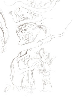
But, today I wanted to post and talk about the image I submitted for this week's "Illustration Friday," challenge which is the word 'Lost.'  I was originally inspired to create this illustration by a photo of a spooky, moss covered forest (you can see the original image, below left).  I created the final image in Painter, but before I began, I opened the photo in Photoshop and created a threshold layer so that I could better see the lights and darks in the image. I then used this as a visual reference to create the darkest shapes in my image.


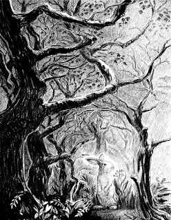
From there, I began sketching in Painter 12.  Originally I had thought to do this as a digital oil or gouache painting, but then I thought it might be more dramatic to do it as a black and white digital pen and ink drawing.  From the very start, I knew I had wanted to have a rabbit in the image.  I like rabbits and I thought it might provide some tension to show an innocent looking little rabbit lost in this rather imposting and dramatic looking forest.
Beginnings of digital pencil sketch

In the above image, I've begun to map the darkest areas
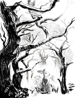
After I had blocked in the darkest trees, I added additional layers to fill in the background shading.  By having the cross-hatched background shading on a different layer, I could erase areas of it without damaging the main shapes.  This came in very handy when I decided to add some shafts of sunlight to the image. As I continued to work, I began to deviate from the original photo and started adding branches and leaves where I thought the image could use some texture and visual interest.
Here, I'm filling in the background with lots of cross hatching.
As I darkened the background, I decided to add some rays of sunlight, to help guide the viewer's eye toward the rabbit.

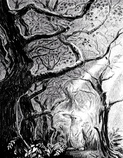
Finally, after finishing the image in black and white, I decided it might be fun to do a colored version.  Since I had created the black and white image on several layers it was easy to add another layer underneath to create the color.  All I did was flatten the black and white layers to a single layer and changed the resulting layer to a 'multiply' blending mode, which allowed the color to show through in the white areas.


Above is the finished piece and below, you can see what the watercolor layer looks like without the pen and ink layer.


Tuesday, September 27, 2011

How to Be Ferocious - Illustration Friday - Ferocious

For this week's 'Illustration Friday' challenge, which is the word "Ferocious," I stuck with the first idea that popped into my head, which was little children acting like ferocious beasts. I started off by doing some digital sketches using the 2B pencil brush in Painter 12. Originally I thought I would do a whole series of sketches, but I ended up just doing two which I then painted using Painter 12's new watercolor brushes (which I really like by the way).


I started out with a sketch of a child wearing a headband with attached animal ears.  A long, cloth belt tied around the waist makes a tail. He/She (at this point the sex hadn't been decided) is trying to scare a kitten. 


I then did another sketch, adding a boy in a similar pose but facing the opposite direction. 


As I began to refine the sketches, the first child turned into a little girl in her pajamas. She is imitating the lion that is depicted on her pajama top. The little boy is trying to frighten a puppy. As I refined him, I gave him pajamas with a dinosaur on the top and put him in slippers that looked like alligator heads. 


After finishing and cleaning up the sketches, I began painting them using Painter 12's new watercolor brushes. For painting the figures I used the Digital Watercolor 'New Simple Water' brush and the 'Coarse Mop Brush.' For the blue background, I used one of my favorites of the new brushes that come with Painter 12 - the Real Watercolor 'Fractal Wash' brush. This brush acts and looks like a real wet wash, and the speed at which it paints is greatly improved over previous versions. It's a great brush for adding a wet looking, fuzzy background.

At this point, I also added in another sketch of the first little girl, showing her sneaking up on the kitten. I liked the idea of showing a sequence, but it wasn't going to work with the image of the little boy and the dog, so I decided to split the illustration into two illustrations.  The boy and the dog now became a separate image.


Tuesday, September 20, 2011

Illustration Friday - Mesmerizing


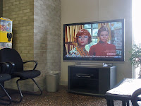
I had several ideas for this week's 'Illustration Friday,' which this week is the word "mesmerizing." The idea I ended up using came to me while I was sitting in an auto-shop waiting room, waiting to get my oil changed and my tires rotated. There was a big screen TV in the room that was set to a channel playing old sitcoms. I had brought a book to read, but I had a hard time concentrating on it. The giant TV, which was showing an old episode of 'Bewitched,' was so mesmerizing that I found my eyes constantly drifting away from my book to look at the screen. Since there was no one else in the room, I finally got up and turned the sound down, which helped a little as far as concentrating on my book went.

So, from that experience I came up with the idea of a waiting room filled with children. All of the children in the room, with the exception of one little girl, find the TV to be mesmerizing. The child who is not watching the TV, is mesmerized by her book and would rather read.  This is my first image that I started and finished using the new Painter 12 upgrade (I did take a side trip into Photoshop to add some filters, but more about that in a minute).

Since it's small enough to fit in my pocket, I almost always carry my camera with me.  For this illustration I consulted a reference photo that I took while in the auto-shop waiting room (see photo at right). From there, I made a digital sketch. I knew I wanted to have the little girl and her book off to one side of the image, so I started by arranging the chairs and figures. After the initial sketch, I did another one where I refined the figures and darkened the lines.

Once I was happy with the sketch, I started doing some coloring. On a separate layer, I filled the canvas with a soft yellow color to give the image some overall warmth. Then, using the Digital Watercolor 'New Simple Water' brush, I began to color in the background and shapes. You can see my progress in the images below (Click on any image to see it larger).

As I worked, I created lots of layers so that I would have the flexibility of changing the opacity of different objects and adding special filters to some areas.  When everything was colored, I saved the image as a Photoshop file and then opened the image in Photoshop CS4.  In Photoshop, I used a third-party filter called Mister Retro (made by Permanent Press) to add some speckled texture to the various layers of color. The second to the last image in the progression (see below), shows the image with all of the coloring finished in Painter, prior to adding the filters. The last image in the progression shows a screen shot of the finished image, re-opened in Painter, after the Mister Retro photoshop filters had been applied. In this image, you can see all of the layers I created while working. I reopened the image in Painter in order to add some shadows on the little girl and under the chairs. I created the shadows on their own layer and painted them using Painter's Smart Strokes 'Textured Chalk' brush.

Wednesday, August 31, 2011

Have You Ever Made a Prank Call? Illustration Friday - Disguise

Yesterday I read an article about how to create blog headlines that will catch the attention of readers. One of the ways suggested was to make the headline a question.  Lest you think my headline is just an attention getter and has no relation to this week's post, read on.

The word for this week's Illustration Friday is "Disguise." I put off working on this challenge all week. I just didn't feel inspired. Yesterday I sat down and decided I would do something, even if it was just an illustration of a kid in a Halloween costume. That's a disguise, right? As I was sketching, I started to think about what else can be disguised other than one's appearance. Right away I thought about someone disguising their voice. That led me to thinking about prank phone calls. Prank phone calls made me think of the old Joan Crawford film, "I Saw What You Did and I Know Who You Are." This film, from 1965 was directed by William Castle, king of shlocky horror films and theatrical gimmicks. He's the man who put buzzers in the seats of one theatre showing his film, "The Tingler," so that when the Tingler appeared on screen, audience members would get a mild shock or tingle in their rear.  Anyway, "I Saw What You Did," is about two teenage girls, Libby and Kit, who make a series of prank phone calls. They call people at random and tell the person answering the phone, "I saw what you did and I know who you are." One of the people they reach has just committed a murder and is convinced that the caller is a witness.  Murderous consequences ensue.

Libby and Kit get in over their heads
So that was my inspiration for this week's illustration. I googled a few photos of telephones and found a photo from the film that served as further inspiration.

I didn't want to try and copy the photo, I wanted to make my kids younger, but I did reference it from time to time to look at how the phone was held and the lighting effects on the girl's hairstyles. I had a real problem designing the girl on the right. I sketched several versions of her until I finally managed to get her to look the way I imagined her in my head. You can see some of my earlier sketches below.

In creating this illustration, I did a series of preliminary digital pencil sketches in Painter 11. To create the final illustration, I primarily used three of Painter's brushes: the Dull Conte brush, the Acrylic Captured Bristle, and the Grainy Water Blender. For some of the details I used the Real Sharp Colored Pencil brush and for adjusting the shading, I used the Broad Water Brush. I started by blocking out my shades of gray, then went in and did some blending. I then added some details, did some more blending, added more shading, then more blending, etc. I went back and forth this way for quite a while. I ended up spending about 4 hours on this illustration, which was much longer than I had originally anticipated it would take. Unlike how I usually work, I created most of the image on one layer. The exception was the phone cord which I gave its own layer so that I could blend and adjust the figures behind it without obscuring the coiled cord details.

Here are some of the early sketches. My original drawing consisted of a lone girl sitting on her bed. She is holding a cloth over the phone receiver to disguise her voice. I wasn't happy with this and I was afraid I wouldn't be able to paint the cloth convincingly enough. Since it would be obscuring part of the phone, I was afraid it would end up confusing the viewers. So in the next version, I added the second girl, who is leaning toward her friend so she can listen in.  I also decided to get rid of the cloth. Instead, I decided to show the caller placing her hand over the receiver. That way I wouldn't be hiding any of the phone.

By the way, my experience with prank phone calls is pretty limited. I do remember as a kid making a few with my sister and cousins. I think we called people and asked them if their refrigerator was running.  When they said, "Yes, it is," we replied, "Well, you'd better run and catch it."

Sunday, July 24, 2011

Illustration Friday - Perennial

It's been a while since I've had time to create an illustration for 'Illustration Friday," but when I saw that this week's word is 'Perennial,' I decided I should give it a go, especially since I just finished the big project I was working on.  Anyway, being a gardener, the first thing that came to my mind when I saw the word 'Perennial,' was flowers.  When thinking of a way to depict the word, my mind drifted to thoughts of my grandmother who, from what I've heard, was an avid gardener. She died when I was seven years old and my memories of her are vague, but I do have memories of being in her Colorado garden, or what was left of it. By the time I was born, most of her gardening days were behind her and all that was left of her garden were some of the perennials that came back every year. So this illustration, a digital watercolor created with Corel Painter 11, is a tribute to my father's mother, whose name was Augusta Desjardins. An appropriate name for a woman who loved to garden.


Sunday, June 05, 2011

Illustration Friday - Shadows

For the past couple of 'Illustration Fridays,' I've used work that I had previously done that seemed to fit the theme. At the moment, I'm in limbo over the final details of an illustration job (an actual paying job!), so I decided I would paint something new for this week's 'Illustration Friday' word challenge which is "Shadows."

I actually ended up creating two pieces on this theme, both involving trees and their shadows. My first attempt was a digital pen and ink drawing that I created from my imagination. I'm not very good at drawing trees without a reference, so I'm not completely satisfied with this first attempt (see image at left). I'm especially dissatisfied with the middle tree, maybe because its branching structure is too symmetrical. I also couldn't get the shadows on the ground to look right.

I decided to give it another try, this time using Painter's digital oil brushes. But this time I also decided to use a photographic reference. I love photographing trees, especially in the fall when they put on their colorful show. I took this panorama photograph last year in Bryan Park which is just a couple of blocks from where I live.


I made a sketch based on the tree that is just to the left of center. Here is my image at an early stage with the sketch still visible. I wanted this to be a somewhat loose and impressionistic piece, so I kept my sketch fairly minimal. I started off painting with fairly light tones.  As I went along, I added new layers with darker glazes. Every once in a while I would collapse the layers so that everything was on one layer and then, when necessary, I would add a new layer and once again add darker glazes. I created my glazes by using Painter's Wet Oily Blender brush set to a low opacity. Since I would paint these glazes on their own layer, I could also layer the opacity of the layer itself, which gave me much more control over how dark the glaze appeared.
The finished piece

Thursday, May 26, 2011

Illustration Friday - Soaked

The word for this week's 'Illustration Friday' challenge is "Soaked," an appropriate word for this week considering the number of storms that have passed through where I live. This is a piece that I actually did a few weeks ago as an experiment in using Corel Painter's Liquid Ink and Watercolor brushes. The idea came from something I witnessed on one of the many daily dog walks that I take with my dog, Poppy. One day, after a spring shower, we were out walking and saw a young boy and girl out playing with their umbrellas in the puddle-filled streets. Since it was warm out, they were in shorts and didn't seem to mind getting a little soaked. That afternoon, I created this illustration based on my memory of those two kids playing in the rain.

I started this illustration with a simple digital sketch, using Painter's Colored Pencil brush.


After sketching in the children, I began inking them in and adding some ink splatters to the background.

I continued to add layers of ink and watercolor washes.


Here I've added an overall wash of color to tone down the stark white background that was showing through.

You can see that by this stage, I've changed the color of the ink I used to outline the children. I started off with a brown ink and here I've changed it to black. I also decided to give the umbrellas a white ink outline.

The finished image. For the final step, I softened some of the watercolor edges and lightly erased some areas to give a better feeling of light reflecting off of the puddles.