When I first saw the word for this week's 'Illustration Friday' challenge, which this week is "Chicken," I wasn't sure of what I wanted to do. All I knew was that I wanted to do something somewhat retro looking. My first sketch showed a chick with a worm in its mouth being chased by a mother hen while another chick comes running in from the side. For some reason I couldn't get the sketch to look the way I imagined it in my head, so I tried again. This time I decided to eliminate one of the chicks from the foreground and to have the hen and chick pursuing the worm (which I decided to turn into a caterpillar). By doing this, it allowed me to make the hen and caterpillar larger and therefore give me some space to show a facial expression on the caterpillar.
 |
| First Sketch |
 |
| Revised Sketch |
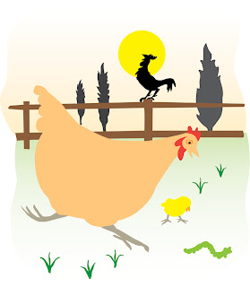
After I was happy with the sketch, I placed it into a new Adobe Illustrator file where I started to draw the basic color shapes (I could have done this in Painter, which I used for doing the sketch, but I don't like Painter's shape tool as well as I like Illustrator's).
To the left is the image after I traced the basic shapes in Illustrator. From here, I exported the file as a Photoshop file where I used a Mister Retro filter on the shapes to give them the appearance of a vintage print. With Mister Retro you can make it look like the ink has been scuffed or even out of register. You can also add halftone dots.
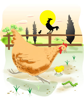
Once I finished adding the Mister Retro filter, I reopened the file in Painter where I used some of Painter's brushes to add in detail. If I knew more about Photoshop's brushes I could have finished the image in Photoshop, but I find Painter's brushes unbeatable when it comes to imitating chalks, pastels, conte crayon, watercolor and leaky pens.

To the right is the image after I started adding some details in Painter.
At this point, I was pretty happy with the image and could have called it quits, but then another idea struck me. While working on this image I had come across an old card game from my childhood. It was a card game based on the Rocky and Bullwinkle cartoon show. I have always loved the graphics on card games from the 1960s so I decided to try and make my image look like a vintage children's playing card. That was my first idea anyway. As I continued to work on the image, I began to think that it might be even better if I tried to duplicate the look of an old card game box.
Here is the original box from the Bullwinkle card game. I scanned this box and then removed the illustration in Photoshop so that I would have a blank background to work with.
 |
| Image with the layer mode set to Darken |
I pasted my image of the chicken over the blank box and scaled it to fit. I changed the layer mode to darken, which made the image somewhat transparent allowing the textures from the box to show through. But because this also made the colors too dark, I decided to duplicate the chicken layer and to place the new layer under this original layer. I changed the layer mode on the new layer to screen. This caused the colors on this layer to brighten almost to the point of looking washed out, but when viewed through the layer above it, it made the colors look just right.
 |
| Image with layer mode set to Screen and the above Darken layer turned off |
 |
| Image with both the Darken layer and the Screen layer visible |
The last step was adding in the text. I decided to call my fictional game "Who's Got the Worm?" because that sounded to me like the name of a children's card game. After trying a few fonts, I ended up using one called Saddlebag. I played around with distorting it a bit, being careful not to make it look like a computer distortion (I wanted this to look vintage after all). Once I got the letters to look the way that I wanted, I duplicated the text layer. With the lower of the two text layers, I rasterized the type, selected it and then expanded the selection by 20 pixels. Then I added a red stroke to the outside edge of the selection. By expanding the selection it gave the stroke some distance from the original text on the layer above, so it looked like an outline that was drawn around, but not touching the original lettering. I then ran the text through a Mister Retro filter to give it the scuffed, vintage printed look that I had given the illustration and then lowered the opacity a bit so that some of the texture of the box showed through.


