Showing posts with label digital watercolor. Show all posts

Sunday, March 10, 2013

Illustration Friday - "Yesterday"


Click illustration to see it larger
As someone who has a hard time of letting go of his past, I’ve often associated the word “yesterday” with a feeling of nostalgia. I especially get nostalgic for my childhood, a time when I was closer to my sister and lived in a home where I felt safe and secure. I didn’t come from a perfect family, we definitely had our dysfunctional problems but I won’t go into those problems here. Despite our dysfunctions, I felt cared for and loved by my parents and even when I was younger, I think I knew they were spoiling my brother, sister and me.  

I was sick a lot as a child and because of this I missed a lot of school. My bedroom became my refuge and safe haven. I was a shy and inhibited child, afraid of much of the real world and my room, with all of its books and toys, became the only place where I felt safe and secure. I remember thinking that I would be perfectly happy to spend the rest of my life in my room. 

For this week’s Illustration Friday challenge, I’ve drawn an affectionate portrait of the way I remember my room.  It represents ‘yesterday’ to me because I often feel as if my childhood in that room took place only yesterday. I find it hard to believe that it’s been over 40 years since I could legally be considered a child. It really does seem like yesterday that I was curled up on my childhood bed and reading the Oz and Narnia books.

I’ve tried to include a number of things that were actually in my room at one time or another. I always had a lot of stuffed animals and dolls on my bed, a few of which I’ve shown in the drawing, including a Raggedy Ann doll, a plush green snake, a large dalmatian, several bunny rabbits and a teddy bear.  Above the bed, sitting on the headboard is a large papier mache cheetah that I made when I was 11 or 12.  On my walls I had thumb-tacked several posters, including a reproduction of a 1920s poster for  “The Thief of Bagdad,” starring Douglas Fairbanks (shown on the wall behind the cheetah). I remember I also had a poster showing a ruined castle in Ireland (you can see a portion of it on the right edge of my illustration).  The floor was made up of linoleum tiles in various shades of speckled browns and tans.  For awhile I had a large, oval braided rug that took up most of the floor space.  At the base of my bed I remember having a decorative green cardboard box that had a flowered lid. There were often newspapers stacked on this box because for a while I used to cut out and save the ads for my favorite movies.  The curtains on my window were beige and patterned with green, blue and tan representations of colonial shop labels and broadsheets. My room faced our backyard and from my window I could look out on to our backyard with its oval swimming pool and the brown mountain that rose up a block away from our property.

Even after I moved away from home in the late 1970s, my parents continued to live in this house so I often returned for visits.  Some time in the mid to late 1980s disaster struck my room in the form of a busted water heater which was in a service porch behind my bed. When the water heater broke, it flooded my bedroom, damaging many of my record albums and anything else I had stored on the floor. The linoleum was also damaged and had to be replaced. After this disaster, many of my things were put in storage and moved to other parts of the house. From that time on, my room never felt the same again. It no longer looked, or felt, like the room I had grown up in. 

I created the illustration using Painter 12's "Real" watercolor brushes and a customized "Pen" brush.

Monday, December 17, 2012

Illustration Friday - Snow

We've been having a mild fall here in Indiana, no snow so far and there's none forecast for the near future. We do have a lot of cardinals around and when I saw this week's Illustration Friday challenge, which is the word "Snow," I thought of how pretty a red cardinal looks against a snowy backdrop. I created my image as a quick watercolor sketch in Painter 12. I started off with a digital pencil sketch (see below) and added the watercolor on a separate layer.

After coloring the bird, I used one of Painter's Bleach Splatter brushes to make some spots on the bird's feathers (see detail below). After that I used Painter's Real Watercolor Scratch brush to draw some snowflakes over some of the bleach spots (detail below). I decided to leave the background white to further enhance the feeling of a bird on a snowy day.


digital pencil sketch

detail of the bleach spots created with the Bleach Splatter Brush

Snowflakes drawn with Painter's Real Watercolor Scratch Brush


Saturday, December 15, 2012

Evolution of an Illustration

I was recently commissioned by FarFaria to illustrate Clement Moore's classic Christmas poem, "Twas the Night Before Christmas."  FarFaria is an app for the iPad and their stories are published for that device (to be honest, I'm not sure if they can be read on other tablet devices or not).  This version I created for them is due to be released on December 24th.  Here is a sneak preview of the evolution of one of the images I created for the story.

Storyboard panels for pages 9-12
Designing for the iPad can be a bit of a challenge.  Unlike a traditional picture book where you have the ability to have an illustration cross over the page gutter (the division in the middle of the book where the pages are joined) to cover two pages, an illustration for the iPad is limited to the size of one screen at a time. For FarFaria's app the main part of the illustration needs to fit within an area approximately 6 x 7 inches (the text will cover the lower portion of the illustration, so any important information needs to be in the aforementioned dimensions above the text).


For this job, the art director requested that I create the illustrations in a specific style. He cited an older illustration of mine from my website that he liked and asked me to create the story in that style. The first step in creating the illustrations was to draw storyboards, one sketch for each page of text. I created these as digital pencil sketches, four to a page. Once these had been approved, I enlarged the sketches to the appropriate size and refined them. For this blog I will be showing the evolution of page 12. All of the art was created in Painter version 12.


Above is the enlarged story board sketch that I used for my digital inking
On a new layer above the sketch, I have begun inking the final line work.


Above is the final inked line art

On separate layers, using digital watercolor brushes, I have begun to color the image


The next step is to start adding shadows

The final image with some darker shadows


Thursday, May 31, 2012

Illustration Intensive with Joann Hill

I recently attended the SCBWI's regional conference for Indiana where I participated in an Illustrator's Intensive with Joann Hill, the Design Manager for Disney Hyperion. As part of the intensive we were given an assignment to create prior to the conference.  We were allowed to choose from several texts that were chosen by Ms. Hill.  From her list, I chose to illustrate three different nursery rhymes.  We were required to do two picture book spreads, so I put two of the rhymes on one spread and gave the third rhyme its own spread.

Prior to beginning, I played around a little bit, experimenting with some techniques in Painter 12, which is the program I use for most of my illustration work. One of the rhymes I chose to do was A Misty Moisty Morning which tells of a child meeting a man dressed all in leather. I knew right away that if I wasn't careful, this could end up looking rather creepy. To try and negate the creepy factor, I did two things - First, I made the old man VERY old by giving him a long white beard, glasses and a cane.  I tried to make him look harmless and sweet.  Secondly, I gave the child, a dog.  People are always asking me if they can pet my dog, so I thought a dog would be a good reason for the interaction between the old man and the child.

My experiment, which you can see above, was created by using painter's gouache brushes and some of the liquid ink pens.  I ultimately decided against this technique and ended up using painter's 'real' watercolor brushes.  But prior to starting on the finished spreads, we were asked to email Joann detailed pencil sketches so that she could give us feedback before we began our final paintings.

(By the way, you can click on any of these images to see them larger).

She liked my handling of the old man and the child very much but she felt that there were a couple of problems with the illustration for the second rhyme on the right side of the spread.  The second rhyme I chose for this spread was "Simple Simon."  She felt that my pieman looked a little too sly and the black crow standing on his backside, made him look a little too ominous.  She also thought the boy looked too powerless.  She felt that changing their facial expressions would help even out the dynamic between the two characters.

For the final painting, I changed the facial expressions on both the pieman and the boy and I changed the crow into a smaller, friendlier looking blue jay.  

For the third rhyme, which was to go on the second spread, I chose "The Old Woman Who Lived in a Shoe." Since she is supposed to have so many children she didn't know what to do, I thought this would be a good opportunity to draw lots of kids engaged in various activities. 

Below is a very early sketch, before I began to fill in many of the details.


Below is the finished sketch that I submitted for feedback.


She loved the positioning of the shoe and all of the activity going on with the kids.  She especially liked the two children in the left foreground - the little boy teasing his sister with a frog. The suggestions she made on this illustration were fairly minor.  She suggested that I have the boy hold the frog even closer to the girl's face. She also wondered why the old woman was scolding the one little boy so she suggested that maybe I show him with a paint brush and show that she has caught him painting grafitti on the shoe. In the upper right window of the shoe, she wondered why two children were in bed when all of the other children were outside playing.  

Below is the final painting that I brought with me to the conference. 


At the conference she looked at our final work and compared them to what we had originally sent to her.  She seemed happy with all of the changes I made but she had a few comments on the colors for both illustrations.  In the Misty Morning/Simple Simon piece, she felt that the figures needed to be a little darker to make them pop out more from the background.  She felt that the pieman's shirt blended in to the background while his pants really stood out.  She also felt the old man could be a couple of shades darker.  In the Old Woman in the Shoe painting, she felt the shoe needed to be darker.  After I got home, I worked on both illustrations and implemented her new suggestions.  Below are the two finished pieces which I have added to my portfolio.  


It was a fun project and it was a privilege to get to work with Ms Hill.  I felt she had a real knack for seeing what worked and didn't work in my illustrations and her comments definitely helped turn them into better illustrations.  


Sunday, May 13, 2012

Illustration Friday - Kernel

The 'Illustration Friday' word for this week is "Kernel."  A corn kernel is the first thing I thought of, the second thing was popcorn. I abandoned the popcorn idea and instead drew a little mouse clutching a kernel of corn. I know people who cringe at the thought of rodents and I know they are a big problem for farmers when they get into their stored grain, but I decided to put those thoughts out of my mind and concentrate on creating a cute little mouse. I created this image using Painter 12.  I started out with a digital pencil sketch and then colored it with Painter's 'real watercolor' brushes.  I'm pretty happy with the way it turned out.

Monday, April 30, 2012

What Makes You Jump?

"Jump" was this week's 'Illustration Friday' word and I had quite a bit of fun coming up with ideas.  Since I couldn't decide which idea I liked the best (and since I was also looking for a way to procrastinate working on another project), I actually ended up doing three interpretations.

My first idea was to see if I could make the word itself into things that seemed to be jumping. My first sketch was with letters shaped like people, but I couldn't get that idea to work, so I tried it with animals. The "J" duck, the "U" fish and the "M" dog came easily but I had a hard time coming up with something for the "P." First, I tried a Giraffe, but, even with it's long neck, it wouldn't cooperate.  When I thought about the elephant and it's trunk, I knew I had my solution.

My next idea was inspired by my dog.  Fortunately she doesn't have fleas, but she does scratch herself once in a while, which gave me the idea for this drawing. Fleas are powerful jumpers.  I think I read somewhere, that a flea's jumping ability, if it were translated to a human equivalent would be like a man jumping over a building.  I actually did two versions of this drawing.  In my first one, I sketched the dog very quickly and though I liked its face, the body seemed too rigid and stiff. I was going to go with it anyway until at breakfast this morning my dog began scratching and I could see all of the problems with my original pose.  So, I tackled it again.  I've put the two of them side by side so that you can see the difference.  The one on the left is my first attempt.  On the right is my final version.  You can see I decided to add some more fleas. I also changed their size and the color of their trajectory lines.

I hadn't planned to do a third interpretation but this idea came to me this afternoon and it seemed too great to pass up. I did it fairly quickly, in just under an hour, using Painter 12's 'real' watercolor brushes. I think anyone who's gone to see a good scary movie can identify with what it's like to almost jump out of your seat when an unexpected scare is sprung on the audience. I wanted this illustration to have a spontaneous and 'alive' look to it, so I didn't do much in the way of cleaning up the watercolor.  I used 4 or 5 layers and painted in the dark blue gray first.  I like the way it sort of pooled into dark spots behind the figures, almost as if the light from the movie they're watching is casting a shadow behind them.


Tuesday, April 24, 2012

Illustration Friday - Heights

Giraffes see the world from great heights, which is why I chose it as my subject for this week's 'Illustration Friday' challenge which this week is the word "Heights."

I've been playing around lately with Painter 12's watercolor brushes. I've also been using some brushes that I downloaded from Skip Allen's Painter tutorial blog. Whenever I get a chance I try and do a quick illustration where I experiment with the various brushes. This week's 'Illustration Friday' illustration is the result of one of those experiments.
I started this illustration by painting in a background and then creating a new layer where I drew a pencil sketch of the giraffe (see below). I wanted the giraffe to appear to be stretching up into the sky, the tallest thing around, but in my original sketch, he seemed kind of lonely.  Not only that, but the image seemed rather boring.


I decided I wanted to have something at the giraffe's eye level, so on another layer I sketched in a flying bird.  To emphasize the giraffe's height, I decided to have him towering over some shrubs. To paint the giraffe's body, I created another layer and, using one of the soft chalk brushes, filled in the body's shape in a light tan. Above that layer, I placed a new watercolor layer where I painted his spots.  On yet another layer, I used some sketchy pen brushes to draw in his eyes and also to add a few lines to his face and legs.


Next, on a separate layer, I played around with adding another tree.  But when I added the large tree, suddenly the giraffe didn't seem so tall, so I got rid of it. I also ended up changing the foliage underneath the giraffe. It originally looked too dark and thick, so I thinned it out a bit and lightened the color.
As you can see in the final image (see below), I ended up flipping the bird horizontally over to the right side of the giraffe. 


Saturday, April 14, 2012

Illustration Friday - Puzzled

Another Friday has come and gone and with it, another 'Illustration Friday' challenge. This week the word is "Puzzled." For some reason, this word made me think of that scene in Disney's "Dumbo," where the little elephant wakes up after his accidental drinking binge and discovers that he is up in a tree.  Of course he's puzzled by this, how in the world did he get himself up a tree? Of course the audience knows that he flew up into the tree with his gigantic wing-ears.  Anyway, my dog is obsessed over squirrels and I know she would do anything if she could get up in a tree to catch one.  I know I would certainly be puzzled if I went out into our yard and found her sitting up in a tree.  So that's where I got my inspiration for this week's word.

Lately, I've been doing some experimenting with Painter 12's real watercolor brushes which is what I ended up using to create the finished artwork. By the way, you can click on the image to see it larger. I did several sketches before I finally got the dog and the little boy the way I imagined them.  My progression of sketches is below.


Wednesday, April 11, 2012

Illustration Friday - Vocal

My first thought for the word 'Vocal,' which is this week's "Illustration Friday" challenge was of someone singing or yelling.  When I sat down to start sketching I began to draw a little boy.  During my lunch break, just prior to beginning this drawing, I had watched an early episode of "The Andy Griffith Show," and my drawing ended up looking like Opie Taylor as played by a very young Ron Howard. When I realized I was turning him into Opie, I googled the character and came up with a reference photo of Opie singing (or maybe he's yelling, though I don't recall too many episodes where Opie yelled). Anyway, I used the photo as a guide for the mouth, but as you can see I made some changes. I gave my boy, a gap in his teeth and I decided to have his eyes open.  I also turned his head slightly.


Below are a couple of early pencil sketches.  As I worked on the image, I decided the composition needed something else so I added a dog, which I based on a photo of my own dog, Poppy. The pencil sketches, as well as the finished illustration were done using Painter 12.


First sketch
Sketch after some clean up and shading

Thursday, December 15, 2011

Illustration Friday - Separated

I've been very busy getting ready for one more holiday craft fair so I only had time to do a quick sketch for this week's word which is 'Separated.' I'm not sure what made me think of this idea, other than that I know how painful it can be to be separated from an animal that you love.

At one point in the development of this sketch, I had the mother looking very mean and perturbed by her child's behavior. But I decided to go back to a more worried looking mom.  You can see the sketch of the mean mom below.

Monday, October 03, 2011

How Would You Hibernate? - Illustration Friday

This week, the word challenge for 'Illustration Friday' was "Hibernate." In announcing the challenge, the host of the site provided this quote from Anais Nin: 

"You live like this, sheltered, in a delicate world, and you believe you are living. Then you read a book (Lady Chatterley, for instance), or you take a trip, or you talk with Richard, and you discover that you are not living, that you are hibernating. The symptoms of hibernating are easily detectable: first, restlessness. The second symptom (when hibernating becomes dangerous and might degenerate into death): absence of pleasure. That is all. It appears like an innocuous illness. Monotony, boredom, death. Millions live like this (or die like this) without knowing it. They work in offices. They drive a car. They picnic with their families. They raise children. And then some shock treatment takes place, a person, a book, a song, and it awakens them and saves them from death."


Hibernate detail
This is not how I picture hibernation. First of all, I don't think of it as a restless condition.  Restful, yes, but not restless. An absence of pleasure? I suppose that would be true if you define hibernation as withdrawing from life. My idea of hibernating is to stay in bed, which can be a most pleasurable thing to do, especially if one has a good stack of books at the bedside. I suppose my idea of hibernation is probably closer to the concept of cocooning. In other words, not going anywhere, staying inside surrounded by the things that comfort you. 


When I think of hibernation, I always think of bears. So, in my illustration I have depicted a bear, cozy in bed with a couple of stacks of books. He's not quite ready to hibernate yet, he wants to spend some time reading first. I've also given him a pal - down at the foot of the bed, is a little mouse with his own blanket and pillows and even his own books (see detail at right, click on images to see them larger).

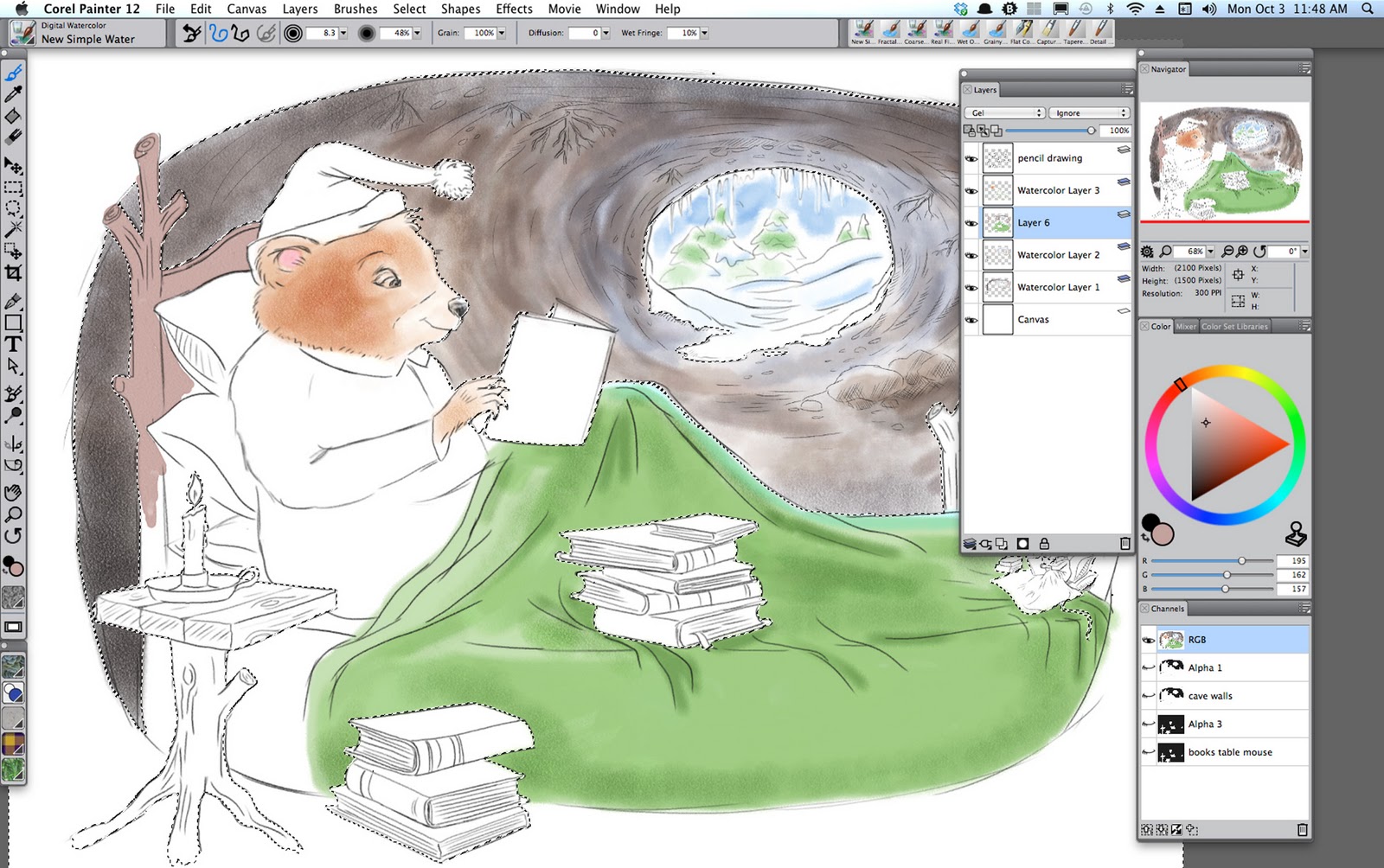
I created this image in Corel Painter 12 and I worked in a slightly different manner than I have in the past. First of all, I spent more time on my pencil sketch. I did a number of sketches until I got the bear looking just right. Once I had the bear the way I wanted him to look, I tightened up the sketch and made a cleaner drawing. In the past, I've inked in my drawings, but this time I decided I would keep the sketch visible and not use any ink pens. Another thing I did that I don't usually do was to create selections so that I could paint in areas while protecting others. I created the selections by creating new alpha channels and painting the areas I wanted to protect in opaque white on the alpha channel.  Once I had the areas painted that I wanted to protect (think of this as applying a frisket mask to watercolor paper), it was easy to load and save these areas as selections. 

First sketch
Second Sketch
Third Sketch
Fourth Sketch
Fifth Sketch

Final Sketch


Starting to paint, I protected certain areas by using selections created from alpha channels

Screen shot showing selection
Almost done. I completed the illustration by adding some darks and some colored pencil details