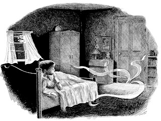
 Last fall, in order to strengthen the black and white section of my portfolio, I began creating some digital pen and ink illustrations based on scenes from a young adult novel I had recently finished reading. The book, "The Hounds of the Morrigan
The illustration that I am featuring in this post is from a scene that comes fairly early in the story. After 10-year-old Pidge unwittingly releases the evil serpent Olc-Glas from the pages of a crumbling manuscript, he finds that he and his sister are soon being hunted by the Morrigan, the Goddess of Death and Destruction. In this scene, Pidge who is not yet entirely aware of the dangers he has unleashed, wakes in the night and discovers that something has entered his room. Here is the passage:
"It was a cold, hissing, tinkling sound and it came from the landing outside his bedroom door. He sat up, eyes wide open.
There was something coming in from under the door: a thin, snaky tendril of fog. It crept into his room, keeping low on the floor. It began touching things and creeping into things. It whispered to itself as it crept towards his chest of drawers and then it insinuated itself through all the cracks, until it had been in and out of every drawer. It withdrew then, and paused as though to think before turning towards his wardrobe, as if it had an intelligence and could make decisions for itself."
The main challenge of this illustration was to create an atmospheric scene in what is basically a darkened room. I decided to have a full moon outside as one source of light, that would also provide some reflected illumination. The other light is coming from under the door. Because of the furniture elements in the room and the perspective I wanted to use for the figure, I used Poser, a 3D modeling program to help me layout the scene. I'm not an expert at using Poser, but I know enough to position figures and to add a few props. I also know how to move the camera around so that I can select the best view. Once I got the scene close to the way I had envisioned it, I exported a low resolution tiff file of the image and then opened that in Corel Painter.
The next step was to add a new layer over the Poser scene so that I could sketch out the details of my illustration. In the image at the left you can see I have lowered the opacity of the Poser scene so that it can be used as a guide for creating my illustration. You can also see the beginnings of my sketch.
Once I had outlined a sketch, I then began blacking in the darkest areas. I used Painter's pen brushes for this, primarily the Flat Color pen and the Scratchboard tool. For the finer cross-hatch lines, I used the Smooth Round Pen 1.5. As I was inking in the blacks, I began to realize that I really needed to add some shading to my pencil sketch so that I would have a better guide for inking in my shadows.
Here is my pencil sketch with added shading, that I used as my guide for crosshatching the lights and darks.
To the left you can see the penciled image showing through from its own layer underneath the inked layer. I created lots of layers for this image. The screenshot at left shows how many layers I was using. Since I was going to be doing lots of crosshatching, having separate layers for different areas of the image made it easier to build up the darks. It also helped in case I made a mistake and needed to erase an area. By having different layers I could erase sections without having to start over again on the areas beneath it. For example I had a separate layer for the recessed panels in the bedroom door. I did the crosshatching on the door frame first, then added a new layer for the panels. If my crosshatching went over the edges of the door frame, by having it on a different layer I could clean up the edges without ruining the surrounding areas in the panels.
I began working on this illustration last November. Then, with the holidays and my preparations for going to the SCBWI winter conference, I put it aside for awhile. It wasn't until two days ago that I finally decided to tackle it again. I wish there was a way that the computer could keep track of how many brushstrokes are made when creating a digital painting. If there is such a piece of software I'm not aware of it. Anyway, I would love to know how many strokes ended up in this piece. While working on it, it felt like millions.


Awesome, what a great way to lay out a scene. I love it and I had forgotten about Poser, I have it in a drawer somewhere. I should pull it out again. I put it away out of frustration ;)
ReplyDeleteThanks Karen. Poser can be a great aid for tricky perspectives. It can be kind of frustrating to use, until you get use to it. I only know the very basics. I know you can do animation with it and put different clothes and hair on the figures, but that's way too advanced for me.
ReplyDeleteWhat a fascinating process! I know nothing about 'poser' (useful to know about!) and I am amazed at your patience and attention to all the details and lines. Beautiful work. Thank you for sharing your knowledge and skills with us.
ReplyDelete