Monday, May 30, 2011

Illustration Friday - Asleep

For this week's 'Illustration Friday' word, "Asleep," I am using an image that I created back in April as a homework assignment for an illustrator's intensive that I attended at SCBWI's Indiana regional conference. The assignment was to create two to three 2-page spreads from "Goldilocks and the Three Bears." One of the spreads that I chose to do, shows the Three Bears discovering Goldilocks asleep in Baby Bear's bed.


This illustration went through at least four revisions before I arrived at the finished image. Before attending the intensive, I showed my work in progress to a critique group that I belong to and their comment on my first draft was that Goldilocks looked too sexy (see the image at right). As a reference for Goldilocks's sleeping pose, I had looked at Lisbeth Zwerger's version of "Thumbelina," and based my drawing on a similar pose that Zwerger used for her heroine, but what worked for Thumbelina, didn't seem to work for Goldilocks, so I went back to the drawing board.

In my next version, I tried to make Goldilocks look a bit younger and I've changed her body so that she is lying in a more level, less provocative pose. Everyone seemed to agree that this was a much better pose.

The next revision for this illustration was done  because of a change I made in an earlier spread in the story, where I decided to put Goldilocks into pants. This revision was fairly easy since the only thing involved was repainting the lower part of her body.

The final revision was made based on recommendations from Kerry Martin, the editor from Clarion books who was the conference's instructor for the illustrator's intensive.  She loved the Three Bears characters, she thought they were very cute, but she felt my Goldilocks character looked too much like an all-American girl and that there was nothing 'special' about her.  Another point that was brought to my attention was that the windows in the background didn't match the windows that I had shown in an earlier, exterior view of the bears' cottage.  So, this revision involved changing the background wall and windows and completely re-drawing Goldilocks.  It may not be evident in this pose, but notice that once again, I've tried to make Goldilocks look younger. One way that I accomplished this was to shorten her hair length and change it's color so that it's not such a 'hot' yellow.  I also changed the color of her sweater and added a ladybug pattern to her boots. These changes in the design of Goldilocks are more evident in one of the earlier spreads I revised where I show Goldilocks trying out the three chairs (see below).  In the chair spread, it's easier to see the changes in Goldilocks's appearance. Not only did, I shorten her hair, add a pattern to her boots, change the color of her clothing, but I also added a bunny design to her T-shirt.

Creating these spreads for the illustrator's intensive, and then attending the intensive was a great experience. It gave me a taste of what I imagine it would be like to work on an actual picture book project. Coming up with the concepts, designing characters and settings, submitting the work for review and doing the revisions are all components of creating a picture book. Hopefully, one day I'lll be doing it for real.

Thursday, May 26, 2011

Illustration Friday - Soaked

The word for this week's 'Illustration Friday' challenge is "Soaked," an appropriate word for this week considering the number of storms that have passed through where I live. This is a piece that I actually did a few weeks ago as an experiment in using Corel Painter's Liquid Ink and Watercolor brushes. The idea came from something I witnessed on one of the many daily dog walks that I take with my dog, Poppy. One day, after a spring shower, we were out walking and saw a young boy and girl out playing with their umbrellas in the puddle-filled streets. Since it was warm out, they were in shorts and didn't seem to mind getting a little soaked. That afternoon, I created this illustration based on my memory of those two kids playing in the rain.

I started this illustration with a simple digital sketch, using Painter's Colored Pencil brush.


After sketching in the children, I began inking them in and adding some ink splatters to the background.

I continued to add layers of ink and watercolor washes.


Here I've added an overall wash of color to tone down the stark white background that was showing through.

You can see that by this stage, I've changed the color of the ink I used to outline the children. I started off with a brown ink and here I've changed it to black. I also decided to give the umbrellas a white ink outline.

The finished image. For the final step, I softened some of the watercolor edges and lightly erased some areas to give a better feeling of light reflecting off of the puddles.

Friday, May 20, 2011

More Pen & Ink Sketchiness

A few days ago I wrote a blog about working in a sketchier pen and ink style. I so enjoyed working on that illustration, that I decided to go ahead and do another one. Like the last one, this is also based on a scene from Eleanor Cameron's "Stowaway to the Mushroom Planet," a middle grade sci-fi fantasy that was one of my childhood favorites. In this scene, the scheming and ambitious Horatio Q. Peabody is determined to get to the bottom of the secret discovery that was alluded to in a letter from Tyco Bass that was sent to his employer, the astronomer Dr. Frobisher. After tricking Chuck, David and Theodosius Bass into thinking that he's a professor, Horatio takes Dr. Frobisher's place as a guest lecturer at the boys' Society for Young Astronomers and Students of Space Travel. The scene in my illustration takes place after Horatio's lecture, when he has pretended to go to bed, stuffing his bed with pillows to make it look occupied:

"Then he turned out the light, surveyed the lump that in the darkness looked exactly as if someone were lying there, then on tiptoe he slipped out of the house and around to the cellar door. Here he hunched down behind a bush and listened. The boys and Mr. Theo were talking . . . " 

In my earliest sketch, I had Horatio standing in a sort of hunched over pose.  I didn't care for the way he looked and in order to better hide him behind the bush, I needed to put him in more of a kneeling pose.  To the right, you can see my original sketch.

To the left, you can see my original version, after I've begun to ink it in. As I continued to work on it, I became more and more dissatisfied with the Horatio figure. He was standing too far out from the bush that he was supposed to be hiding behind.
In the image on the left, you can see that I have erased the standing figure and re-sketched him in more of a kneeling pose. In this version I still don't have the legs quite right.

Building up the black shadows was the most difficult aspect of this illustration, especially the shadows around the bush and the tree. I didn't want to make them so dark that the foliage became obscured.

I'm fairly happy with the outcome. I especially like the way the light from the cellar illuminates part of the wall of the house. I'm not entirely happy with my design for Horatio, but I am happy with the way he's lit. I left enough highlights on him, to make him visible, but not so much that he stands out as a distraction.

I set out to create a scene that had a dark, mysterious atmosphere and I think the result was fairly successful in achieving that goal.

Wednesday, May 18, 2011

Sketchy Style


I've written several posts on this blog on pen and ink work and on artists like Erik Blegvad whose black and white illustrations are some of my favorites. I've also posted several of my own pieces that I've created in black and white using Corel Painter's digital pen brushes.  Most of my black and white work has been very detailed, containing lots of cross-hatching, which is extremely time consuming.

Lately, I've been reading lots of William Steig, not only his picture books, but one of his middle grade books, "Dominic," the story of a restless dog who goes out looking for adventure. "Dominic" contains some really charming black and white illustrations that are done in Steig's very loose style. Inspired by Steig, I decided I would try experimenting in a looser, sketchier style myself.

The problem that came up immediately was, 'What should I draw?' I scanned one of the bookshelves where I keep some of my middle grade books and found one of my childhood favorites, "Stowaway to the Mushroom Planet," by Eleanor Cameron, a book with no illustrations. Because I had not read it in many years, I couldn't recall off hand any particular scenes to illustrate, so I sat down to read the first couple of chapters. The early chapters serve as an introduction to the characters and since this book is a sequel to "The Wonderful Flight to the Mushroom Planet," they set the background for what happened in the first book. The main plot point that takes place is that the boys meet Theodosius Bass who is the cousin of their old friend Tyco Bass. My first attempt showed Theodosius sitting in Tyco's old chair while the boys are standing nearby. But I felt that showing these characters just sitting and standing around was uninteresting and boring so I read a little further until I came to a scene at the start of Chapter 2: Theodosius has been telling the boys about his wanderings around the world and his search for a place to call his own. He says: "'Once I thought the Aleutians might be the answer - but oh, the cruel winds, the fogs, the bitter cold! A great mist-ake, you might say, eh?' And he darted the boys a sudden, twinkling glance, and they grinned at one another and knew with certainty they were going to get along with Mr. Theodosius. 'Something you'll never fog-et, you mean!' burst out Chuck, and then he slapped his knee and roared with laughter. David looked disgusted, but Mr. Theo seemed to think it a fine pun, and laughed and laughed." Even though the characters are still in their same positions, there is a more lively interaction going on - Chuck is in hysterics, David's looking disgusted and Mr. Bass is laughing at Chuck's word pun. If you compare my first attempt (at top) with the final result, I think you'll agree that the second illustration, which shows something of the character's personalities, is a much better illustration.

Sunday, May 15, 2011

Illustration Friday - Safari

This week's word for the 'Illustration Friday' challenge is "Safari," a word that in previous generations would have conjured up images of the 'great white hunter,' with his big guns and a retinue of porters. Fortunately, for the most part, that sort of safari is a thing of the past. Nowadays, those who actually go on safaris, go with a camera in hand instead of a gun. I love taking pictures of animals, so I would love someday to go on a photo-shooting safari. Anyway, the idea of a photo safari made me think of a boy on a backyard safari, stalking the family cat with his camera.

In my first sketch, I had the boy peeking at the cat, who's trying to sleep, through the fronds of a potted palm. I wasn't happy with the boy's pose, he was too static. Sense I wanted to convey the idea that he was stalking the cat, I wanted more of a sense of movement. Before creating a new sketch, I did what I often do when I need inspiration or a reference for movement, I consulted one of my books on cartooning and animation. In this case I consulted the book "Animation," by Preston Blair. I've had this book for years, probably since I was in high school, a time when I had dreams of becoming an animator. It's a thin, paperback book, part of the Walter T. Foster "How to Draw" art book series that has been around for years (over 80 years, according to their website).

I've used this book many times in the past, it's a great resource for designing cartoon-style characters and learning exaggerated movements. It has a great page dedicated entirely to a 'sneak' animation cycle, (see page detail at left) which is what I used as a reference for my second sketch.

My digital pencil sketches as well as the finished piece were created using Corel Painter 11. In the final illustration, I used Painter's New Simple Water and Coarse Mop Brush watercolor brushes, as well as some of their pen brushes which I customized slightly to produce a more ragged, leaky looking line.

Wednesday, May 11, 2011

Pen and Ink - Digital Style Part 6, Something at the Door

Last fall, in order to strengthen the black and white section of my portfolio, I began creating some digital pen and ink illustrations based on scenes from a young adult novel I had recently finished reading. The book, "The Hounds of the Morrigan," by Pat O'Shea is a fantasy adventure novel rooted in Celtic mythology.  It's quite a long novel (over 600 pages) and as far as I know, there has never been an edition with illustrations. The story is filled with vivid scenes and characters and as I read it, I was able to easily visualize certain passages that I felt would make good illustrations.

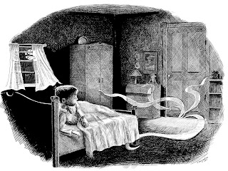
The illustration that I am featuring in this post is from a scene that comes fairly early in the story. After 10-year-old Pidge unwittingly releases the evil serpent Olc-Glas from the pages of a crumbling manuscript, he finds that he and his sister are soon being hunted by the Morrigan, the Goddess of Death and Destruction. In this scene, Pidge who is not yet entirely aware of the dangers he has unleashed, wakes in the night and discovers that something has entered his room. Here is the passage:

"It was a cold, hissing, tinkling sound and it came from the landing outside his bedroom door. He sat up, eyes wide open.

There was something coming in from under the door: a thin, snaky tendril of fog. It crept into his room, keeping low on the floor. It began touching things and creeping into things. It whispered to itself as it crept towards his chest of drawers and then it insinuated itself through all the cracks, until it had been in and out of every drawer. It withdrew then, and paused as though to think before turning towards his wardrobe, as if it had an intelligence and could make decisions for itself."

The main challenge of this illustration was to create an atmospheric scene in what is basically a darkened room. I decided to have a full moon outside as one source of light, that would also provide some reflected illumination. The other light is coming from under the door. Because of the furniture elements in the room and the perspective I wanted to use for the figure, I used Poser, a 3D modeling program to help me layout the scene. I'm not an expert at using Poser, but I know enough to position figures and to add a few props. I also know how to move the camera around so that I can select the best view. Once I got the scene close to the way I had envisioned it, I exported a low resolution tiff file of the image and then opened that in Corel Painter.

The next step was to add a new layer over the Poser scene so that I could sketch out the details of my illustration. In the image at the left you can see I have lowered the opacity of the Poser scene so that it can be used as a guide for creating my illustration. You can also see the beginnings of my sketch.

Once I had outlined a sketch, I then began blacking in the darkest areas. I used Painter's pen brushes for this, primarily the Flat Color pen and the Scratchboard tool. For the finer cross-hatch lines, I used the Smooth Round Pen 1.5.  As I was inking in the blacks, I began to realize that I really needed to add some shading to my pencil sketch so that I would have a better guide for inking in my shadows.

Here is my pencil sketch with added shading, that I used as my guide for crosshatching the lights and darks.


To the left you can see the penciled image showing through from its own layer underneath the inked layer. I created lots of layers for this image. The screenshot at left shows how many layers I was using. Since I was going to be doing lots of crosshatching, having separate layers for different areas of the image made it easier to build up the darks. It also helped in case I made a mistake and needed to erase an area. By having different layers I could erase sections without having to start over again on the areas beneath it. For example I had a separate layer for the recessed panels in the bedroom door. I did the crosshatching on the door frame first, then added a new layer for the panels. If my crosshatching went over the edges of the door frame, by having it on a different layer I could clean up the edges without ruining the surrounding areas in the panels.


I began working on this illustration last November. Then, with the holidays and my preparations for going to the SCBWI winter conference, I put it aside for awhile. It wasn't until two days ago that I finally decided to tackle it again. I wish there was a way that the computer could keep track of how many brushstrokes are made when creating a digital painting. If there is such a piece of software I'm not aware of it.  Anyway, I would love to know how many strokes ended up in this piece. While working on it, it felt like millions.

Monday, May 09, 2011

Conferencing with The Three Bears

Last weekend I attended my first Indiana regional SCBWI conference. Saturday was a full day that consisted of general and breakout sessions. Lisa Yoskowitz, an editor from Disney/Hyperion gave a helpful talk on generating suspense. Not necessarily the sort of suspense that you might find in a mystery or thriller, but the suspense you need to generate in order to make the reader want to turn the page. Many of the examples that she used focused primarily on picture books, but I think they could easily be applied to other formats as well. She talked about introducing conflicts and keeping the stakes high and pointed out that suspense, when used well, makes the reader use their imaginations to think about what's going to happen next.

Later in the day I attended two sessions led by Kerry Martin, a Senior Designer from Clarion Books. Prior to those sessions, she also conducted private portfolio critiques, which I signed up for when I registered. When I arrived at the conference and received my schedule I was relieved to find that I was scheduled for her first critique session. I had been a little nervous about it, so I was happy to find that I was going to get it over with early in the day and wouldn't have to worry about it while sitting through the other sessions. My worries were put to rest when I met Ms. Martin. She was very friendly and seemed even a tiny bit shy which helped put me at ease. It was obvious that she respected artists and knew how to communicate her ideas about an artist's work without being harsh or super critical. She focused on the positive things about particular pieces and in a gentle, modest way, made suggestions that she felt could improve them. For example, in a piece that I have in my portfolio that shows a boy entering a dark, cobweb filled attic, she said that the illustration made her want to know more about the story (a good thing) but she felt the boy's face needed a little more work (she suggested adding eyelids). She also felt that placing a few more objects that one might find in an attic might make the scene even more interesting. In another piece she suggested a little more contrast behind one character's face in order to help differentiate the figure a bit more from the background. Overall, I felt the balance of her remarks were positive. At the end of the session she said, "You have a beautiful book."

In the first of the breakout sessions that I attended, Ms. Martin talked about sending out art samples. She showed examples of items that had been sent to her in the mail and which of those things she liked receiving (postcards) and those she didn't like (toys, calendars, temporary tattoos, stickers). Her advice in sending out art work samples could be boiled down to "the simpler the better." Her personal preference definitely seemed to lean toward receiving postcards. She admitted that because she gets so much mail, that if she receives an envelope or box that she has to open, it often gets put on the bottom of the pile.  With a postcard, there is nothing to open, the art is visible immediately, and if you have used an intriguing, striking, quirky image, she will keep it on file. When designing a postcard, she advised against cluttering it up with lots of small images. Two to three images can be made to work if they are clear and placed properly, but she seemed to feel that one really strong image was just as (if not more) effective.

Later in the day, Ms. Martin held a session that concentrated on picture book dummies and showed examples of dummies from various picture book projects that she had worked on. It was an interesting behind the scenes look into how a book is mapped out, and the advantages it has for the artist (and/or author) in planning the illustrations.
The version that I showed at the Illustrator's intensive


The revisions I made based on Kerry Martin's comments
I spent Saturday night in the conference hotel, and Sunday morning got up bright and early to attend the Illustrator's intensive, which was also led by Kerry Martin. The intensive had been limited to seven participants and it apparently had sold out, but when we were scheduled to start, there were only four of us who actually showed up. From what I gathered, at least two of the other illustrators who had signed up had not realized, until they arrived at the conference, that there had been a homework assignment and that we were expected to bring that assignment with us to discuss during the intensive. I felt sorry for the illustrators who missed out, but having a smaller class made it a more intimate experience for those of us who had done the assignment. The assignment was to create two to three 2-page spreads from "Goldilocks and the Three Bears." It was a fun assignment to work on and gave me a feel of what it might be like to actually design and layout a picture book. I ended up doing three spreads. Ms. Martin said she loved my three bears, she thought they were very cute. She also liked the cottage that I had designed for them to live in. Most of her criticisms were aimed at my Goldilocks. She seemed to feel that she was too 'average, all-American' looking. She suggested that if I chose to continue working on the project for my portfolio, that I should do something to make her more special (for example, patterns in her clothing, more detail in her hair, etc.). She also felt that in one of my spreads (the one showing Goldilocks trying out the three chairs) that the color palette was too hot for her tastes. She seemed to like the overall layout of the images, and she could tell that I had been thinking of character placement in regards to the book's gutter.

Even though the conference and the assignment are now over, I've decided to continue working on the Three Bears illustrations and to make the revisions that were suggested. I feel that by doing this, I will end up with some good portfolio pieces. During this past week I've spent a lot of time revising the layout that shows Goldilocks trying out the three chairs. I chose this one to start with because it's the one that needed the most reworking. I will probably continue to work on it, but the major issues have been taken care of, i.e., adjusting the color palette, making Goldilocks more 'special' (I hope I've accomplished this), making the type smaller and adding some background details. In comparison, the other two should be easy to revise. Once they are completed, I'll post them as well.