Sunday, October 31, 2010

Creative Partners - Maud and Miska Petersham

In the world of movies and television, we can all think of husband and wife partnerships that produced fruitful collaborations, Burns and Allen, Lucy and Desi, Bogart and Bacall, the list goes on, but there is another artistic field where wife and husband teams have also produced a lasting legacy. Since I primarily write about children's books in this blog, you can probably guess that the artistic field that I'm talking about is children's book illustration.  The world of children's books has given us Berta and Elmer Hader (The Big Snow, 1948), Alice and Martin Provensen (The Glorious Flight, 1983; A Child's Garden of Verses, 1951), Leo and Dianne Dillon (The People Could Fly, 1985) and Maud and Miska Petersham (Poppy Seed Cakes, 1924, The Rooster Crows: A Book of American Rhymes and Jingles, 1945). It is the Petershams that I'm featuring in this posting, primarily because I recently acquired two of their books at used book sales.

The Petershams illustrated many wonderful books in a period that lasted for over thirty years, primarily between the 1920s and 1950s. Maud was born in 1889 and was a New York native, while her husband Miska immigrated to the United States from Hungary in 1912.  They met in an art school in New York City, were married and began collaborating on children's books.  The first book that they not only illustrated but also wrote, was "Miki" (1929), which according to Anita Silvey's "Children's Books and Their Creators," was "the first big colored picture book printed in the United States, and the first of a tide of pictures books set in a foreign land."


As I mentioned earlier, I recently acquired two of the Petershams' books - their illustrated version of the combined "Rip Van Winkle and The Legend of Sleepy Hollow," published by The Macmillan Company in 1951, and their 1946 Caldecott Medal winner, "The Rooster Crows: A Book of American Rhymes and Jingles." The illustrations in these two books couldn't be more different, one done in pen and ink, and the other in what looks to be lithographs.  The Petershams were known for their depictions of European traditions and old world cultures so their pen and ink illustrations for "Rip Van Winkle and The Legend of Sleepy Hollow," were a perfect fit. The Petershams lived in the area where Irving's stories were set and their illustrations beautifully capture the craggy hills, the crooked trees and the natural beauty of a part of New York that was once a Dutch settlement. I think you'll agree that their depiction of Ichabod Crane is a wonderful match for Irving's description of the character,"His head was small, and flat at top, with huge ears, large, green, glassy eyes, and a long, snip nose, so that it looked like a weather-cock perched upon his spindle neck to tell which way the wind blew. To see him striding along the pofile of a hill on a windy day, with his clothes bagging and fluttering about him, one might have mistaken him for the genius of Famine descending upon the earth or some scarecrow eloped from a cornfield."


"The Rooster Crows: A Book of American Rhymes and Jingles," was published in 1945 and as I mentioned earlier, won the 1946 Caldecott Medal.  As an interesting side note, according to Anita Silvey, later editions of this book had two rhymes and their accompanying illustrations removed due to the fact that they contained offensive black stereotypes. The edition that I recently found at a library sale, and that I am featuring in this blog, is a later edition without the offending rhymes, so I will reserve comment on what was omitted.  "The Rooster Crows," as its subtitle states, features all sort of rhymes and jingles, some of them familiar like "How much wood would a woodchuck chuck...," and some not so familiar "Bat, bat, come under my hat, and I'll give you a slice of bacon." 

The illustrations are all delightful with a mix of contemporary (contemporary to the 1940s that is) settings and earlier time periods that look to be close to the era in which "The Legend of Sleepy Hollow" is set. I love this illustration for "Star bright, star light," (see above right) where the artists have chosen to make the earthbound portions of the rhyme, more fantastical than the starry night. If you look closely you'll see that the young girl is surrounded by some fantasy fireflies, each one carrying a little lantern. It's a good example of how an illustrator can bring something to an illustration that is not mentioned in the text.

This beautiful color illustration for the rhyme "Red at night, Sailors delight. Red in the morning, Sailors take warning," is one of my favorites. I love how they have split the scene in two, one side bright and cheerful, the other blue and stormy. The two different sides are tied together by the rhythmic, almost art deco waves. By showing a sailor facing the ocean, with a caged parrot in one hand and a duffel bag in the other, the artists have given this short little saying a narrative that goes beyond its four lines of text. 
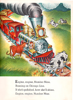
Another of my favorites, is this one for the rhyme, "Engine, engine, Number Nine." This is a jingle that I remember from childhood, and I love how the Petershams have illustrated the last part of the rhyme "If she's polished how she'll shine," by showing a cow looking at its reflection in the shiny engine's surface.
This illustration of a young girl testing the waters of a stream, is another example of how the artists have used their imagination to supplement the limited text. I love all of the little animals that are in the scene, none of which are mentioned in the rhyme.

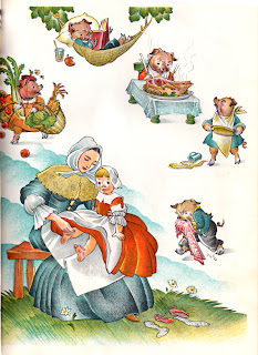
I'm sure most of us can remember having a parent count out our toes using the "This little piggy went to market" rhyme. Here the Petershams show us a mother in 18th or possibly early 19th century costume, counting out the rhyme on her little girl's toes, while above them we are shown what each of the little pigs is doing. 

I was delighted to find these two books illustrated by the Petershams and they have made me want to check out more of their illustrious output.

Monday, October 18, 2010

Pen and Ink - Digital Style Part 4, Mawleogs

Over the past month, I've been developing my black and white portfolio by drawing scenes from the children's novel, "The Hounds of the Morrigan," by Pat O'Shea. It's quite a wonderful children's fantasy based on Celtic mythology and has two very likable protagonists, 10 year-old Pidge and his 5 year-old sister Brigit. In this scene, the children, who are being pursued by the hounds belonging to the Morrigan, the Goddess of Battle and Destruction, meet the friendly spider Mawleogs who aids them in their journey to find the blood-stained pebble that is needed to stop the evil queen from regaining her full powers.

I originally envisioned depicting this scene from behind the children, looking over their shoulders so that the viewer could get a good look at Mawleogs. But with this layout, the spider would need to be further back in the scene and he would end up being so small, that most of his facial detail would be lost and therefore the scene would lose some of its impact. I did do a sketch of it though, which you can see below. Below it, is a close-up sketch of the spider, Mawleogs. He is described in the story as wearing a shirt with a ruffled neck and cuffs, black knee britches, knitted stockings, buckled hornpipe shoes, and a little hard hat.


In this part of the story, which takes place in Ireland, the children have crossed over into Tír-na-nÓg (the otherworld or Fairy land) so I'm guessing that the hard hat that Mawleogs was wearing might not be what we think of as a hard hat. Considering that he's described as a gentleman, I pictured the hat more like the type that you might see a leprechaun wearing. I had to dig for some reference to find out what a hornpipe shoe was.


After I decided to show the children from the front, and Mawleogs from the back, I came up with this sketch. After spending quite a bit of time working on this composition, I still wasn't happy with it. The children looked too stiff and I felt the layout lacked interest. It was too straight-forward and it was not matching the vision I had in my head of how I wanted this to look. 


So, I revamped it one more time. This time I decided to tilt the scene a bit and show it from slightly above, as if you were up in the tree with Mawleogs, looking down on the children.


To help me in the perspective and the shading of the scene, I set up two figures in Poser, which you can see to the right. As far as using Poser, I only know the basics. I don't use it as often as I use to, but it still comes in handy once in a while to help with a tricky perspective. Below, is the final pencil sketch that I worked from, based on this new viewpoint. I feel this layout works much better and gives the scene some dynamic visual interest and movement. 


One of my favorite children's book illustrators is Erik Blegvad (who I've written about before in this blog) who has illustrated many wonderful books using pen and ink.  While drawing the children in my illustration and doing the cross-hatching, I constantly referred to some of his illustrations, in particular some that he did for the Mary Norton book "Bed-knob and Broomstick." 

Sunday, October 17, 2010

Illustration Friday - Spooky

Those of you who have been following this blog, may recall seeing this image before. It's an image that I created this past spring and wrote about on this blog as a work in progress. My working title for it was 'Spooky' and since that is the word for this week's "Illustration Friday," I thought it would be appropriate to re-post it. My original idea for this piece came while reading "The Dark Secret of Weatherend," one of John Bellairs' spooky books for kids. It was my attempt to create a picture filled with atmosphere and mysterious details. I'm still trying to think of a narrative to go with this story. So far I have the germ of an idea, but I need to develop it. As a side note, I did get this piece into a show here in Bloomington at the Paper Crane gallery. It's part of their opening show, the theme of which is monsters.

Here is the original pen and ink thumbnail sketch that I did before I began on this piece. You can see it is quite rough. I used it to establish a basic layout and a few lights and darks.

For those of you who missed the original posting of this image, where I talked about its development, here are a few of the work in progress shots.

Monday, October 11, 2010

Illustration Friday - Transportation

Another week, another 'Illustration Friday' challenge, this week the word is "Transportation." My first thought was to do something with futuristic cars and monorails, but then another thought popped into my head, and that had to do with bicycles and dogs. The original idea was to have a bicyclist transporting a little dog in her bike's basket. But as I thought about the idea, I began to embellish it. I thought it might be funny to have other dogs chasing after the bicycle. Then, I thought it would be even better if the bicyclist were carrying two dogs, one riding up front, the other in a basket on the back of the bike. The dog in the back basket would have a self-satisfied look on its face, as if it were taunting the dogs that were chasing it. The last two things I decided to add were extra little details - a small puppy watching from the window of the building and an upset cat, hissing at the dog parade below while balancing on a balcony railing.


Here is my original pencil sketch. You can see that off to the left of the building, I had originally intended to add some stylized clouds and the edge of another building, but in the end, I decided to eliminate those details, keeping it simple with just the suggestion of some tree shapes.


I created the image in Corel Painter and primarily used the digital watercolor brushes, especially the New Simple Water brush and the Coarse Mop Brush which gives a nice fuzzy bleed effect after you've applied the stroke.  For the details I used a couple of Painter's pen brushes - the Smooth Round Pen and a modified version of the Leaky Pen.  I colored the bike rider's hair and most of her clothing, as well as the bicycle baskets with Painter's gouache brush. In the screen shot to the left, you can see where I've begun to color in the background.

I used a lot of layers so that it would be easier to make changes. In this screen shot, you can see the list of layers that I set up. When you have this many layers, it becomes very important to name them so that you know what is on each layer.
In this last screen shot, you can see a close-up view of the little dog in the window and the hissing cat that I added as background details.

One of my inspirations for the style of this piece, especially as far as the background goes, was the artwork in Disney's 1961 animated "One Hundred and One Dalmatians." That film's sketchy drawing style, brought a big change to the look of Disney's animated films.  It's my understanding that a new technique for xeroxing the artist's pencil drawings directly on to the animation cels, is what gave the film its unique look. But even the character design and coloring of the backgrounds was unique to a Disney feature, it had more of the look of some of the mid-century modern cartoons that were being made at UPA studios than the romantic classical backgrounds of previous Disney features. If you're interested in this subject, I highly recommend the book "Cartoon Modern" by Amid Amidi.

Tuesday, October 05, 2010

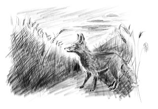
Pen and Ink - Digital Style Part 3, The Fox in the Wheat Field

In Part 2 of my posting on my digital pen and ink work, I posted a work in progress - a picture of a fox in a wheat field. It is one of the illustrations I'm doing as part of a challenge to myself to come up with some black and white 'spot' illustrations for the children's book "The Hounds of the Morrigan," by Pat O'Shea. It's also a way to add some much needed black and white examples to my portfolio.

This image is an illustration based on this passage from the book: "The fox coughed delicately and was, to all appearances - instantly very deeply absorbed in studying a splendid green beetle with polished wing-cases and remarkable antennae, who was taking a casual ramble up a wheat stalk." This is a scene that follows the introduction of Cooroo, the fox that befriends the two children of the story, Pidge and Brigit. The fox has been conversing with the children when he is distracted by the beetle. It's just a short paragraph, the beetle doesn't feature in the story, but by including a description of the fox's interest in it, the author gave me a clear sense of the fox's similarity to a dog. My dog is always being distracted by the smallest little things, so I thought this short scene was a beautiful way for the author to tell us something about the fox's personality.

Since I tend to work in spurts and stops, between interruptions and distractions, it's kind of hard to tell how long I worked on this piece, but I estimate it was probably between 20 and 30 hours. The fox's fur was the most time consuming part of the illustration and also the most intimidating, but I'm quite happy with the way it turned out.

Monday, October 04, 2010

Illustration Friday - Beneath

I normally like to create a new illustration for the 'Illustration Friday' word challenge but this week, on top of training a new dog, I've been working on too many different projects to create something new, so, instead I'm posting an image I created last spring for my portfolio.  It depicts a happy purple whale swimming under a beaming sun. Below the whale is a glimpse of some other creatures that live beneath the sea. Once again this was created digitally in Corel Painter. I used various chalk, gouache and sponge brushes for the coloring and the background, plus some pen brushes for the outline details.

Friday, October 01, 2010

Pen and Ink - Digital Style Part 2, Work in Progress


I am continuing to work on the challenge I set for myself by drawing 'spot' illustrations for the children's book that I am reading, "The Hounds of Morrigan," by Pat O'Shea. Once again I'm working digitally using Corel Painter's pen brushes.  So that I could get a better idea of the lights and darks, I first did a digital pencil sketch.

Once I was happy with my drawing, I lowered the opacity of the sketch and created a new layer above it where I began to draw with the pen. Using the sketch as my guide, I first drew an outline of the fox. From there, I drew in some of the wheat stalks and started to shade in the background and the fox's face.

To the right you can see the drawing as it has gone through various stages of development.  The last image at the bottom is where I'm currently at with the drawing. I'm hoping to finish it this weekend. When I do, I'll put up another post with the completed image.