Sunday, April 21, 2019

Evolution of a Surface Pattern - Calculating the Moon

The finished pattern, "Calculating the Moon"
Back in December I created a pattern, as I do almost weekly, for one of Spoonflower’s design challenges. In this posting, I’m not going to go into the technical how-to aspects of how I created the repeat for this surface pattern but instead I will explore how I came up with the idea for my design and how it evolved.

For those of you who might be unfamiliar with it, Spoonflower is a company that prints designs on fabric, wallpaper and gift wrap. Their online website allows designers to upload their own designs for printing on these surfaces and then to sell the designs in their own shops. Each time a purchase is made, the designer receives a 10% royalty of the total purchase. Spoonflower handles the printing and shipping of all the products ordered. To encourage designers to upload to the site, they host a weekly challenge where they provide a theme to inspire creativity for designers.

For the design I’m writing about in this posting, the challenge was to celebrate the 50th anniversary of the 1st Moon landing. Normally Spoonflower gives the winner of the weekly challenge a $200 credit in Spoondollars which can be used to make purchases on the site. Once in a while though they have a corporate sponsor who offers up additional prizes or licensing deals. For this challenge the sponsor was the company Princess Awesome who makes a clothing line for young girls. According to the Princess Awesome website, they believe “it is crucial that girls have access to clothes that tell them that they can be and do anything…Princess Awesome is a company founded by women - mothers - who want girls to be able to express themselves through their clothing. We are committed to making clothes that girls want to wear, and that parents want to see on their daughters.” Their emphasis is on the sciences and topics (dinosaurs, rockets, robots) that in the past have been thought of as more geared for boys. For this challenge, Princess Awesome was offering a licensing deal worth $500 to the first place winner.

1961 Life magazine image that inspired my design
I’ll tell you right off the bat, I didn’t win this contest, but I did come in second place. It was a close race, if I had received just 7 or 8 more votes I would have won the prize, but with so many wonderful entries, I was honored to be in second place.

Before I began designing, I did a Google search of the 1st moon landing. My search results came up with loads of imagery of astronauts on the moon, the moon lander, the rockets that carried the lunar module, etc. None of what I was finding really sparked my imagination, until I came upon an unusual image from Life magazine that showed a group of male NASA mathematicians standing on ladders writing calculations on a gigantic blackboard. I knew from all of the publicity around the film, “Hidden Figures,” that there were a number of unsung women who worked on the moon landing, including some who helped calculate the trajectory the lunar module would need to make the landing. Using the Life magazine photo as inspiration, I decided to replace the men with the women who were until recently, hidden from view.

My original sketch
This is before I decided to have the blackboard fill the background

In this step I added another woman and filled the background with the green of the blackboard
Since this challenge was supposed to celebrate the Moon landing, I knew I wanted to have the Moon somewhere in my design. My first idea was to have the blackboard floating against a dark blue sky, but after roughing out a sketch and trying it as a repeat, the rectangle of the blackboard seemed to interrupt the flow of the pattern so instead I decided to eliminate the sky and make the entire background be a giant blackboard (or in the case of my design, a greenboard). I decided I would make the Moon look like a chalk drawing on the board.

I created my drawing using Corel Painter 12. Painter has wonderful brushes that emulate all sorts of natural media, including chalks which were perfect for creating the elements drawn on the board. For the drawings of the women, I used some of Painter’s pen brushes, mainly the flat color pen and the scratchboard pen. Before I began drawing on the computer, I made a quick pencil sketch of my design.

Using illustrations of the rocket that carried the lunar module for reference, I drew a simplified version of the rocket that I superimposed over the blackboard. Originally, I had the rocket placed at an angle, but I didn't like how it looked in the repeat so I ended up placing it upright, giving it a ready for launch look. I used a photo of the lunar module I found on Wikipedia as a reference for my chalk drawing of the module on the blackboard. For the formulas on the blackboard, I used some of the actual formulas shown in the Life magazine photo, re-drawing them using one of Painter’s chalk pens.

Finally, I added some curved dashed lines to represent the orbit and trajectory of the lunar module and added some scuffed out marks on the blackboard to make it appear as if certain parts of the board had been erased.

I named my pattern "Calculating the Moon," and I've been very happy with the wonderful response it has received. If you click on the link above, it will take you to my Spoonflower shop where you can purchase the design on fabric, wallpaper or gift wrap.


Pinterest images of the Apollo landing sites on the Moon

Google search results for Saturn V rocket


Friday, July 31, 2015

Evolution of an illustration

The final image, showing Henry
Bergh jumping through the skylight.
For the past three months I've been working on a non-fiction children's book that will be released next Spring. I am very excited about this project, not only because of the fascinating subject matter (more on that in a second) but because it is my first assignment with a major publisher (Houghton Mifflin Harcourt). The book is titled "Mercy, The Incredible True Story of Henry Bergh, Founder of the ASPCA," by Nancy Furstinger.

April of 2016 will mark the 150th anniversary of the founding of the ASPCA and being an animal lover, I'm very excited that the book I am illustrating will be released in conjunction with the ASPCA's anniversary celebrations.

For this posting I am going to let my readers in on the process of how I went about creating one of the illustrations for "Mercy." In the book's introduction, author Nancy Furstinger relates a suspenseful incident involving ASPCA founder Henry Bergh and his attempt to put a stop to a dog fight. The scene describes him waiting on the rooftop of a building where a fight was about to take place. He and another officer are watching the activities of the dog owners through a skylight. Just before the men release their dogs, Henry leaps through the skylight. I won't tell you how the scene ends, you'll have to read the book to find out, but in this post, I'll show you how I came up with the illustration that will accompany this scene in the book.

Reference books from the library
The action for this scene takes place in 1866. So, before beginning any sketching, I researched the time period. Henry Bergh was born in 1813 and died in 1888, his life spanning much of the nineteenth century. To begin my research, I checked out a number of books from the library, including books on fashions of the period and references for both human and animal anatomy. Much of my research though was done online. For this particular illustration I needed an image of a man jumping down through an open skylight. One of my favorite online sources for visual reference material is Getty images, which is actually a stock photography site for purchasing the rights to hi-res images for use in publications. But it's also a great source for reference images to aid in your drawings. The previews that come up when you do a search will be at screen resolution and have a watermark across them, but since they are to be used only for drawing reference, they are extremely useful for finding people in various poses, styles of dress, etc.


The leaping man in this image became my reference
for Henry Bergh jumping through the skylight
To start on this illustration I entered a number of search terms, things like 'man jumping,' 'man jumping down,' 'man leaping,' etc.  I not only used Getty images, but I did "Google" searches as well, using the same search terms. Once I started finding some possibly useful images, I downloaded them in to a folder on my computer. Using Adobe Bridge, I was then able to organize and look at thumbnails of all of my downloaded images. While using Getty images, I discovered some wonderful late nineteenth century illustrations from a periodical titled 'Le Petit Journal.' These illustrations were loaded with action and great period details and provided useful reference in several of my illustrations including this one.


An early attempt at a layout using
cut and pasted reference material

Once I had enough images, I did a rough layout by cutting and pasting some of my reference figures into a sort of collage. These collages were my early attempts at getting the illustration to match how, in my imagination, I felt the scene should look.  I played with several poses from various images and if things didn't look like how I imagined them, I would start over from scratch.  This scene on the left is my first attempt at a layout.

If I were an expert at drawing anatomy and perspective from scratch, I might have opted to just sketch out my idea. But since I had already downloaded the reference images, I found it was quicker to do a rough cut-and-paste job of my reference materials. That way I could move the elements around, scale them, flip them, etc. until I achieved a layout I was happy with.

Below are some examples of how my collage layout changed to reflect my evolving idea of how I wanted the scene to look.  Once I had the main figures positioned where I wanted them, I began to draw. I drew the dogs freehand, without much in the way of reference. I also made up whatever figures and elements were missing from my collage. The sketch shown at the bottom below displays the final layout, although I did make some changes to the dogs before I began to ink and color the illustration. I did all of my coloring and painting in Corel Painter 12, primarily using the digital watercolor brushes.

a second attempt where I've changed
some of the reference elements
The scene is starting to come together
 although the foreground is too
crowded, with no room to show the dogs.

Here I have begun to sketch out the scene based
on my cut and pasted collage. Some elements,
like the dogs, and some of the faces in the crowd,
I made up without much in the way
of any reference.


Monday, February 02, 2015

Hey wait, I thought I hated clowns!

The Farmer and the ClownThe Farmer and the Clown by Marla Frazee
My rating: 5 of 5 stars
Published by Beach Lane Books (Simon & Schuster, New York, 2014)

Okay, I have to get this out front - I really dislike clowns. I’ve always found them creepy and not a bit funny. But with this sweet and touching picture book, author/illustrator Marla Frazee has just but a small dent in my opinion of clowns. The little clown in her wordless picture book, who gets separated from his family when he falls off of their circus train, is probably the cutest clown ever. His simple makeup consists of a plain white face, a relatively small red nose and a painted-on smile. When he’s found and taken home by a stern-looking farmer and washes off his make-up, we see underneath a worried and sad expression - the look of a lost child.

This book is all about finding a home, learning to feel at home, and the very essence of what home is. It could just as easily be the story of a refugee taken in by strangers, or about the adoption of a child. However you want to look at it, it’s a sweet and charming book. Considering that this is a wordless book, the author does a wonderful job of developing her characters. The farmer starts off seeming very stern and no-nonsense. Just from the expressions the author/illustrator has given him, we can see he is completely perplexed by this strange little person in a clown suit. But after the little clown washes off his make-up, we see from the farmer's facial expression that he is concerned about this lost child who he has brought into his home. Over the course of just a few pages, we see the farmer, while trying to make the sad child smile, loosen up and develop an affectionate bond with this little person. Along the way, each of the characters learns something new from the other. The farmer teaches the little clown how to milk a cow, while the little clown teaches the farmer how to juggle eggs. The farmer appears to be learning that all work and no play can make for a very dull existence. Marla Frazee conveys so much feeling and understanding in her illustrations with just changes in the body language of her characters and their facial expressions. This book is a great example of how to tell a complex story with no accompanying text.

I love how Frazee has used a limited color palette for her delightful illustrations. The farmer seems to exist in a world of soft sepia browns and charcoal grays. The little clown, dressed in reds and yellows brings color into the farmer’s drab existence. The clown’s suit really pops against the monochromatic backgrounds. More color is brought into the story when the circus train returns, bringing greens, blues, soft purples and oranges into the palette. At the end of this story, I had the feeling that the farmer had been changed forever by the little stranger who briefly became part of his life. And of course, without giving away the ending, the last illustration shows that the farmer’s adventures may not be quite over.

This book brought a smile to my face (the first time any clown has ever done that!) and I found it sweet and touching. I highly recommend this one!

Illustration by Marla Frazee. The farmer approaches the little clown who has fallen from the circus train.

Illustration by Marla Frazee. Underneath his make-up, the clown is a sad, lost child.

Illustration by Marla Frazee. The Farmer tries his hand at juggling and the clown helps the farmer in the fields.

Illustration by Marla Frazee. A happy reunion, but the story is not quite over yet.


View all my reviews

Sunday, January 25, 2015

Dory Will Leave You With a Smile

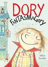
Dory FantasmagoryDory Fantasmagory by Abby Hanlon
My rating: 4 of 5 stars

The narrator of this funny and fast-paced story is six-year-old Dory (appropriately nicknamed Rascal) who has an active imagination and fills her days attempting to get her older siblings to play with her, conspiring with her imaginary monster friends, and trying to figure out ways to vanquish the child-snatching Mrs Gobble Gracker (an imaginary being her older siblings invent to try and scare Dory into being good). This is a cute book and author/illustrator Abby Hanlon successfully gives the reader a glimpse into the mind of a 6-year-old, reminding us of what it was like when fantasy and reality were intertwined and play was an integral part of our lives. With its profuse black and white illustrations, the book at times reads like a graphic novel and in fact many of the charming drawings have integrated dialogue bubbles. The illustrations, by the way, are delightful, filled with expression, action and funny details. This is a fast read and one that I think will delight young children and anyone who wants to relive those special years of childhood when playtime was ruled by imagination.

Illustration by Abby Hanlon. Dory is the cute little character on the far right

Illustration by Abby Hanlon. 

An example of how illustrator Abby Hanlon integrates comic book style word balloons into her illustrations
Illustration by Abby Hanlon. Dory gets a shot while on visit to the doctor.

Don't worry, the intended target of the dart is the imaginary Mrs. Gobble Gracker. Illustration by Abby Hanlon.


While on a time-out, Dory imagines her family is enjoying popcorn with her nemesis, Mrs. Gobble Gracker. Illustration by Abby Hanlon


View all my reviews

Tuesday, May 13, 2014

Mistress Masham's Repose


Mistress Masham's ReposeMistress Masham's Repose by T.H. White
My rating: 4 of 5 stars

Maria is shown the tiny livestock
illustration by Fritz Eichenberg
The premise of Mistress Masham’s Repose is a clever one - the travels of Lemuel Gulliver described in Jonathan Swift’s “Gulliver’s Travels” actually took place and some Lilliputians, captured on a later expedition, have escaped and have been hiding out and living in exile on a rundown English estate.  For over a century, they have managed to avoid detection by living inside of a garden folly. Their secret comes close to being exposed when they are discovered by Maria, a young girl living on her ancestor’s estate. For me, the best parts of the book were in White’s descriptions of how the tiny Lilliputians are forced to cope in a land of gigantic threats. The writing is often somewhat dense, but filled with humor and White shines in describing the foibles of his characters. The character of Maria is not always likable but White uses her to show how a little power can corrupt even a person with the best of intentions. As is often the case, the villains of the story are often the most interesting characters and White has created a devious pair in the characters of Maria’s governess, Miss Brown and Mr. Hater, a greedy Vicar. There is a lot of suspense created when these two conniving schemers discover the existence of the Lilliputians and plot ways to make a fortune off of them. They even discuss murdering Maria if it should become necessary to achieve their gains. White fills the book with doses of English humor (which may go over the heads of some younger readers) and frequently goes off on rather esoteric tangents, which I felt slowed down the narrative. If it weren’t for these esoteric and wordy asides, I probably would have given this book 5 stars. All in all, it’s an enjoyable read, especially if you’re in the mood for a story rooted in a classic of English literature. If you can, make sure and find an edition that contains the fantastic illustrations by Fritz Eichenberg. His amazing pen and ink work perfectly captures the humor and drama in White's story.

All illustrations are by Fritz Eichenberg and were scanned from a 1946 copy of Mistress Masham's Repose by T.H. White, published by G.P. Putnam's Sons.

The book has recently been reprinted by The New York Review Children's Collection.


Click on the illustrations to see them larger.

Miss Brown and Mr. Hater poke a captured Lilliput

Miss Brown discovers the People in Maria's room
The Professor and the People try to figure out
a way to release Maria from the dungeon


Some of the dangers faced by a
person who is only six inches tall.


View all my reviews