Monday, December 17, 2012

Illustration Friday - Snow

We've been having a mild fall here in Indiana, no snow so far and there's none forecast for the near future. We do have a lot of cardinals around and when I saw this week's Illustration Friday challenge, which is the word "Snow," I thought of how pretty a red cardinal looks against a snowy backdrop. I created my image as a quick watercolor sketch in Painter 12. I started off with a digital pencil sketch (see below) and added the watercolor on a separate layer.

After coloring the bird, I used one of Painter's Bleach Splatter brushes to make some spots on the bird's feathers (see detail below). After that I used Painter's Real Watercolor Scratch brush to draw some snowflakes over some of the bleach spots (detail below). I decided to leave the background white to further enhance the feeling of a bird on a snowy day.


digital pencil sketch

detail of the bleach spots created with the Bleach Splatter Brush

Snowflakes drawn with Painter's Real Watercolor Scratch Brush


Saturday, December 15, 2012

Evolution of an Illustration

I was recently commissioned by FarFaria to illustrate Clement Moore's classic Christmas poem, "Twas the Night Before Christmas."  FarFaria is an app for the iPad and their stories are published for that device (to be honest, I'm not sure if they can be read on other tablet devices or not).  This version I created for them is due to be released on December 24th.  Here is a sneak preview of the evolution of one of the images I created for the story.

Storyboard panels for pages 9-12
Designing for the iPad can be a bit of a challenge.  Unlike a traditional picture book where you have the ability to have an illustration cross over the page gutter (the division in the middle of the book where the pages are joined) to cover two pages, an illustration for the iPad is limited to the size of one screen at a time. For FarFaria's app the main part of the illustration needs to fit within an area approximately 6 x 7 inches (the text will cover the lower portion of the illustration, so any important information needs to be in the aforementioned dimensions above the text).


For this job, the art director requested that I create the illustrations in a specific style. He cited an older illustration of mine from my website that he liked and asked me to create the story in that style. The first step in creating the illustrations was to draw storyboards, one sketch for each page of text. I created these as digital pencil sketches, four to a page. Once these had been approved, I enlarged the sketches to the appropriate size and refined them. For this blog I will be showing the evolution of page 12. All of the art was created in Painter version 12.


Above is the enlarged story board sketch that I used for my digital inking
On a new layer above the sketch, I have begun inking the final line work.


Above is the final inked line art

On separate layers, using digital watercolor brushes, I have begun to color the image


The next step is to start adding shadows

The final image with some darker shadows


Thursday, November 29, 2012

House Held Up By Trees

House Held Up by TreesHouse Held Up by Trees by Ted Kooser
My rating: 5 of 5 stars

Ted Kooser’s beautiful history of a house is in someways reminiscent of Virginia Lee Burton’s “The Little House,” but unlike that book, Kooser doesn’t anthropomorphize his house or try to imbue it with human feelings.

In telling his story of a house from the time when it was new to its rebirth as a house held up by trees, Kooser, a former U.S. Poet Laureate uses language that is evocative but at the same time wistful. Like in Burton’s “The Little House,” the house in this story is the main character, the humans are secondary and they come and go. In the beginning we see the house when it is new, being cared for and loved by a man and his two children. Set in a clearing between two wooded lots, the house’s owner keeps the grounds immaculate, uprooting any seedlings that pop up in his perfect lawn. But as the years pass, the children move away and eventually so does their father. Sitting unsold, the house falls into disrepair. As time passes, seedlings and saplings pop up around it, hugging the house and protecting it from the winds. One day the trees, whose roots and branches have held the house together, begin to lift the house up toward the sky, where it is reborn as a house held up by trees. Jon Klassen’s digital and gouache illustrations are the perfect compliment for this somewhat melancholic story. Many of the illustrations are double-page spreads that give us wide panoramic vistas that emphasize the house’s isolation in the landscape. In two spreads early in the story we see the house as it looks from the point of view of the woods. We glimpse it through tree branches and see it sitting in the distance. It’s a clever foreshadowing of later illustrations where we will once again see the house through tree branches, the difference being that in the later illustrations we are up close to the house, with it looming large in the frame and the trees we are looking through are the ones that “held it together as if it was a bird’s nest in the fingers of their branches.”

As I mentioned, there are human characters in the story, but we never learn their names. We get glimpses of them from a distance or from behind, but we never see their faces. There are several haunting illustrations in this story that tugged at my heartstrings. In one, the two now grown children are shown from behind looking at the woods next to the house, a place where they use to run and play. It’s also a place where they would sit in the shadows and watch their father as he worked on his lawn. On the left side of the illustration are the woods, cool and inviting and unchanged from their childhood. On the right side, we see the adult children, the man holds a baseball cap at his side, while the woman holds a leaf. For me, these two details - a baseball cap and a leaf convey the melancholy of growing older. The only thing we can hold on to from our childhood are our memories and a few small mementoes, we must let go of everything else.

In another panoramic illustration, we see the father sitting in a folding chair, watching the sunset. The text tells us he is older now and his grown children "were gone for good . . ."  Next to the father, is an empty chair. On the left side of the spread we see through a window into the house's dining room where we get a glimpse of a lone place setting. Leaning against the outside of the house is the man’s lawnmower. Tall grass is starting to grow around it and even without the information in the text, we know that the man has given up on trying to keep up his lawn. It’s an illustration suffused with loneliness.

I loved this book. It was published by Candlewick, a publisher that seems to strive to put out beautiful books. This one is no exception. The language, illustrations and story are all beautiful. Having said that, I was somewhat surprised to see a publisher put out a children’s book that has no strong characters for children to identify with. It seems very much a book that will appeal more to adults looking back wistfully on their lost childhoods, then it will to most children. Maybe that's why I liked it so much. But I do hope that children will read this and love it. Those who do will be rewarded by a book that demonstrates the passage of time and what it means to grow older. Though there is a tone of loneliness in the book, there is also a comforting message of rebirth. I checked this book out from our public library, but it’s one that I fell in love with so I know I’ll be buying a copy for myself.

The illustrations below are by Jon Klassen from Ted Kooser's "House Held Up By Trees."

One of the panoramic two page spreads showing the house near the forest
Detail showing the house as it looks from the woods
A detail showing the father sitting alone on his perfect lawn

The now derelict house, sits alone, but the saplings are starting to surround it.


View all my reviews

Thursday, November 08, 2012

A Bus Called Heaven

A Bus Called HeavenA Bus Called Heaven by Bob Graham
My rating: 5 of 5 stars

Stella lives in the city. When an abandoned bus with a sign taped to it reading “Heaven” appears one morning in front of Stella’s house, people in the neighborhood seem to change. For once, they stop and talk to one another. Stella, who usually has her thumb in her mouth, changes as well. She sees potential in the old bus and before you know it, she has inspired her community to clean it up and turn it into a neighborhood club house where all are welcome. Everyone brings something to donate to their new community center - one little girl brings her goldfish, a little boy donates his comic books, Stella contributes her table soccer game, other people bring chairs, rugs and baked goods. One little girl loans her dog for people who just need to sit and pat something. This is a really sweet and delightful story of how a diverse neighborhood of people are able to work together for the betterment of their community. Author/Illustrator Bob Graham shows people of all ages, colors and creeds uniting to create a shared space where children can play (and fight), babies can crawl, people can laugh, granddads can scratch dogs, couples can meet, and families can show their vacation pictures. But this bit of heaven does face a crisis. When a junkyard man shows up with an order to remove the illegal vehicle, the community must figure out how to save it. I don't think it's a spoiler to say that Stella saves the day (and the bus!). The illustrations in this book are delightful - double paged spreads and pages with multiple illustrations are crammed with details. Cars and trucks, people of all shapes and sizes, dogs, birds, cityscapes, ships, and factories, houses and junkyards fill the pages and demand repeated viewings. A wonderful book about inclusion and working together to create a community.

View all my reviews

Wednesday, October 31, 2012

Creepy Carrots!Creepy Carrots! by Aaron Reynolds
My rating: 4 of 5 stars

What’s a poor rabbit to do when the carrots he loves to munch on begin stalking him? Jasper Rabbit is faced with that question when he begins to suspect the delicious carrots from Crackenhopper Field are following him around, spying on him as he brushes his teeth and watching him while he’s in bed. Author Aaron Reynolds and illustrator Peter Brown have created a child-friendly homage to a classic ‘Twilight Zone’ scenario in this funny picture book that is perfect for any young child looking to be scared, but not too scared. Illustrator Peter Brown, using a monochromatic palette of warm grays and carroty orange, captures the shadowy look of an old horror movie. Even the edges of the frame are rounded to suggest a story unfolding on an old television screen. Jasper Rabbit’s paranoia is cleverly conveyed in Brown’s illustrations where the artist shows us what Jasper sees (creepy carrots everywhere) and what others see (everyday orange objects like flower pots or pop bottles). Because no one else can see the creepy carrots, Jasper realizes that he must turn to his own resourcefulness to outwit them. Kids may not look at a carrot in the same way after finishing this funny, slightly spooky tale. This would be the perfect read-aloud for Halloween or any night when a scary tale is called for.


View all my reviews

Sunday, October 28, 2012

Oh, No!

Oh, No!Oh, No! by Candace Fleming
My rating: 5 of 5 stars

Candace Fleming has written a charming picture book about a group of jungle animals who one by one fall into a deep hole where they are stalked by a tiger. Don’t worry, the situation might sound dire, but it’s handled with great humor and no animals get harmed in this funny tale. Fleming’s use of word repetition to describe the animals’ sounds and movements is so wonderfully rhythmic that I can almost imagine this book being put to music and sung. Even reading it silently to myself, I could almost hear the words being sung like a folk song. The beautiful relief print illustrations are by Caldecott medal winner Eric Rohmann, author and illustrator of such books as “Time Flies,” “The Cinder-Eyed Cats,” and “My Friend Rabbit.” Beginning and ending with the end papers, Rohmann fills the book with full page spreads showing us each animal as it approaches the hole and then what happens as they fall into it. The illustrations have a wonderful sense of movement and rhythm, making a perfect match for Fleming’s sing-song text. On some spreads Rohmann has split the page into panels, much like a comic strip so that we get a continuous flow of movement. As each animal falls in, we are shown the animals already in the hole, jostling to make room for the new occupant. For these ‘action shots,’ Rohmann cleverly changes the point of view so that we get a glimpse of what it’s like looking up from the bottom of the deep, deep hole. I think kids will be delighted by the ending of Fleming’s tale when they see who comes to the rescue and what happens to the tiger. And for those worried about the tiger, the last spread on the end papers should ease any worries over his fate. This would make a great read-aloud, one I’m sure kids will enjoy participating in and hearing over and over again.


View all my reviews

Tuesday, October 02, 2012

Hit the Road, Jack

Hit the Road, Jack by Robert Burleigh
My rating: 4 of 5 stars

I've been a fan of Ross MacDonald's picture books since "Another Perfect Day." His retro style, done in watercolor and pencil crayon, is filled with a warm yellow glow, that looks like sunshine hitting paper. "Hit the Road, Jack" celebrates life on the open road and the joys of traveling cross country and was loosely inspired by Jack Kerouac's "On the Road." Author Robert Burleigh gives us a jackrabbit named Jack who is itching to travel and to see America. Setting out in New York he walks, bikes, hitchhikes and rides the rails from sea to shining sea, where he finally lands in San Francisco. But for Jack, the city by the bay is just one more stop, because for guys like Jack there's only one rule: "Never, Never Stop."

"Hit the Road, Jack" cleverly exalts the world of roadside diners, tourist attractions and taking the time to appreciate our country's beautiful scenery. My only complaint about this otherwise wonderful picture book is that some of the cities that Jack passes through look a little too generic. For example, when Jack lands in Chicago, we see him on South Halsted Street, but with the exception of a few jazz club signs, the buildings lack any real detail. The skyscrapers in the background could be from any big city. The text frequently mentions places that Jack is passing through, but instead the illustrations give us depictions of Jack having a picnic or sleeping in a car. Now, as an illustrator myself, I don't believe an illustrator's job is to literally interpret every word of the text, but I do feel that some of MacDonald's choices seem a little simple and generic. The illustrations are warm, funny, colorful and wonderfully composed, but I do think on a few occasions MacDonald missed an opportunity to do something spectacular. For example when Jack passes through the salt flats the text reads, "Over the salt flats, on and on, The horizon thick with reds, And mesas looming far, far off, Like carved-out giants' heads." The illustration shows Jack running across white ground with his arms upraised to the sky. In the background are a line of reddish-orange mesas which don't appear to be looming, nor do they resemble the giants' heads described in the text. Instead, they look small and insignificant and just don't convey the grandeur of these magnificent natural wonders.

On the whole the pictures and text depict an America of the past, a nostalgic 1940s America where strangers wave to one another, walking the streets was a safe thing to do, and hopping a freight and hitchhiking were inexpensive ways to travel. In this rosy colored world, money is not important "You're broke - but well, so what? 'Cause money's only something, Jack, That gets you in a rut." If only life were so simple.

I love to travel and I love road trips so I recommend this book for it's message of throwing your cares to the wind and seeing the world, even if in real life, that's not always the easiest thing to do. But, after all this is a picture book and kids need to know there's a beautiful world out there, waiting for them to explore it. Robert Burleigh's story conveys that message in a colorful way and kids will love searching MacDonald's illustrations for the little blue bird that follows Jack on his cross country travels. For adults, I think parents will enjoy the rhythms of the delightful text which is perfect for reading aloud.


Detail from "Hit the Road, Jack" illustration by Ross MacDonald

Detail from "Hit the Road, Jack" illustration by Ross MacDonald
View all my reviews

Monday, October 01, 2012

Illustration Friday - Book


I haven't submitted anything for 'Illustration Friday' in quite a while, but when I saw this week's topic was the word "Book," I couldn't resist participating. Over a ten year period, I worked at two different independent bookstores and during that time one of the things I was responsible for was editing the newsletters for both stores. Because I'm also an artist, I created a lot of book-related spot illustrations, especially for the children's newsletter that I created. I don't remember if this image was for the newsletter or not, but I did use it for a while on my business card. It started off as a black and white pen and ink sketch which I then turned into a color illustration in Adobe Illustrator.  I then took that image, exported it as a tiff file and opened it in Photoshop where I applied some Mister Retro filters to give it the look of an old, scuffed print image.


Tuesday, September 18, 2012

The Secret of the Stone Frog

The Secret of the Stone FrogThe Secret of the Stone Frog by David Nytra
My rating: 5 of 5 stars

A building comes to life
TOON Books is dedicated to bringing the world of graphic novels to a younger audience. They have produced some wonderful books including the “Benny and Penny” series by Geoffrey Hayes, “Stinky” by Eleanor Davis, “Little Mouse Gets Ready,” by Jeff Smith and “Zig and Wikki in the Cow,” by Nadja Spiegelman and Trade Loeffler. The books are beautifully produced and feature art by some of the finest illustrators working in the field of comics and graphic novels. This one, written and illustrated by newcomer David Nytra is a stunner. Nytra’s black and white art, reminiscent of Winsor McKay’s “Little Nemo” comic strip from the early 20th century is incredibly detailed and full of surprises. The story starts off and ends in a child’s bed but whether what falls in between is a dream or not is left for the reader to decide. When two young children, Leah and Alan wake up in the middle of the forest, they are told by a talking stone frog how to get home. But their mysterious guide also gives them a warning: “Stay on the path!” Anyone who is familiar with the lore of fairyland knows that strange things can happen to those who stray from the path. It’s not a spoiler to tell you that it doesn’t take long for Leah and Alan to be tempted off the path, and yes, very strange things do begin to happen. They meet giant, fuzzy bees who steal words, a trio of foppish lions, giant rabbits, and some bizarre denizens of the deep sea, who ride a subway dressed in suits and top hats. Besides the aforementioned “Little Nemo,” the book’s surreal episodes also have the feel of Lewis Carrol’s “Alice in Wonderland.” This is a book I think kids will want to read over and over again. The fantastic illustrations by themselves are enough to keep readers coming back for repeat viewings. I loved this book!

View all my reviews

Tuesday, September 11, 2012

The Fairy-Tale Detectives (The Sisters Grimm, #1)The Fairy-Tale Detectives by Michael Buckley
My rating: 4 of 5 stars

This book, the first in the Sisters Grimm series by Michael Buckley, has a clever premise - that fairy tales are real and that after years of tension and persecution from humans, fairy tale creatures, (or Everafters, as the fairy tale creatures refer to themselves), have left their homelands and moved to America. Settling here hundreds of years ago when America was still relatively unpopulated, tensions between Everafters and humans once again flare as civilization impinges on their new home. The series is centered around Sabrina and Daphne Grimm and their grandmother Relda who is in charge of solving any mysteries that arise involving the Everafters. And yes, they are supposed to be descendants of Jacob and Wilhelm Grimm, the original "fairy-tale guys." My first thought when I began reading this book was that it was nothing but a kid-friendly rip-off of "Fables," the long running graphic novel series by the talented Bill Willingham. The premise in "Fables" is very similar - characters in fairy tales are real, they have been persecuted and forced into exile in our world where they must learn to live in hiding among humans. “Fables” made its debut in 2002. The Sisters Grimm series began in 2005, so it's very possible that author Michael Buckley was aware of it. Now, the new ABC TV series "Once Upon a Time" has a similar premise, so I guess this is one of those ideas, that once out there, is picked up and 'borrowed' by others. Since all of these fairy tale characters are in the public domain, I guess they're fair game for authors to use in any way they want. If you want to trace this trend back even further, I suppose you could make the case that author Gregory Maguire popularized the idea when he wrote his best-selling novel, "Wicked" that gave us the backstory to the Wicked Witch of the West and allowed us to see the events from "The Wizard of Oz," from the 'villains' point of view. Anyway, I suppose authors borrow from one another all of the time. Although "Fables" and "Wicked" are definitely for adults, this is the first time I've seen the premise adapted for kids. I did enjoy this book quite a bit, it’s well written, the story moves along quickly and the three main characters are nicely developed. In the beginning of the book the two girls are orphans being shuttled from foster home to foster home. When they finally end up with Relda Grimm, the younger girl, Daphne, is delighted by the woman’s eccentricities but her older sister Sabrina doubts the woman’s stories and, since they were told they had no living relatives, believes the woman to be a liar. Buckley does a good job of dramatizing the tension between the two girls and in portraying Sabrina’s doubts and her later remorse when she finally is shown proof that Relda is what she claims to be. The plot revolves around the destructive appearance of a giant in the town of Ferryport Landing, a strange occurrence considering that all of the beanstalks had been destroyed and all of the magic beans confiscated, cutting the giants off from contact with the other Everafters. Who has helped the giants return to our world? Can the Grimms gain control of the situation before word spreads outside of Ferryport Landing? When Relda and her friend Mr. Canis are kidnapped by the giant, it’s up to the two young Grimm sisters to solve the mystery and save their grandmother. Along the way we get to meet Mayor Charming (the former Prince Charming), Jack (of Jack and the beanstalk fame), Puck (from ‘A Midsummer’s Night Dream), the Magic Mirror (from Snow White) and several other familiar fairy tale characters. The book is a fun read, and Buckley does a great job of bringing childhood favorites into the ‘real’ world. Sure to appeal to fans of magical stories, especially those that enjoy an element of mystery. The atmospheric illustrations by Peter Ferguson are an additional treat!

View all my reviews

Thursday, September 06, 2012

The One and Only IvanThe One and Only Ivan by Katherine Applegate
My rating: 5 of 5 stars

This story about a gorilla, two elephants and a stray dog living as caged sideshow animals in a shopping mall is sweet and touching. Told from the point of view of Ivan, the gorilla, it is a compassionate look at the world as seen through the eyes of a caged animal. Ivan has always been an easy going gorilla, seemingly content to watch TV and finger paint. He doesn't seem to mind that he's a money-making display for gawking shoppers. But when a baby elephant is added as a new attraction to the Exit 8 Big Top Mall, and a tragic event occurs, Ivan begins to see the world in a new way. He no longer sees his home as a domain, but as a cage. Through his finger paintings, Ivan manages to make a change for the better for all of the animals at the Big Top Mall.

This book would be an excellent way to introduce a child to the meaning of compassion. It's also a wonderful tribute to the power of art. The book is told in short, almost poetic segments and would make a great read-aloud. It is 300 pages long, but the type is large and there is a lot of blank space between the lines of text. In other words, it's a fast read. As an illustrator, I'd be remiss if I didn't mention the wonderful illustrations by Patricia Castelao that beautifully capture the poignancy of the story.

I've always had ambivalent feelings about zoos, mostly because I hate to see animals in cages, but the world has changed and fortunately so have most zoos. With habitat loss a major concern for many wild animals, zoos are in the forefront in trying to save many of the world's endangered animals. And although zoos still aren't the ideal home for a wild animal, they sure beat the conditions that Ivan and Ruby have endured living in a shopping mall.

Applegate was inspired by a real gorilla named Ivan who spent 27 years on display in a shopping mall in Tacoma, Washington. Due to the efforts of animal rights activists, Ivan was finally sent to live in a zoo in Atlanta, where, for the first time in his life, he was able to interact with other gorillas. Ivan was still alive when this book was released earlier this year, but sadly he died on August 21st, 2012. He had been in declining health for a number of years and died while under anesthesia administered to him during a routine physical exam.

View all my reviews

Wednesday, July 18, 2012

Illustration Friday - Lost

I've been very lax about posting to this blog.  Lately, I've become addicted to tumblr and have two blogs there where I post sketches and other items of interest with minimal writing attached (vincentdesjardinsdraws and Jumbled Planet).

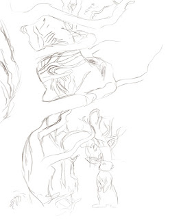
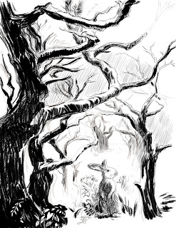
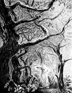
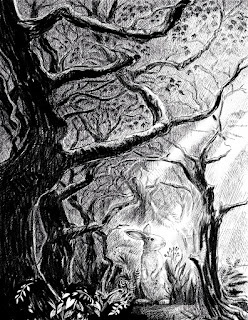
But, today I wanted to post and talk about the image I submitted for this week's "Illustration Friday," challenge which is the word 'Lost.'  I was originally inspired to create this illustration by a photo of a spooky, moss covered forest (you can see the original image, below left).  I created the final image in Painter, but before I began, I opened the photo in Photoshop and created a threshold layer so that I could better see the lights and darks in the image. I then used this as a visual reference to create the darkest shapes in my image.


From there, I began sketching in Painter 12.  Originally I had thought to do this as a digital oil or gouache painting, but then I thought it might be more dramatic to do it as a black and white digital pen and ink drawing.  From the very start, I knew I had wanted to have a rabbit in the image.  I like rabbits and I thought it might provide some tension to show an innocent looking little rabbit lost in this rather imposting and dramatic looking forest.
Beginnings of digital pencil sketch

In the above image, I've begun to map the darkest areas
After I had blocked in the darkest trees, I added additional layers to fill in the background shading.  By having the cross-hatched background shading on a different layer, I could erase areas of it without damaging the main shapes.  This came in very handy when I decided to add some shafts of sunlight to the image. As I continued to work, I began to deviate from the original photo and started adding branches and leaves where I thought the image could use some texture and visual interest.
Here, I'm filling in the background with lots of cross hatching.
As I darkened the background, I decided to add some rays of sunlight, to help guide the viewer's eye toward the rabbit.

Finally, after finishing the image in black and white, I decided it might be fun to do a colored version.  Since I had created the black and white image on several layers it was easy to add another layer underneath to create the color.  All I did was flatten the black and white layers to a single layer and changed the resulting layer to a 'multiply' blending mode, which allowed the color to show through in the white areas.


Above is the finished piece and below, you can see what the watercolor layer looks like without the pen and ink layer.


Thursday, May 31, 2012

Illustration Intensive with Joann Hill

I recently attended the SCBWI's regional conference for Indiana where I participated in an Illustrator's Intensive with Joann Hill, the Design Manager for Disney Hyperion. As part of the intensive we were given an assignment to create prior to the conference.  We were allowed to choose from several texts that were chosen by Ms. Hill.  From her list, I chose to illustrate three different nursery rhymes.  We were required to do two picture book spreads, so I put two of the rhymes on one spread and gave the third rhyme its own spread.

Prior to beginning, I played around a little bit, experimenting with some techniques in Painter 12, which is the program I use for most of my illustration work. One of the rhymes I chose to do was A Misty Moisty Morning which tells of a child meeting a man dressed all in leather. I knew right away that if I wasn't careful, this could end up looking rather creepy. To try and negate the creepy factor, I did two things - First, I made the old man VERY old by giving him a long white beard, glasses and a cane.  I tried to make him look harmless and sweet.  Secondly, I gave the child, a dog.  People are always asking me if they can pet my dog, so I thought a dog would be a good reason for the interaction between the old man and the child.

My experiment, which you can see above, was created by using painter's gouache brushes and some of the liquid ink pens.  I ultimately decided against this technique and ended up using painter's 'real' watercolor brushes.  But prior to starting on the finished spreads, we were asked to email Joann detailed pencil sketches so that she could give us feedback before we began our final paintings.

(By the way, you can click on any of these images to see them larger).

She liked my handling of the old man and the child very much but she felt that there were a couple of problems with the illustration for the second rhyme on the right side of the spread.  The second rhyme I chose for this spread was "Simple Simon."  She felt that my pieman looked a little too sly and the black crow standing on his backside, made him look a little too ominous.  She also thought the boy looked too powerless.  She felt that changing their facial expressions would help even out the dynamic between the two characters.

For the final painting, I changed the facial expressions on both the pieman and the boy and I changed the crow into a smaller, friendlier looking blue jay.  

For the third rhyme, which was to go on the second spread, I chose "The Old Woman Who Lived in a Shoe." Since she is supposed to have so many children she didn't know what to do, I thought this would be a good opportunity to draw lots of kids engaged in various activities. 

Below is a very early sketch, before I began to fill in many of the details.


Below is the finished sketch that I submitted for feedback.


She loved the positioning of the shoe and all of the activity going on with the kids.  She especially liked the two children in the left foreground - the little boy teasing his sister with a frog. The suggestions she made on this illustration were fairly minor.  She suggested that I have the boy hold the frog even closer to the girl's face. She also wondered why the old woman was scolding the one little boy so she suggested that maybe I show him with a paint brush and show that she has caught him painting grafitti on the shoe. In the upper right window of the shoe, she wondered why two children were in bed when all of the other children were outside playing.  

Below is the final painting that I brought with me to the conference. 


At the conference she looked at our final work and compared them to what we had originally sent to her.  She seemed happy with all of the changes I made but she had a few comments on the colors for both illustrations.  In the Misty Morning/Simple Simon piece, she felt that the figures needed to be a little darker to make them pop out more from the background.  She felt that the pieman's shirt blended in to the background while his pants really stood out.  She also felt the old man could be a couple of shades darker.  In the Old Woman in the Shoe painting, she felt the shoe needed to be darker.  After I got home, I worked on both illustrations and implemented her new suggestions.  Below are the two finished pieces which I have added to my portfolio.  


It was a fun project and it was a privilege to get to work with Ms Hill.  I felt she had a real knack for seeing what worked and didn't work in my illustrations and her comments definitely helped turn them into better illustrations.  


Sunday, May 13, 2012

Illustration Friday - Kernel

The 'Illustration Friday' word for this week is "Kernel."  A corn kernel is the first thing I thought of, the second thing was popcorn. I abandoned the popcorn idea and instead drew a little mouse clutching a kernel of corn. I know people who cringe at the thought of rodents and I know they are a big problem for farmers when they get into their stored grain, but I decided to put those thoughts out of my mind and concentrate on creating a cute little mouse. I created this image using Painter 12.  I started out with a digital pencil sketch and then colored it with Painter's 'real watercolor' brushes.  I'm pretty happy with the way it turned out.