Saturday, January 22, 2011

Illustration Friday - Dusty

For this week's 'Illustration Friday' challenge, which is the word "Dusty," I could have just taken a picture of the shelves in my office, but I had another idea in mind, one that came to me because I've been thinking a lot about David Lean's 1946 film version of Charles Dickens' novel, "Great Expectations." The new theater that recently opened on the campus of Indiana University, here in Bloomington, is presenting a retrospective of the films that earned David Lean an Academy Award nomination for best director. "Great Expectations" is coming up on the 31st.  It's always been one of my favorite movies and I think it is without a doubt the best film adaptation of any Dickens novel (I'm not counting TV mini-series here, since there are some amazing BBC adaptations. The 2005 version of "Bleak House" is one of the best).

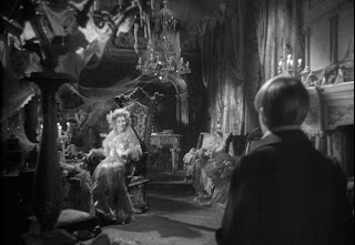
Anyway, to get back to how "Great Expectations" relates to this week's word: In Dickens' story, the character of Miss Havisham, who plays an important role in the life of the young protagonist, Pip, lives in a house of shuttered windows, cobwebs, decaying food and lots and lots of dust. She is a bitter woman who wears a tattered wedding dress and has stopped all of the clocks in the house at twenty minutes to nine. She shares her home with her adopted daughter, Estella, who she is raising to be a young woman who will break men's hearts. The scenes in the film where Pip (played by Tony Wager) goes to the home of Miss Havisham (Martita Hunt), where he has been hired to entertain her by playing cards with Estella (a young Jean Simmons), are unforgettable. These scenes are some of my favorites in the film and each of them is a masterpiece of art direction and cinematography.

For my illustration, I wanted to pay tribute to this film and in particular to the scenes with Miss Havisham and Estella, but I didn't want to try and do a realistic rendering of the actors or to capture any particular moment in Lean's film.  Instead I wanted to attempt to do a somewhat stylized, sketchy painting that utilized a limited color palette.  What I had in mind as I worked on this image, were some of the illustrations I remember from the Reader's Digest Condensed books of the mid-1960s.

Before I started on the actual painting, I decided to do a few sketches of the Miss Havisham character. You can see those sketches on the left.  The first three were done without any reference to the Lean film.  The fourth one was based on the character as played by the actress Martita Hunt.  I felt the first three sketches that I did looked too much like an old schoolmarm. After consulting a DVD of Lean's film, I created sketch number 4. I felt I really couldn't improve on Lean's interpretation, so that's the look I decided to go with.

Once I had decided on the look of Miss Havisham, I took a few DVD screen captures from Lean's film to use as inspiration and a visual reference for drawing the cobwebs and the costumes. As I mentioned earlier, I wanted this to be somewhat stylized and sketchy, so I tried not to get bogged down in duplicating too many details.  Below are a few of the screen captures that I used for my inspiration.


The next thing I did was to create a digital pencil sketch in Corel Painter, which is my favorite program for drawing and painting. I decided to do a portrait of Miss Havisham and Estella and here is the sketch I came up with.

My next step was to use a leaky pen brush to ink in some lines and details.

After that I used one of Painter's oil brushes, a dry bristle brush to paint in some gray tones. I started with the lightest shades and gradually added in the darks.

In this screen shot, you can see where I've begun to paint Estella's dress. You can see my reference image behind my canvas.


Here is what the image looked like after I competed painting in the gray tones.

When I created the original sketches of Miss Havisham (see above) I did an experiment on my fourth sketch where I added a light green wash to parts of the figure.  I liked the way that looked so I decided to do the same thing for the final image.

In the image on the left, I have turned off the visibility of the ink layer so that you can see what the image looked like with only the gray and green layers.

I didn't want to go overboard trying to draw dust particles, so I tried to convey the feeling of dust by using textures. I used some pastel brushes and sponge brushes to add texture. I also tried to convey the look of cobwebs by using lights and darks in conjunction with the textures. Hopefully I succeeded in creating an image that suggests a setting of neglect and decay.

Finished Image

Thursday, January 20, 2011

Illustration Friday - Chicken


When I first saw the word for this week's 'Illustration Friday' challenge, which this week is "Chicken," I wasn't sure of what I wanted to do. All I knew was that I wanted to do something somewhat retro looking. My first sketch showed a chick with a worm in its mouth being chased by a mother hen while another chick comes running in from the side. For some reason I couldn't get the sketch to look the way I imagined it in my head, so I tried again. This time I decided to eliminate one of the chicks from the foreground and to have the hen and chick pursuing the worm (which I decided to turn into a caterpillar). By doing this, it allowed me to make the hen and caterpillar larger and therefore give me some space to show a facial expression on the caterpillar.

First Sketch

Revised Sketch


After I was happy with the sketch, I placed it into a new Adobe Illustrator file where I started to draw the basic color shapes (I could have done this in Painter, which I used for doing the sketch, but I don't like Painter's shape tool as well as I like Illustrator's).

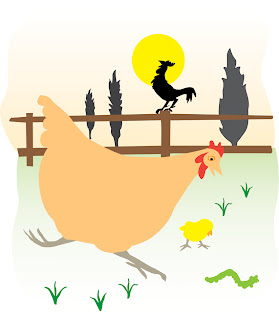
To the left is the image after I traced the basic shapes in Illustrator. From here, I exported the file as a Photoshop file where I used a Mister Retro filter on the shapes to give them the appearance of a vintage print.  With Mister Retro you can make it look like the ink has been scuffed or even out of register.  You can also add halftone dots.

Once I finished adding the Mister Retro filter, I reopened the file in Painter where I used some of Painter's brushes to add in detail. If I knew more about Photoshop's brushes I could have finished the image in Photoshop, but I find Painter's brushes unbeatable when it comes to imitating chalks, pastels, conte crayon, watercolor and leaky pens.

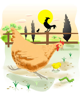
To the right is the image after I started adding some details in Painter.

At this point, I was pretty happy with the image and could have called it quits, but then another idea struck me. While working on this image I had come across an old card game from my childhood. It was a card game based on the Rocky and Bullwinkle cartoon show. I have always loved the graphics on card games from the 1960s so I decided to try and make my image look like a vintage children's playing card. That was my first idea anyway.  As I continued to work on the image, I began to think that it might be even better if I tried to duplicate the look of an old card game box.

Here is the original box from the Bullwinkle card game.  I scanned this box and then removed the illustration in Photoshop so that I would have a blank background to work with.

Image with the layer mode set to Darken
I pasted my image of the chicken over the blank box and scaled it to fit. I changed the layer mode to darken, which made the image somewhat transparent allowing the textures from the box to show through. But because this also made the colors too dark, I decided to duplicate the chicken layer and to place the new layer under this original layer.  I changed the layer mode on the new layer to screen.  This caused the colors on this layer to brighten almost to the point of looking washed out, but when viewed through the layer above it, it made the colors look just right. 
Image with layer mode set to Screen and the above Darken layer turned off


Image with both the Darken layer and the Screen layer visible


The last step was adding in the text.  I decided to call my fictional game "Who's Got the Worm?" because that sounded to me like the name of a children's card game. After trying a few fonts, I ended up using one called Saddlebag.  I played around with distorting it a bit, being careful not to make it look like a computer distortion (I wanted this to look vintage after all).  Once I got the letters to look the way that I wanted, I duplicated the text layer.  With the lower of the two text layers, I rasterized the type, selected it and then expanded the selection by 20 pixels.  Then I added a red stroke to the outside edge of the selection.  By expanding the selection it gave the stroke some distance from the original text on the layer above, so it looked like an outline that was drawn around, but not touching the original lettering.  I then ran the text through a Mister Retro filter to give it the scuffed, vintage printed look that I had given the illustration and then lowered the opacity a bit so that some of the texture of the box showed through.

Sunday, January 16, 2011

Erik Blegvad and Oddity Land

For those of you who have been following my posts, you already know that Erik Blegvad is one of my favorite illustrators. I've featured his work in two previous posts and, as I think I've already mentioned, I'm slowly building a collection of some of the books that he has illustrated. Since most of them are out of print, I'm constantly on the look-out for them at library discard sales and in used book stores. I've also bought a few of them online. The book that I'm featuring in this particular post is one that I acquired on eBay. It's a book titled "Oddity Land," by Edward Anthony which was published in 1957. It's a funny little book, aptly titled, that is made up of limericks devoted to various animals that the author says he knows.  For example, this little verse that accompanies a wonderful pen and ink drawing of some dogs enjoying a ride on a merry-go-round:

"I know a hound
Who often is found
At the carnival riding the merry-go-round."


Or this one about a spaniel named Daniel
The book's dust jacket contains this quote by Louis Untermeyer regarding the contents of "Oddity Land":

"Oddity Land" is as lively and laughable a collection of wild whimsicalities as I have seen in many years. It has been a long time since so many delightfully queer creatures have been assembled in a single volume."

The book certainly does contain a collection of queer (in the sense of unusual) creatures and Blegvad has done a wonderful job of matching his illustrations to the whimsicalities of the limericks. There are so many small gems in this book. Here are a few more examples:
The illustration below, of some ice-skating mice is one of my favorites. It's easy to see which of the seven mice is the one who doesn't like skating. He's the one on the far right, standing with a cane on the shore of the frozen lake. 

Mr. Blegvad manages to give personality to each of the creatures in his illustrations. I love the blissful grin on the face of this possum who is enjoying eating some orange blossoms . . .

. . . and the feeling of comfortable coziness that he conveys in this image of a dignified looking rabbit (which reminds me a bit of some of the rabbits by Garth Williams, another favorite illustrator of mine).

I'll finish with another of my favorites, an illustration depicting a diverse flock of birds gathered together around three small trees. The image is placed on the page opposite this text:

"There are birds, of course, in Oddity Land
But, as you have guessed, they are differently planned,
A fact that you'll be arriving at
When you read these little announcements that:

I know a bobwhite
Who's so very polite
He won't sing a note till he asks if he might

I know a canary
Who works in a dairy.
She likes it because it is sunny and airy.

I know a flamingo
Who loves to play bingo.

I know a crow
Who's learning to sew.

I know a squab
Who likes corn on the cob."


Sunday, January 02, 2011

Illustration Friday - Resolutions

First off, Happy New Year every one! Thanks to all of you who have become followers over this past year and thanks also to those of you who may not be followers, but still check in from time to time.  It's nice to know that there are people out there who actually read this, especially when there are so many other wonderful and interesting blogs to choose from.

This posting, my first for 2011 is another dedicated to an entry for the 'Illustration Friday' word challenge, which this week, appropriately enough is "resolutions." I originally hadn't planned to do an entry for this week's word. I don't know if it just seemed too daunting or I just didn't want to devote the time to it, but upon reading this week's challenge, I had pretty much decided to skip it. But then the word started me thinking - do I have any resolutions for this year? If so, what are they? and if I have resolutions, could I draw them? After giving it some thought, I realized that I probably make these same resolutions every year, but I guess they're worthy resolutions so they're not bad ones to renew each year.  My first resolution is to read more.  Now, I do read quite a bit, but since the majority of my reading gets done at bed time, I'm often too tired to get in more than a few pages at a time before I'm falling asleep.  So, I'd like to make more time for reading. I'd especially like to read more middle grade and young adult novels.  And of course there is a whole back list of classics I'd like to read.  My second resolution is to sketch more.  Most of my sketching of late has been done on the computer but I would really like to get back in the habit of working in an actual sketch book using real pencils and not digital ones. I'd also like to discipline myself to start taking my sketch book with me on trips to do some on location sketching. Next is a resolution I probably make every year  - to exercise more. There was a period when I was doing quite well with this resolution, going to the gym two or three times a week, but for the past four months, most of my exercise has come from walking our dog, Poppy, who we got just about four months ago. It's no coincidence that my drop in gym attendance coincided with our getting a dog. Poppy does need to be walked and it takes a lot of time out of the day to squeeze in 4 or 5 dog walks, so I've sacrificed going to the gym. But here's hoping that in 2011 I can get back to the gym at least once a week. My last resolution is one that I really need to stick to - to spend less money. For the past two years, I've been living off of a small inheritance that I received when my mother died, but over these past two yeas I've watched that money dwindle as it has gone into paying rent, buying groceries, paying utility bills, upkeep for the car, medical bills, etc. These aforementioned expenses are things I can't really control, but some expenses that I can control are those that I spend on books, movies and cds. I tend to be an impulse buyer, a dangerous thing to be when you're on a limited income. I have a weakness for a good bargain and it's so darn easy to shop online by hitting that 'add to cart,' button, that before you know it, you've got a huge credit card bill filled with lots of small transactions.  I really need to take control of that impulse.  There are lots more resolutions I'd like to make - send out more postcards to publishers, work  harder to get published, write more, stay in better touch with friends, etc.  I guess I would consider the four that I've decided to illustrate to be my 'core' resolutions, the ones that will help keep me sane. And if the world keeps going in the direction that it's been going over the past couple of years, I'll need to hold on to my sanity.

A little about the artwork - I did this piece 'on the fly.' In other words, there were no preliminary sketches.  I created the piece in Corel Painter using some of the calligraphy brushes for the line work and digital watercolor brushes for the color washes. I tried to keep the piece spontaneous by drawing quickly, but I will admit that I did erase and 'undo' some of the lines and re-drew them until I got them the way I wanted. I probably created the whole piece in around 20 minutes.