This past summer I was hired by AmazonEncore (Amazon.com's new publishing division) to create 15 black and white illustrations for author Karen McQuestion's fantasy, "
Secrets of the Magic Ring," which is due out in November. Karen and I exchanged quite a few emails while I was working on the job. I sent her sketches and she would write back with comments. She was a great author to work with because she only requested two small changes! As part of the publicity campaign for the book, Amazon asked Karen to come up with some questions for me, related to illustrating her book. Unfortunately, because of space limitations, Amazon won't be posting the entire interview. But I have no space limitations on my blog, so, below is the full-length version of the interview.
True confession—before I knew for sure that you’d be doing the artwork for my book, I secretly stalked your website and blog and was so impressed! The examples of your work show very diverse styles. How did you become so versatile?
First off, thanks for the compliment. I’m always thrilled when someone tells me that they were impressed by my work. As far as my versatility goes, I think in order to compete in today’s competitive illustration market, an illustrator needs to be versatile. But actually I think any versatility that I may have achieved is probably due to my career-long search for a style. As an aspiring children’s book illustrator, I’ve heard over and over again how important it is to develop a personal style. I’ve always worried that my work was too “all over the map” and that I didn’t have a style. I’ve been doing my work digitally for over twenty years, and in the digital realm it’s much easier to explore and take risks. If you make a mistake you can “undo” it and you can save multiple versions of the same image. I also have so many different illustrators that have influenced me that I often find myself creating challenges to see if I can do something in their style. I suppose I could say that’s how I stumbled upon any versatility that you may or may not see in my work.
When my editor told me you were available to do the illustrations for Secrets of the Magic Ring I was over-the-moon thrilled. How did you prepare for the project?
Well, first off I read the manuscript straight through. Then I went back over it for a second pass and underlined all of the passages that I felt had visual potential. When Terry Goodman, your editor, forwarded me one of your emails where you said you were a fan of N. M. Bodecker, the illustrator of Edward Eager’s books, I went to our public library and checked out all of his books so I could study the illustrations. Bodecker has a wonderful style, he was especially good at using patterns and stylizing things like trees and plants I learned a lot from looking at his work, especially when it came to drawing backgrounds - trees, plant detail, etc.
With publishers tightening their belts, fewer middle grade books are now illustrated. What are your thoughts on this?
Of course as an illustrator this is something that directly affects my profession so it makes me sad. As an avid reader of children’s middle grade fiction, it also makes me sad, especially when I browse the books in our library’s children’s classics section and I see the beautiful pen and ink illustrations that filled so many of the books from the 1940s, 50s, and 60s. I know that when I was a child, I would always go for the books that had pictures in them. When starting to read a book, I would find and look at all of the pictures first because then I found it fun to search for the accompanying text while I was reading. When I would get to the text that was being illustrated, I would always go back and forth between the picture and the text to see how the artist interpreted the author’s words. I still do that.
 |
| sketch of Vicky falling |
We had a fun back and forth via email while you were working on this project. At one point, you showed me a preliminary drawing of Aunt Vicky falling into a pool. I realized then that I hadn’t done a very good job describing her appearance. After explaining that Vicky was a glamorous aunt, I added more description to the text, and you made changes to the illustration. Are you willing to share the initial sketch and the final illustration?
 |
Final illustration with more
glamorous Vicky |
I’d be happy to share the original sketch. I was glad that you commented on my original drawing of Vicky because looking at my original drawing now, I can see that I made her look too generic. When you mentioned the name of a particular celebrity as an idea for how you imagined she should look, that was a big help. I even googled that celebrity to see how she wore her hair, so that I could give Vicky a more glamorous looking hairstyle.
Do you draw from memory?
Not entirely. I usually do a rough layout sketch of where I want the figures placed and then I use various types of guides to help me flesh things out. For example, I will often google images of plants and animals to use as drawing aids. Sometimes I will even google things like women’s hairstyles. For the dog, Clem, in your book, Secrets of the Magic Ring, I looked at photographs of a breed of dog called an Otterhound. While I was working on the illustrations that featured Clem, I found several images on the internet that I kept open on my desktop while I worked. Also, for reference, I used a program called “Poser,” that allows you to pose and set up human and animal mannequins in three dimensional space. You can even change the lighting on them to use as an aid in creating your shadows. That program was an invaluable tool on this job, especially for the illustrations that required unusual perspectives, like the scene where Paul is climbing up the ladder and sees Henry standing above him. For filling in simple background details, for example, the objects you might see in a laundry room, I usually just use my imagination and memory.
Can you tell us about some of your influences?
I have a lot of favorite artists, all of whom I guess could be considered influences. For the black and white work I did in this book, I was heavily influenced by the works of Erik Blegvad, N.M. Bodecker and Louis Darling. Blegvad has illustrated lots of children’s books including Mary Norton’s “Bed-knob and Broomstick,” Judith Viorst’s “The Tenth Good Thing About Barney,” and Marjorie Winslow’s “Mud Pies and Other Recipes.” As I mentioned before, Bodecker illustrated the Edward Eager Books, as well as other books that he himself wrote, like “Hurry, Hurry Mary Dear,” which is a wonderful book of his nonsense poems. Louis Darling illustrated a number of children’s classics, including Beverly Cleary’s “Henry Huggins” and her Ramona Books. Darling also illustrated one of my childhood favorites, Oliver Butterworth’s “The Enormous Egg.” I have also been influenced by people like Mary Blair, Gustav Tenggren, J.P. Miller, Tibor Gergely, John Schoenherr, David Small and many more.
How old were you when you knew you wanted to be an artist?
I knew I wanted to be an artist from a very young age. I had asthma as a kid and my mother would often keep me inside. In addition, I was also somewhat sickly and would stay home from school a lot. My mom encouraged me to draw. She was a frustrated artist herself and had lots of talent which unfortunately, once she started raising a family, she didn’t get to use very often. Before she had my older brother, she had enrolled in the Famous Artists Correspondence school. As part of that course she was sent three large art instruction books. The books covered everything from drawing basic forms, to human anatomy. Even though she never finished the course, she kept the books and when I showed an interest in drawing, she gave them to me. I spent a lot of time looking at those books, which I still have by the way, and would often copy images out of them. I guess I’d have to say that those books were my first drawing teachers.
You took a drawing I’d thought was perfect, redid the scene from a different angle and made it even better. Can you show us the before and after, and explain what you did and why?”
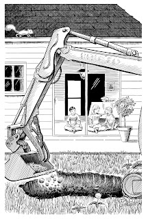
This image was somewhat of a challenge. I had to try and figure out a way to show the two children, Paul and Cecelia, and the dog Clem while they were sitting inside their house watching a swimming pool being dug outside their window. I know that kids, especially little boys, seem to like pictures of digging equipment and trucks. Because of that, I wanted to make the backhoe somewhat prominent. Because the children were sitting in the house I had two choices: I could show the children from behind and have the backhoe in the background, or I could have the backhoe in the foreground and the two children could be seen inside the house in the background. Because I didn’t want to show the backs of the children, I decided to go for the second option. But since they were going to be in the background, that option meant the children were going to be quite small. I completed that illustration, which I think was perfectly fine, but after showing it to my critique group, they pointed out to me that since this was to be the first illustration in the book, the children should be the main focus. So I went back and redid the illustration from a different point of view. I did end up showing the children from the back, but instead of having them looking out the window, which would have meant you’d only see the backs of their heads, I had them looking toward one another which allowed me to show their faces in profile. It was a perfect compromise. I was really happy that I decided to re-do it, because I think it turned out to be a much stronger illustration.
 |
| original version |
 |
| final version from new angle |


