Wednesday, June 30, 2010

Fears of a Shy Dog

1984 was a big year for me - I turned 30, I made my first solo trip overseas when I went to work in Oslo, Norway for four months, and I got my first dog that was entirely my own.  I found Fante through an ad in the Los Angeles Times classifieds. He was a purebred Shetland Sheepdog that was being sold at a discount by his owner, a Sheltie breeder. To make a long story short, when Fante was born, the breeder originally chose to keep him for his markings, thinking he would be a beautiful show dog. But as he got a little older and his personality began to develop, the breeder discovered that the puppy was much too shy and introverted to ever be a show dog. So he put him up for sale, selling him for the cost of the shots that he had already invested in him. I was warned when I got him that he would never be a completely normal dog, that he would probably not be good around kids. I felt sorry for the poor little guy. After all who would want a dog like that? What would happen to him if I didn't take him home with me?


Fante (the name came from the author John Fante who I had been reading a lot of that summer while in Norway), did eventually come out of his shell, but it was a long process that required a lot of patience on my part. Every night I use to put him up on my bed and try to get him to play with me, to wrestle with my arm. After months of doing this, one night he finally seemed to get it - he took my wrist in his mouth and from a new gleam in his eye, I could tell that he was trying to be feisty, a character trait he had never shown evidence of possessing. He remained suspicious of strangers for a good part of the 13 years that he lived, but he did later develop a curiosity that I never could have foreseen during the first year I had him.


While going through some of my old sketchbooks, I came across a series of sketches that I did during that first year that Fante and I were getting acquainted. First, a little background on where I did these sketches. In the fall of 1984, after returning from Oslo, I got a new job at a video post-production house in Hollywood called Pacific Video (I think they're still around, but now called something like Laser-Pacific). My job was to operate the vidifont machine, a computer graphics console that was primarily used for titling and putting the end credits roll on shows like "Star Search," "Solid Gold," "Falcon Crest," "The New Twilight Zone" etc.  I would be given a list of credits to type up and then, when I was done, I quite often had to wait for several hours before I would be called on to roll the credits for the editor who would then transfer them to the just edited videotape.  Because I had so much free-time, I often would pull out my sketchbook and doodle, or sketch. Fante was on my mind a lot, I often worried about how he was doing at home, all alone during the day, so I created a series of sketches that were based on my idea of what some of his fears might look like.  He often used to sit or stand very rigid, staring at something that I couldn't see. What was going on in his mind? These sketches are some of the things that I imagined he might be seeing (including the floating spherical monster in the above sketch).


As I mentioned above, he was very shy around people, especially during the first year or two of his life. He spent much of his time hiding under my bed.  Here I've imagined what he must have felt like when people were around - surrounded by a gang of hooligans and punks.

Here I'm trying to coax him to come upstairs, but he seems frozen and doesn't want to pass by a certain spot in front of the sofa. Often, there were times when he seemed to be afraid of a certain object or space that he would not go near. In this sketch, I imagined he saw a scary skeleton spread on the floor, blocking his way.

Here, I'm waiting in the shadows at the base of the steps that led up to my backdoor, waiting for him to get the courage to run up the stairs.

Later, when I entered into a relationship, I imagined him watching me and my new partner from a distance. The changes that my new relationship brought about must have felt to him like an eruption of our quiet home life, like a volcano blowing its top.

The real Fante, photographed on the backporch of my Silver Lake apartment, in October of 1984, shortly after I got him. He died in February of 1997 in Washington state where we moved in 1993.  I buried him on our 1 acre property with a headstone that read "Fante, My Little Fella."  I still think about him, my poor little dog with all of the fears.

Sunday, June 27, 2010

Illustration Friday - Satellite

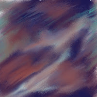
Last week's word, 'Paisley' left lots of room for interpretation and a chance to explore pattern and color. This week, the word challenge was 'Satellite,' and I have to admit that I wasn't too excited when I opened my email and discovered it was the choice for the week. Nevertheless, I decided to go for it. At first, I bounced back and forth between two ideas - an outer space scene filled with satellites, and a more metaphorical scene depicting a beautiful flower being orbited by insects that circled the flower like little satellites. I think my second idea certainly has potential for a fun and colorful illustration, but I guess I just wasn't energized enough to pursue it (I think I will file that idea away though), so I went with my first, more obvious idea - a depiction of satellites in outer space. Since I've been working a lot with patterns lately, I decided to see what I could do with an outer space themed pattern.

I did a few sketches of satellites in my sketchbook and then went to my computer where I started trying to come up with an appropriate outer space background.  I tried lots of variations and had a difficult time coming up with something that I was happy with.  I started off with a very dark color scheme which I gradually developed into something much lighter.


I started adding some additional colors that I had planned to develop into gas clouds or nebulas, but they just never seemed to look right. I was getting frustrated fast.


Next I tried to see what would happen if I put the image through a posterize filter.  


After that I began to blend the colors, and to lighten them.


Then I decided to duplicate the layer a couple of times.  I tried some different layer blending modes, gave the whole thing a more overall blue color and then added some star-like growth patterns.  By this time, I was definitely getting closer to the image I had in my mind.


After lightening it even more, I finally had something I was happy with.

Here is the image after I started to do some freehand sketching of my satellites over the finished background.  Before starting to draw I had turned on the 'Define Pattern' mode so that anytime a line went off the edge, it would reappear on the opposite side of the drawing and would thus line up properly when tiled.  This of course, slowed down my pen a lot, which was frustrating. As you may notice, I originally had an extra satellite in the image, but I decided to take it out after doing a test of how the pattern looked when tiled.  The extra satellite, since it was a vertical object, tended to create a vertical stripe when the image was repeated so I decided to remove it.

Here is the final painted image after I removed the extra satellite.  You can see what the image looks like tiled as a pattern at the top of this post. 
Thanks for reading this, I hope you found it interesting.

Wednesday, June 23, 2010

Toys That Remind Me of My Childhood Part 2


As much as I try and keep this blog to the subject of illustration and favorite illustrators, I tend at times to drift into areas of nostalgia, in particular, nostalgia for my childhood. But even when I'm indulging in nostalgia, I try and have a link to something illustrated. In this posting, I'm going to share another toy from my childhood, that is if you can count a card game as a toy (since the back of each card has a small logo on it that says "A Built Rite Toy," I guess I'll let that be my confirmation that they are toys). 

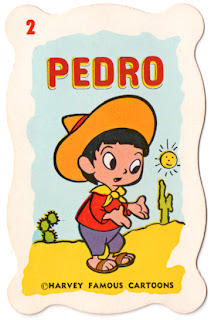
I have three old card games from my childhood that were based around cartoon or comic strip characters. In this posting I will show you the cards based on the Harvey cartoon characters.

The Harvey cartoon characters that we all know and love, the most well known of which is Casper the Friendly Ghost, have a rather convoluted background.  Casper (who is not represented in this card game) was a cartoon character developed in 1945 by Famous Studios (which itself came into being after Paramount absorbed the Fleischer brothers' debt-ridden studio).  In 1951, Harvey Comics, who was already licensing newspaper comic strip characters like Dick Tracy, licensed Famous Studios' cartoon characters, including Casper.  At the same time they began releasing comic books with characters that they had created (Wendy the Good Little Witch, Little Dot, Richie Rich, etc). In the late fifties, Harvey Comics stopped licensing the characters from Famous Studios and purchased all rights to them. In 1963 they started producing their own cartoons, the "Harveytoons," that I'm sure many of you baby boomers remember from your childhoods. (Thanks to Don Markstein's Toonopedia website for this background information).
I don't know the individual histories of the characters represented on these cards or even when these cards were manufactured (there is no date or copyright marked anywhere that I could see). I suspect they are from around 1963 or 1964. I believe that Wendy the Good Little Witch, Spooky, Nightmare and the Ghostly Trio were all spinoffs from the Casper series.  I have strong memories of seeing all of these supernatural characters in either cartoons or in comic books.  I have vague memories of cartoons starting Inchy and Wolfie, but I have no memory of Pedro or Little Feather.  Wily Fox, Moe Hare and Tommy Tortoise are so generic that if I remember them at all, I may be confusing them with similar characters created by other studios (what studio didn't create their own version of the Tortoise and the Hare story?).
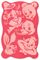
It would have been great if the backside of the cards depicted a grouping of the Harvey characters, but instead we have a group of generic funny animals and goofy people. In closing, I'll mention a few things about the cards that I love - Besides the great artwork of these once famous characters, I love the wavy edge of each card, which according to the box top, was designed to more easily fit the hand, making them easier to hold. I also love the box itself which has a clamshell opening design, which is much sturdier than the other card game boxes I have where the flaps have torn and in some cases gone missing.
I hope seeing these cards, have jogged a few memories for some of you.  For those of you new to the Harvey characters, I hope you have found this interesting and will be curious enough to seek out their old comics or to read them in their newly released archive collections being put out by Dark Horse comics.


Sunday, June 20, 2010

Illustration Friday - Paisley

This week's 'Illustration Friday' word, "Paisley" came as a surprise to me. Being an element of a certain type of pattern, it at first seemed like an unusual choice, but I've had patterns on my brain lately, so the challenge was a welcome one. Last year I did a couple of Peacock illustrations and while researching those beautiful birds I came across several Indian designs that integrated Peacocks and Paisley patterns. Thinking back on that, I decided I would do my interpretation of a 'Paisley Bird' but I decided I would do it in a children's book illustration style. Before starting, I knew I wanted my illustration to be fanciful and colorful and to be filled with other birds as well.

As I sketched (see image at left), I decided that I would make my Paisley bird a somewhat arrogant snob. I tried to convey this through his pose - one leg raised in a regal stance and his eyes disdainfully closed. I always like to add some humor when possible, so I decided I would have some action going on behind the proud bird's back - unbeknownst to him, another bird is stealing one of his prized tail feathers.

After completing my digital pencil sketch, I started off the painting by choosing a color palette. You can see the original palette that I started off with in this screen shot (click on it to see it enlarged).


After working on it for a while, I decided that the colors for the bird were too dark and I didn't like the magenta colors in combination with the blues, so I began experimenting with new color combinations.  First, I changed the hue and lightened the bird's body and the dark background parts of his tail feathers.

Next, I began to play with the pattern shapes that were inside each tail feather. In the image on the right, you can see my first experiment. It was getting closer to what I envisioned, but now I didn't like the lightness of the small comma shapes at the end of each feather.

After a little more experimentation, I was satisfied with the coloring. My next step was to outline the drawing. I used one of Painter's leaky pens (that I had tweaked in the Brush Designer palette) to outline the image.  Before finishing, I added some texture in the Paisley bird's feathers and additonal flowers on the tree, including one for the little duckling to sniff in the lower left of the image. Also, on a layer beneath the feathers, I added some airbrushed shadows to make the paisley tail feathers 'pop' out a little.

Monday, June 14, 2010

Illustration Friday - Ripple

This week, Illustration Friday presented its participants with a special challenge - it was suggested that the word "Ripple," be illustrated using the gulf oil spill as the subject. It was asked that the artwork be done as an ACEO (Art Cards Editions and Originals), a 2.5" x 3.5" artist trading card, which would then be put up for sale at this website, http://ripplesketches.blogspot.com/.  Each card will be available for a small donation of $10.00 to either The Institute for Marine Mammal Studies (http://www.imms.org/) or The International Bird Rescue Research Center (http://www.ibrrc.org/). 100% of the proceeds will go to one of these organizations. The 'ripple' website has instructions on how to proceed.

If you're interested in purchasing this card or seeing the other cards available for purchase, please go to http://ripplesketches.blogspot.com/.

About the illustration - I chose a Brown Pelican as my subject, a bird that has been greatly affected by the gulf oil spill. In the corners, I placed two sea turtles, another animal that is threatened by this horrendous disaster. Because of its decorative possibilities, I decided to do my image in an Art Nouveau style. It was created entirely in Corel Painter 11. Since this is a digitally created image, the purchaser of this piece of artwork will receive a signed print. I will send the card in a deluxe plastic top loading sleeve. The sleeve is made from a PVC that contains no plasticizers or steatites. The PVC will not migrate and will not harm the card. Thanks for looking at this, and thanks for supporting the cause!

Sunday, June 13, 2010

Library Discard Book Finds

Our local public library here in Bloomington, Indiana, recently held one of its clearance sales where they get rid of discarded books and books that have been donated to raise money for the library.  I have very fond memories of going to library sales as a kid with my parents and my sister.  We were all readers in my family and none of us could resist a bargain so it was an event that we all looked forward to.  The public library in my hometown of Riverside, CA held their sales on the lower level of the Riverside Municipal Auditorium.  The Auditorium is a beautiful building that was dedicated in 1929 (see above picture). We always arrived at the sales early and I remember standing outside in the auditorium's beautiful Spanish courtyard waiting for the doors to open.  Once inside we were each given a brown paper shopping bag and then we were set loose to browse for treasures.  We never failed to fill up our bags.  My dad filled his bag with non-fiction, often books about the French Revolution or books on science.  My mom loved mysteries and historical fiction, so she was always on the look out for books by Mary Roberts Rinehart, Mary Stewart, or Eileen Goudge. I think I had recently discovered Daphne DuMaurier and A.J. Cronin, so I kept an eye open for books by them.  My sister was interested in literary fiction and dog stories. We were also both interested in books connected with the movies and star biographies.  A book that I featured on this blog not long ago, "Those Daring Young Men in Their Jaunty Jalopies," with illustrations by Ronald Searle, was purchased at one of those sales.


Anyway, back to the local library sale that I recently attended. At this sale I spent a good deal of time and most of my money on children's books.  I found some wonderful picture books from the 1960s and even a couple of much older books from the 1940s.  I found two books illustrated by Adrienne Adams, an illustrator who was a two time winner of the Caldecott Honor Award (for "Houses from the Sea," and "The Day We Saw the Sun Come Up.") Adams who was born in 1906, was at the height of her career in the fifties and sixties and was known for her illustrated interpretations of various fairy tales.  The two books I found, illustrated in very different styles are "The Twelve Dancing Princesses," and "The Mouse Palace," by Frances Carpenter.

Her illustrations for the "The Twelve Dancing Princesses," are done in a flat, but colorful style, where each scene is depicted in an almost tableaux format.  Some of them, like the illustration of the three riders (above right) suggest a medieval tapestery. In the two page spread (below), I love how she has heightened the colors of the princesses' dresses by placing them against a black background and then echoed the colors of their dresses in the awnings covering the little gondolas on the opposite page.
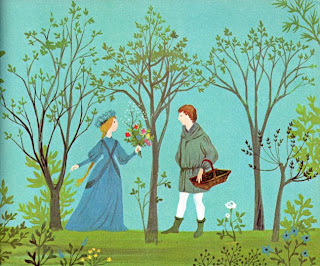
In this illustration, Adams has framed the figures with the trees, an arrangement that to me suggests the layout of a stained glass window or an illuminated manuscript.

In this particular book, Adams avoids using close-ups, keeping the viewer at a slight distance from her subjects. Every figure is seen in (to use cinema terminology) medium to long shot, so that their whole body is always on display. Once again, this choice seems to reinforce the illustration's links to medieval tapestries or stained glass windows, a fitting choice for this classic fairy tale.

I have to admit that I have not read "The Mouse Palace," yet, but from glancing at it, I know it takes place in old Siam (Thailand). In the book's forward, the author Frances Carpenter informs us that she was inspired to write the story after visiting Thailand and seeing the little palace that was built to house the pet mice of the king's children. Like the king in Margaret Landon's story "Anna and the King of Siam," and the same character in the musical version "The King and I," the king in this story seems to be the father to many children. I suppose it might even be the same king.
The illustrations in this book are done in what appears to be pencil and colored pencil with some areas of flat color laid in.
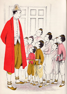
 Here is the king with his children. The bright red coat of the king, makes him the focal point, but his gaze toward the children directs your eye down to the right of the image where you can take in the delicate drawing of the children's costumes and faces.

I particularly like the mood that Adams has created in this black and white drawing of one of the king's children outside under a full moon.
And I love the soft coloration, the poses and the facial expressions of this group of Siamese cats.

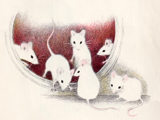
Finally, here is an illustration of the little mice born at the end of the story. I think Adams has done a wonderful job in this illustration of utilizing the negative space created by the white coats of the baby mice against their somewhat darker background.

Before finding these two delightful books, I wasn't familiar with Adrienne Adams, but I'm happy that I discovered her and I'll definitely be keeping my eye open for some of her other titles the next time I'm at a used book sale.