 |
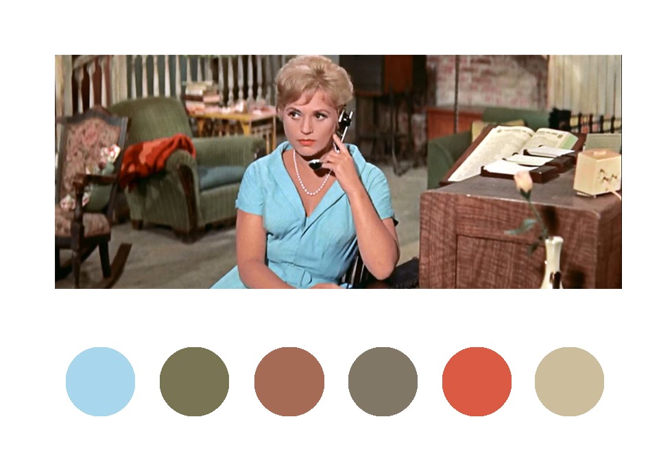
| Bells Are Ringing (1960) |
I recently became aware of a Tumblr blog titled "Wes Anderson Palettes," a visual examination of the color palettes that predominate in the films of director Wes Anderson. Being a visual artist, and always on the look out for interesting color palettes, I was fascinated by the blog, but I was also reminded of another director, Vincente Minnelli, who as a visual stylist, also used color in a very stylized way. For those of you unfamiliar with Minnelli, other than as the father of Liza, Vincente Minnelli was one of the top directors at MGM from the mid 1940s through the early 1960s. Before entering the world of motion pictures, Minnelli was a set and costume designer and before that, he was a window dresser for Marshall Field's department store in Chicago. After directing several well received revues, Minnelli was offered a contract at MGM where, in 1943, he directed his first motion picture, "Cabin in the Sky." That was followed by "Meet Me in St. Louis," in 1944 and a whole slew of other musicals such as "Yolanda and the Thief" (1945), "The Pirate" (1948),"An American in Paris," (1951), "The Band Wagon" (1953), "Brigadoon" (1954), and "Gigi" (1958). Besides musicals, he also directed comedies and melodramas such as "The Clock" (1945), "Lust for Life" (1956) "Tea and Sympathy" (1956), "Home from the Hill" (1960) and "The Courtship of Eddie's Father" (1963).
Growing up, my family had a black and white television. It wasn't until I was almost out of high school that my parents finally splurged and bought a color TV set. Up until that time, my experience of Minnelli's films had been on a small black and white screen. My imagination had to fill in the colors. When I first had the opportunity to see some of Hollywood's classic films in color, it was an eye-opener. The technicolor films from the forties, fifties and early sixties, didn't look a thing like the films that were currently playing in theaters. Instead of looking like "real" life, these classic films looked they had drifted on to the screen out of a carefully designed dream.
I think even a casual movie-goer watching a Minnelli film will notice the impeccable design choices that went into the art direction, set design, costumes and overall look of his films. I think the first time I became aware of this in one of Minnelli's films was when I was in college and had an opportunity to see his wide-screen drama "Tea and Sympathy," on a big screen. Right away I noticed the color harmonies in each scene. It almost seemed as if the whole movie was designed to compliment star Deborah Kerr's red hair.
Whether or not Minnelli was responsible for all of the design choices in his films, I don't know. He did have frequent collaborators in the likes of Art Director/Production Designers E. Preston Ames, Cedric Gibbons, George W. Davis, F. Keogh Gleason, Edwin B. Willis and others. Many of these people worked on the films that are pictured in the examples below. But considering the fact that Minnelli's background was in set design, and as a particular film's director he was in charge of the picture, I would venture to guess that he had a great deal of input into the look of a film. Minnelli has been criticized by some as a director who put style before substance in his films. I suppose there are those who are saying the same thing about Wes Anderson's films.
In 1968, critic Andrew Sarris said this about Vincente Minnelli:
"If he has a fatal flaw as an artist, it his his naïve belief that style can invariably transcend substance and that our way of looking at the world is more important than the world itself. Critic-film-makers like Godard and Truffaut pay lip service to these doctrines, but they don't really believe them. Only Minnelli believes implicitly in the power of his camera to transform trash into art, and corn into caviar. Minnelli believes more in beauty than art."
Below are a few examples of some of the beautiful color palettes from the films of Vincente Minnelli. I put these together from various still images that I found on the internet. In each case I tried to select the colors that I felt dominated a particular scene. You can click on the images to see them larger.
 |
| An American in Paris (1951) |
 |
| An American in Paris (1951) |
 |
| An American in Paris (1951) |
 |
| An American in Paris (1951) |
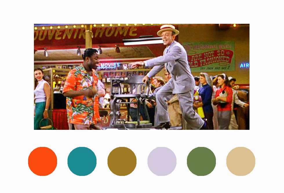 |
| The Band Wagon (1953) |
 |
| The Band Wagon (1953) |
 |
| The Band Wagon (1953) |
 |
| The Band Wagon (1953) |
 |
| Brigadoon (1954) |
 |
| Brigadoon (1954) |
 |
| Brigadoon (1954) |
 |
Brigadoon (1954)
 |
| Bells Are Ringing (1960) |
 |
| Bells Are Ringing (1960) |
|
 |
| Tea and Sympathy (1956) |
 |
| Tea and Sympathy (1956) |
 |
| Home from the Hill (1960) |
 |
| Home from the Hill (1960) |